filmov
tv
6 Golden Rules Of Layout Design You MUST OBEY

Показать описание
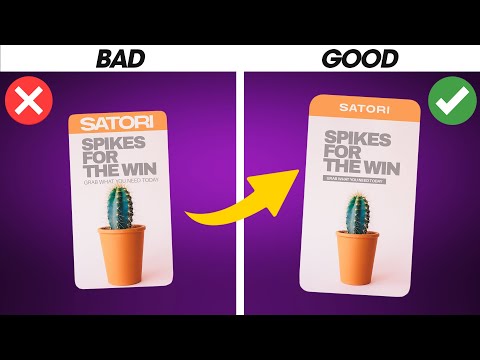
Do you know and follow these 6 GOLDEN RULES for layout design? I’m going to demonstrate these rules that every designer should follow, and also show you why they are so crucial within layout and graphic design.
I do have a few ‘golden rule’ type videos on this channel, and today we delve into the precise and elegant world of layout design. Layout design is a neat and tidy sector of graphic design, but all of these golden rules can be carried over into other aspects of graphic design. I take you through each of the 6 rules in todays tutorial, show you what they mean and where they are used, as well as why they are important to adhere to.
If you would like to see more videos geared towards layout design, or similar subjects for that matter, please do let me know. Also if you dig these golden rule video tutorials, then also let me know and I will make more of them in the future on this channel.
If you found todays layout design video enjoyable or useful, let me know in the comments section and drop a like on your way out. Subscribe to stay updated to all of my uploads and until next time, design your future today, peace
The following links are affiliate links that I personally use on a daily basis 👍
📢 📢📢 SUBSCRIBE TO MY CHANNEL
.........................................................................................................
Join Me On Twitter!
Here's My Instagram!
7 FREE SCRIPTS FOR ILLUSTRATOR:
My LONGEST ever tutorial on an isometric design
Create JAW-DROPPING design by using graphic design principles
***************** MUSIC *****************
JULIAN AVILA - Take Care / Pineapple Paradise /VIBE / BIMMER
▶ Copyright
The work is protected by copyright. This is applied to the video recording of itself as well as all artistic aspects including special protection on the final outcome. Legal steps will have to be taken if copyright is breeched. Music is used from the YouTube audio library and thus copyright free music.
Resources Used:
 0:11:25
6 Golden Rules Of Layout Design You MUST OBEY
 0:07:01
5 laws of design layout & composition *golden rules*
 0:08:26
6 GOLDEN Rules Of Logo Design (Logotype) — 100% Essential!
 0:06:34
6 Typography Golden Rules (NEED TO KNOW)
 0:01:55
Interior Book Design: the 6 Golden Rules
 0:21:26
7 Golden Rules Of Layout Design (must follow)
 0:06:23
🔸 Master ADVANCED Hierarchy In Under 7 Minutes! (Important)
 0:05:09
6 Golden Rules For Business Card Design (QUICK FIRE TIPS)
 0:28:53
How to Build a Convincing Dashboard | The Three Golden Rules and Six Key Tips to have an Impact
 0:11:59
Complete Layout Guide
 0:06:30
LEARN 13 Golden Rules Of Logo Design! (MUST KNOW)
 0:05:21
6 Graphic Design Rules You Should NEVER Break!
 0:06:17
6 Rules EVERY Pro Designer Knows! (Learn In 5 Minutes!)
 0:09:05
🔸 Golden Rules Of Graphic Design In 2024 (Updated)
 0:08:45
5 GOLDEN Rules Of MINIMAL Graphic Design *Pro-Tips*
 0:01:08
6 Golden Rules to Improve your Design Preparation | NIFT NID UCEED NATA JEE Main B.arch
 0:01:41
6 Golden Rules To Design Successful Digital Magazine
 0:00:56
Part 6 - Golden Rules to answer in a System Design Interview #systemdesign #softwareengineering
 0:07:10
PERFECT LAYOUT DESIGN Step by Step *With Examples*
 0:01:10
Understanding the Rule of Thirds | Adobe Design Principles Course
 0:00:33
How much does a UI/UX DESIGNER make?
 0:06:06
3 Rules for Better Composition in Your Art
 0:00:46
6 Golden Rules for Logo Design- Grafix Studios
 0:00:39
The Golden Ratio Explained #Shorts
Комментарии