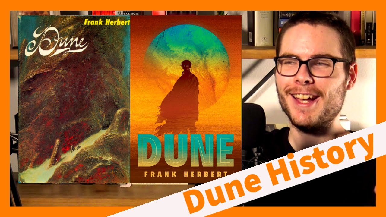
Rating Dune Book Covers

preview_player
Показать описание
Since the 1960s, Dune cover art has reflected trends in sci-fi book publishing. Which era has the best art? The bizarre, pulpy seventies? Or the classy, minimalist 2000s?

00:00 Intro
01:48 The Original Series
06:20 The 70s
07:10 The 80s
10:44 The 2000s
11:40 Current Covers
Рекомендации по теме
Комментарии
Автор

"It's pretentious but i'm gonna say it." What a mood. I still have no idea what Dune is about but judging by the covers I now know it features a big ol worm. The 80's covers didn't need to go so hard, those are stunning.

IReadToday
Автор

The new minimalist covers have really vibrant colors! That definitely drew me into buying Dune.

club_sandvich
Автор

I didn’t realize they made so many dunes and so many different cover arts!

Abe
Автор

I disagree concerning the anniversary addition. The colors are great for starters. You have tattered robes signifying some sort of hardship, but he’s standing straight and confidently, ready to lead. You can tell there’s some technology near his neck, drawing you in even more. His eyes are strikingly blue, and his head has a slight halo that is evocative of the old paintings and mosaics of Christian Saints. You have an image of an otherworldly, resilient, religious figure. If that doesn’t draw you in, I don’t know what would.

justanotherbaptistjew
Автор

9:46 I just noticed they actually all connect together, the covers, wow

Thetopnoobpro
Автор

Gonna be honest, I don’t like the 2000s covers at all, to me they looks like High School Health Class textbooks. But I love how much you love them. This was a great video!

Sidenote: I’m coming to really depend on your Saturday uploads, it’s great to get off work and pop on Man Carrying Thing on the drive home 👍🏻

FantasyTalk
Автор

I disagree with your opinion on both the 2000s era covers and the current era covers.
The 2000s era covers look like something I would look at in my high school library, and pass by without so much as a second thought. As for the current covers, maybe it's because I like minimalism to a certain degree but the current era covers however minimalist they may be, is a case of minimalism done right! The use of color and the font they used just pops off the cover, and the landscapes where it's completely empty minus whatever character, land mark, or ship they set the focus on, look vast and give a sense of mystery.

Another cover that does minimalism well in my opinion, also a dune book is the Dune BAM! Exclusive leather hardcover version.

HyperfixationWizard
Автор

I like the new style of covers, where you have a silhouette with art imposed inside them. I think they look classy. The art has this soft painterly style to it that I enjoy.

FullaEels
Автор

My favorite Dune cover isn't even from one of the books. It's the box cover of the board game from 1979. It's an iconic piece and I'm actually surprised it wasn't repurposed as a book cover for one of the later printings. Whenever I think of Dune, that cover is the one that instantly comes to mind.

Webhead
Автор

The original cover is very impressionistic.

Also ... "This just looks like Pheonix, Arizona."

Hilarious and true.

asmalljoy
Автор

I didn't know I needed this video. You just continue to entertain AND inform XD

My first experience of Dune was reading my mum's old copies of the 70s covers. I love them so much and yes they're SO trippy!

GalacticReads
Автор

I’m a fan of the Folio Society edition of the book (regular, not limited edition). The slipcover has a cool swirling sandstorm in silver, the book itself has a metallic representation of Paul, and the art on the inside is stellar. After that one, I’m fond of the first edition.

uptown
Автор

I have a paperback with the 50th anniversary edition cover, where the silhouette of a worm frames a shot of Arrakis

lolglolblol
Автор

I had no idea Dune was first released as a serial in a magazine! I really like the little factoids you sprinkle in throughout the video

rddhima
Автор

6:26 That cover was also used on a paperback of "The Three Stigmata of Palmer of Palmer Eldrich" by Philip K. Dick.

justinecooper
Автор

The "Chapterhouse: Dune" cover it's suppose to depict a no-ship. Those who read the book know which one and where it is.

UlmoLOTR
Автор

My first Dune was the movie tie in cover. Now I have the Barnes and Noble Classic Edition leather bound. I had the rest of series with the covers from 8:07.

JeantheSecond
Автор

I feel so sophisticated rn. Pinky was up the whole time. lol. These were the best: 8:04 especially the bottom three and the top middle. They give you something interesting to look at, but also give you a snapshot of that world, not just a plain brown sky.

DavidDecero
Автор

You should see the Brazillian covers from Editora Aleph, these covers are amazing, for real

nicolassorg
Автор

The 50th Anniversary paperback’s are GORGEOUS. Really wish we coulda heard your thoughts on em 👀

dankun