filmov
tv
Adding Line Chart Options – Time Series/Designing With Data

Показать описание
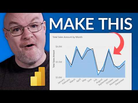
In the last example, we made the more bare-bones line chart possible. Here, we add some additional options that let us control color, labels, and lots more.
ALL THE VIDEOS IN THIS UNIT
DATA SOURCES
CHALLENGES
❓Currently, the dots at each data-point get larger when you hover over them – can you make them get smaller instead?
ALL THE VIDEOS IN THIS UNIT
DATA SOURCES
CHALLENGES
❓Currently, the dots at each data-point get larger when you hover over them – can you make them get smaller instead?
 0:14:37
 0:00:33
 0:00:27
 0:03:25
 0:00:23
 0:00:11
 0:03:19
 0:02:46
 1:02:08
 0:03:55
 0:00:41
 0:04:11
 0:03:20
 0:06:07
 0:05:46
 0:00:59
 0:06:28
 0:02:49
 0:00:29
 0:24:31
 0:00:15
 0:00:18
 0:00:58
 0:00:10