filmov
tv
Data Visualization Power Move: Nested Pie Charts in Excel

Показать описание
Data Visualization Power Move: Nested Pie Charts in Excel
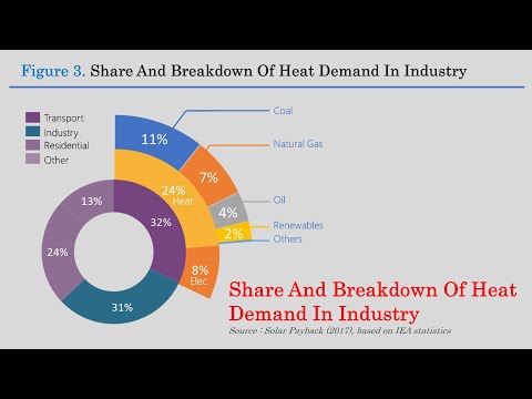
Learn to make a nested pie chart - also called a pie in pie chart in Excel. This allows you to show two different data sets in one chart in Excel. These pie graphs are pretty easy to create and I'll show you exactly how to make one using your own data.
IF YOU LIKED THIS VIDEO YOU MAY LIKE THESE SIMILAR VIDEOS:
Techniques to Shrink Text to Fit on Fewer Pages in Microsoft Word
#helenbradley #microsoftexcel #microsoftoffice #projectwoman #Excelforstudents #excelforbeginners #excelformulaforjobinterview
 0:07:51
Data Visualization Power Move: Nested Pie Charts in Excel
 0:00:27
Power BI - Matrix Visualization - move values from columns to rows
 0:19:11
Doughnut Pie Chart in Excel - Infographic
 0:02:11
Expand and collapse rows in Power BI | Matrix Tables
 0:00:22
Comment yes for more body language videos! #selfhelp #personaldevelopment #selfimprovement
 0:05:27
Excel Visualization | How To Combine Clustered and Stacked Bar Charts
 0:07:43
Data to Design: Sunburst Charts in Excel - Prep, Create, Limitations
 0:00:16
Testing Stable Diffusion inpainting on video footage #shorts
 0:04:03
Excel: One Chart - Two Legends! Quick & Easy - No VBA
 0:00:24
Coding for 1 Month Versus 1 Year #shorts #coding
 0:04:28
UI Design Tips for a Better Data Table UX
 0:04:32
Nested FOR Loops in DAX Measure😲 Power BI | Multi-Layer Loops in DAX Measure- Power BI ⚡️
 0:02:55
HOW TO | Create a Pie Graph with Pie Graph Explosion in Excel
 0:06:13
Excel Magic: In-Cell Charts for Instant Data Insights!
 0:07:19
COMBINE CLUSTERED AND STACKED COLUMN CHART/BAR CHART INTO ONE VISUAL WITH LINE VALUES IN POWER BI
 0:12:58
Filter Nested Tables before Expanding in Power Query
 0:01:00
Building a Sunburst chart in Excel - an easy way to display hierarchical data
 0:00:31
Create a donut-shaped pie chart in power bi
 0:10:21
How to Create in Page Navigation in PowerBI | Page within a Page | Using bookmarks MiTutorials
 0:00:25
Mastering Nested IFs: Advanced Excel Tutorial | How to use nested IF function
 0:08:14
Transform nested tables in Power Query (without writing M coding) | Excel Off The Grid
 0:00:51
Unlock Excel Magic: 3-Level SUNBURST Chart for Sales Hierarchies! #shorts
 0:00:11
Logical Reasoning???#viral #vidumzn
 0:06:03
matrix in power bi | Tips on using the Matrix Visual in Power BI |
Комментарии