filmov
tv
How to use Analyze Data in Excel (AI Creates Pivot Tables and Charts)

Показать описание
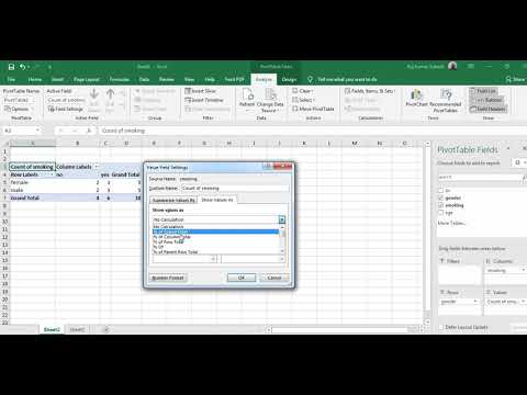
Data analysis in Microsoft Excel has just gotten a LOT easier. A feature called "Analyze Data" uses AI (artificial intelligence) makes this process simpler, faster and more intuitive. This feature used to be called IIDEAS in Excel but it was renamed to "Analyze Data". It automatically creates pivot tables for you so you don't even need to think about what to put in the rows and what to put in the columns of the pivot tables. You'll get pivot table and chart suggestions which you can immediately use. You'll also get data insights you might not be actively looking for which could be important for your analysis. This tool simply makes analyzing data in Excel really easy.
Requires Excel for Microsoft 365.
00:00 Data Analysis Made Easy with Excel AI
00:23 Analyze Data with AI in Excel
03:02 Automatically Create Charts by Asking Questions
04:36 Use Natural Language to Get Insights Into Data
06:42 Update Insights When Data Changes
07:46 Wrap Up
🎬 LINKS to related videos:
🚩Let’s connect on social:
This description contains affiliate links, which means at no additional cost to you, we will receive a small commission if you make a purchase using the links. This helps support the channel and allows us to continue to make videos like this. Thank you for your support!
#Excel #ai
 0:08:16
How to use Analyze Data in Excel (AI Creates Pivot Tables and Charts)
 0:10:20
A Beginners Guide To The Data Analysis Process
 0:07:16
Data analysis using Microsoft Excel
 0:01:25
How to Install the Data Analysis Tool in Excel
 0:01:43
How to Add the Data Analysis ToolPak in Excel | Installing Analysis Tool for Statistical Analysis
 0:00:39
How To Enable the Data Analysis in Excel
 0:08:13
Excel AI - data analysis made easy
 0:24:05
This is how I ACTUALLY analyze data using Excel
 0:52:09
Module3 | Microsoft Fabric | Data Analysis with Apache Spark | PySpark
 0:14:20
ChatGPT Data Analysis for Beginners in 2024! (Full Guide)
 0:13:40
Data Analysis for BEGINNERS in Excel in 2024 | No Python Required
 0:08:16
Learn SPSS data analysis, interpretation and APA reporting for beginners in 7 minutes
 0:13:53
Data Analysis Project in Excel (3-Step Framework)
 0:08:01
How to use ChatGPT to analyze data in SPSS
 0:11:51
Data Analysis Essentials in Excel
 0:08:54
Use AI in Excel to Analyze Data with ONE Click
 0:08:18
How to Use AI to Analyze Data in Microsoft Excel
 0:05:36
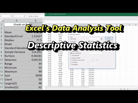
Descriptive Statistics in Excel Using the Data Analysis Tool
 0:10:37
Best free AI tool for data Analysis 📊 || Quantitative data and AI tool | ChatGPT for Research | ai...
 0:13:38
SPSS: How to enter and analyze data from a questionnaire
 0:49:16
Beginner to Pro FREE Excel Data Analysis Course
 0:08:42
Excel What-If Analysis Data Table | Easy to Use Once you Learn This☝️
 0:09:49
Excel Data Analysis ToolPak - Why You Should Be Using It
 0:06:14
Use GEO2R to Analyze Data in GEO, the Gene Expression Omnibus
Комментарии