filmov
tv
How to use scatter plots

Показать описание
From our free online course, “Practical Improvement Science in Health Care: A Roadmap for Getting Results”:
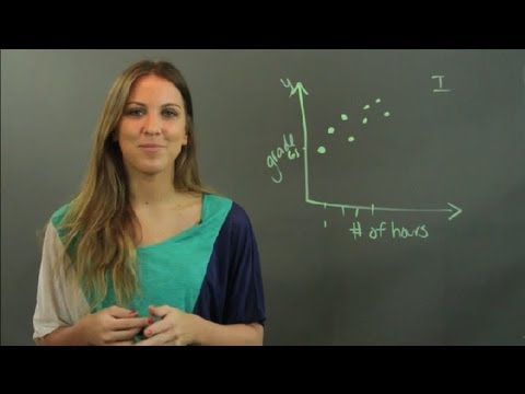
A scatter plot is a graphical tool used to examine the association between two variables. Scatter plots help us to see unusual patterns, data affected by special causes, and interesting clustering of data points. A scatter plot can also show how changes in process measures are affecting outcomes. Use a scatterplot when you want to determine the relationship between two different measures.
HarvardX empowers the faculty of Harvard University to create high-quality online courses in subjects ranging from computer science to history, education, and religion.
 0:04:42
How to Make a Scatter Plot in Excel
 0:04:51
Scatter Plots, Association and Correlation
 0:02:52
Scatter Graphs: What are they and how to plot them
 0:03:13
How to use scatter plots
 0:06:03
Statistics - Making a scatter plot
 0:01:48
When Do You Use a Scatter Plot Graph? : Math Tutoring
 0:01:04
Scatterplots — Basic example | Math | SAT | Khan Academy
 0:00:38
Scatterplots on the SAT
 1:14:00
March Data Viz Project - scatter map and bar charts
 0:00:54
How to Make a Scatter Plot in Excel
 0:04:36
Using Scatter Plot Trend Lines to Make Predictions
 0:07:11
Scatter Diagram (Scatter Plot): Detailed Illustration With Examples
 0:00:39
What is the XY Scatter Plot | #Statistics #LeanSixSigma #OpEx #SixSigma #ASQGreenBelt #CSSGB
 0:05:46
Understanding Scatter Plots 💗
 0:00:50
How to Create Categorical Scatterplots in Excel
 0:19:14
Lesson 1 - Learn Scatter Plots in Statistics
 0:01:57
How To Construct A Scatter Plot Graph - What Is A Scatter Plot Graph
 0:12:03
Making Scatter Plots/Trendlines in Excel
 0:03:31
Scatter Graphs: Correlation
 0:07:23
Create an XY Scatter Chart in Excel
 0:02:31
Constructing a scatter plot | Regression | Probability and Statistics | Khan Academy
 0:06:07
Creating an XY Scatter Plot in Excel
 0:06:49
Scatter Plot in Power BI | When to use the Scatter Plot | Animated Scatter Plot in Power BI | #16
 0:00:22
Easiest SCATTER PLOT in Excel | #excel
Комментарии