filmov
tv
What is the XY Scatter Plot | #Statistics #LeanSixSigma #OpEx #SixSigma #ASQGreenBelt #CSSGB

Показать описание
A Scatter diagram is a visual analysis tool that is meant to reflect the possible relationship between two variables.
The Scatter Plot visually plots pairs of data on an X-Y graph in order to reveal the relationship between the data sets.
The relationship between the two variables can be positive, negative or non-existent. The strength of the relationship can also be analyzed visually by how closely the points fall on the line of best fit.
The strength of that relationship can be expressed mathematically using the Pearson Correlation Coefficient, which is a number that ranges from a strong positive correlation (+1) to a strong negative correlation (-1).
The scatter plot is often used in the problem-solving process when we’re studying a process to understand which input variables (independent variables) are contributing to a negative outcome in a response variable (dependent variable).
@greenbeltacademy
#ASQGreenBelt #CSSGB #LeanSixSigma #ContinuousImprovement #sixsigma #opex
 0:00:39
What is the XY Scatter Plot | #Statistics #LeanSixSigma #OpEx #SixSigma #ASQGreenBelt #CSSGB
 0:07:23
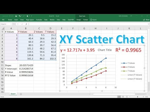
Create an XY Scatter Chart in Excel
 0:06:07
Creating an XY Scatter Plot in Excel
 0:00:54
Plotting an x-y Scatter Chart in Excel
 0:07:01
How to Plot X vs Y Data Points in Excel | Scatter Plot in Excel With Two Columns or Variables
 0:01:10
Excel - XY scatter plot not using proper x values
 0:13:23
How To Make a X Y Scatter Chart in Excel With Slope, Y Intercept & R Value
 0:06:30
How to make a XY scatter plot with OpenOffice
 0:16:25
MS Excel - XY Scatter Chart
 0:01:49
Quickly Add a Series of Data to X Y Scatter Chart
 0:01:07
X-Y scatter plot in Excel 2007
 0:00:54
How to Make a Scatter Plot in Excel
 0:06:21
Plot Two Sets of Data on an X Y Scatter Chart
 0:02:31
Excel scatter plot with group colouring
 0:01:42
How to add a trendline to an already existing XY-scatter plot
 0:01:28
How to Make a Graph on Excel With X & Y Coordinates | How to Make a Scatter Plot in Excel
 0:00:39
How to Set X and Y Axis in Excel
 0:06:46
SCATTER PLOT X - Y RELATIONSHIP
 0:05:14
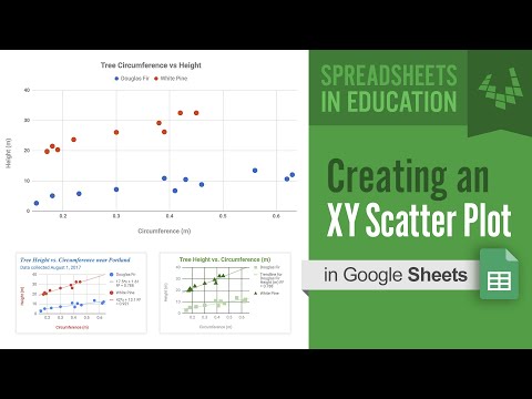
Creating an XY Scatter Plot in Google Sheets
 0:02:15
Creating Scatter Graph in Excel [XY Scatter Graph] [Plot Graph]
 0:03:59
How to make an XY Scatter Plot in Google sheets 2023
 0:04:51
Scatter Plots, Association and Correlation
 0:11:49
Using Office 365 Excel to make an XY Scatter Chart with a Power Law Fit
 0:04:16
Excel 2016: Creating a Scatter (XY) Chart
Комментарии