filmov
tv
Draw Multiple Boxplots in One Graph in R Side-by-Side (4 Examples) | Base, ggplot2 & lattice Package

Показать описание
R code of this video:
B = runif(1000),
C = rpois(1000, 3))
boxplot(data) # Applying boxplot function
library("reshape2") # Load reshape2
data_long <- melt(data) # Reshaping data frame
library("ggplot2") # Load ggplot2
ggplot(data_long, aes(x = variable, y = value)) + # Applying ggplot function
geom_boxplot()
library("lattice") # Load lattice package
bwplot(value ~ variable, data_long) # Applying bwplot function
data(iris) # Loading iris flower data set
iris_long <- melt(iris, id = "Species") # Reshaping iris data
library("ggplot2") # Load ggplot2
ggplot(iris_long, aes(x = variable, y = value, color = Species)) + # Applying ggplot function
geom_boxplot()
Follow me on Social Media:
 0:08:15
Draw Multiple Boxplots in One Graph in R Side-by-Side (4 Examples) | Base, ggplot2 & lattice Pac...
 0:01:11
How To Make a Box Plot in Excel 2022 | Windows and Mac
 0:03:24
SPSS - Box Plots of Multiple Variables
 0:06:39
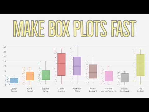
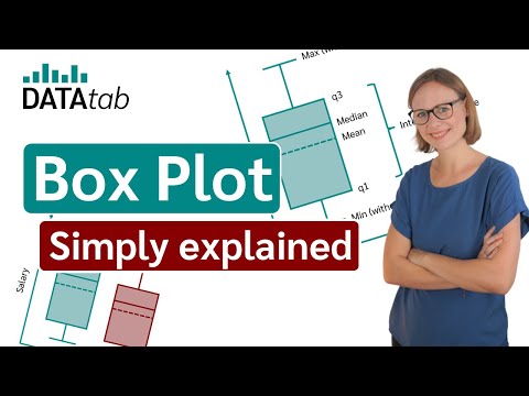
Box-Plot (Simply explained and create online)
 0:09:43
How to draw multiple boxplots together in R using ggplot2? | Iris data | StatswithR | Arnab Hazra
 0:08:01
How To Create A Box Plot In Excel (Including Outliers)
 0:04:04
Draw Two ggplot2 Boxplots on Same X-Axis Position (Example) | geom_boxplot(position = 'identity...
 0:07:11
How to draw Multiple Box plots in R studio - EP 5
 0:13:56
How To Make Box and Whisker Plots
 0:04:58
Understanding & Comparing Boxplots (Box and Whisker Plots)
 0:03:40
Draw Multiple lattice Plots in One Window in R (Example) | Plot Grid Using gridExtra & grid.arra...
 0:02:28
Boxplots in SPSS - How to Create and Interpret (Part 1 of 2)
 0:05:04
Draw Multiple Function Curves to Same Plot | Base R & ggplot2 Package | Using curve() & geom...
 0:06:53
How to read a box plot (a.k.a. a box-and-whisker plot) - Nick Desbarats
 0:12:27
How to Create a Box and Whisker Plot in Excel 2010
 0:06:43
How to calculate summary statistics, draw box-plot, compare two samples and make inference.
 0:03:14
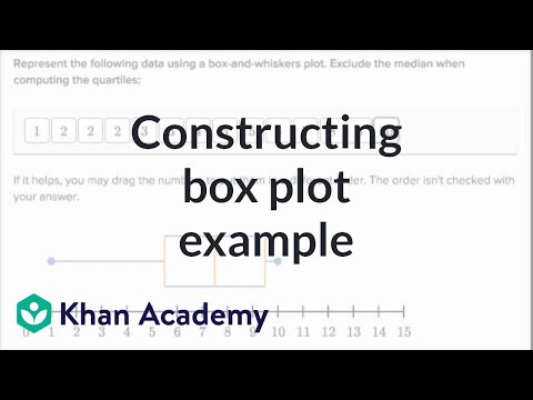
Another example constructing box plot | Data and statistics | 6th grade | Khan Academy
 0:17:17
Box Plots
 0:19:55
Understand Box Plots in Statistics (Box-and-Whisker Plots) - [6-8-23]
 0:02:52
Draw Multiple ggplot2 Plots Side-by-Side (R Programming Example)
 0:03:13
Combine Two ggplot2 Plots from Different Data Frames in R (Example) | Draw Graph of Multiple Sources
 0:06:12
Statistics - How to make a box and whisker plot
 0:13:28
How to draw a line graph using ggplot with R programming. Plots and graphs to visualize data.
 0:07:09
Science of Data Visualization | Bar, scatter plot, line, histograms, pie, box plots, bubble chart
Комментарии