filmov
tv
Boxplots in SPSS - How to Create and Interpret (Part 1 of 2)

Показать описание
Boxplots in SPSS - How to Create and Interpret is covered in this video (Part 1 of 2).
Channel Description: For step by step help with statistics, with a focus on SPSS. Both descriptive and inferential statistics covered. For descriptive statistics, topics covered include: mean, median, and mode in spss, standard deviation and variance in spss, bar charts in spss, histograms in spss, bivariate scatterplots in spss, stem and leaf plots in spss, frequency distribution tables in spss, creating labels in spss, sorting variables in spss, inserting variables in spss, inserting rows in spss, and modifying default options in spss. For inferential statistics, topics covered include: t tests in spss, anova in spss, correlation in spss, regression in spss, chi square in spss, and MANOVA in spss. New videos regularly posted. Videos series coming soon include: multiple regression in spss, factor analysis in spss, nonparametric tests in spss, multiple comparisons in spss, linear contrasts in spss, and many more. Subscribe today!
Video Transcript: In this tutorial we'll take a look at how to produce a box plot in SPSS. And notice here we have the variable college GPA where we have the values our GPAs of 10 different people. To produce a boxplot you want to go to Graphs and then select Legacy Dialogs under Legacy Dialogs you want to select Boxplot so go ahead and click on that. And then here notice Simple is selected by default that's what we want and then you want to make sure that Summaries of separate variables is selected. Go and click Define and then here we have college GPA we want to move that over to Boxes Represent. So click the right arrow button there and then this looks good, so let's go ahead and click OK. Then here we get our boxplot. We get a Case Processing Summary table first of all. That just tells us that all 10 observations were valid 0 were missing. So that looks great. And then our boxplot is shown here and double-click on to open up the Chart Editor. In this box plot there's a few values of interest we want to describe here. This value here the thick line is the Median, also known as the 50th percentile. And if we have all of our values ranked from lowest to highest, for example, the median divides the data set exactly in half. This value down here is the first quartile, also known as the 25th percentile. This point right here in our boxplot, 25% of the values are below it. The top part of our box here corresponds to the 75th percentile, also known as the third quartile. 75% of the values in our data set are below this point. And finally here these values here this line at the bottom here and this line at the top here represent the minimum and the maximum values in our data set, respectively. They are the minimum and maximum as long as there aren't any outliers and if there were any outliers you would see either one or more circles or asterisks either below this point or above this point here. And in fact let's go ahead and create an outlier or two, so you can see what that looks like.
 0:02:28
Boxplots in SPSS - How to Create and Interpret (Part 1 of 2)
 0:03:24
SPSS - Box Plots of Multiple Variables
 0:10:58
Creating and Interpreting Boxplots in SPSS
 0:06:05
Boxplots in SPSS | An Easy Guide | Part 1
 0:06:18
Einfache und kategorisierte Boxplots in SPSS erstellen - Daten visualisieren in SPSS (9)
 0:06:56
Boxplot SPSS - How To Create Boxplot in SPSS
 0:04:54
Boxplots mit SPSS erstellen
 0:08:33
How to Create Box Plot in SPSS
 0:04:38
Boxplots mit mehr als einer Variable (auch im Syntax) - Daten analysieren in SPSS (42)
 0:05:28
HOW TO PERFORM BOX PLOT IN SPSS
 0:12:05
Boxplots & Outliers in SPSS – Identify and Deal with Outliers (4-8)
 0:07:24
Creating Box Plots with SPSS
 0:05:15
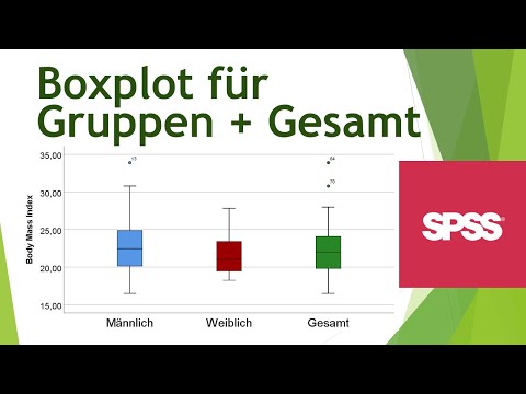
Boxplot für Gruppen und Gesamt in einem Diagramm - Daten visualisieren in SPSS (17)
 0:05:28
Ausreißer in SPSS grafisch diagnostizieren - Daten analysieren in SPSS (28)
 0:09:56
Boxplots in SPSS | An Easy Guide | Part 2
 0:02:55
SPSS-Box Plot Of Multiple Variable Create & Interpret
 0:02:45
Making a Box Plot with SPSS
 0:05:28
How to Visualize BOXPLOT using SPSS 28 via chart builder
 0:02:56
SPSS : Boxplots
 0:02:42
Create Box Plot SPSS Tutorial Lesson 5
 0:07:00
Boxplots in SPSS
 0:03:46
Editing boxplots using SPSS
 0:04:10
Multiple + clustered boxplots in SPSS
 0:08:48
BOXPLOT IN SPSS TUTORIAL
Комментарии