filmov
tv
Box-Plot (Simply explained and create online)

Показать описание
In this tutorial you will learn what a boxplot is, what information can be read in a boxplot and then we will look at what we have learned with an example.
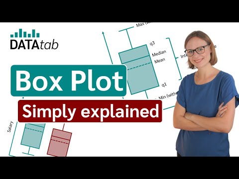
Boxplots are used in statistics to graphically display different parameters at a glance. This is why boxplots are so difficult to understand at the beginning, because a lot of information about the data is provided in one diagram. Among other things, the median, the interquartile range and the outliers can be read in a boxplot.
The data used must have metric scale level. Such as a person's age, annual household electricity consumption, or temperature.
What is the interpretation in a boxplot?
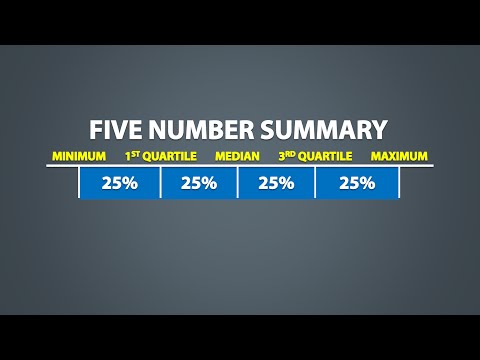
The box itself indicates the range in which the middle 50% of all values lie. Thus, the lower end of the box is the 1st quartile and the upper end is the 3rd quartile. Therefore below q1 lie 25% of the data and above q3 lie 25% of the data, in the box itself lie 50% of your data.
In the boxplot, the solid line indicates the median and the dashed line indicates the mean.
For example, if the median is 34, that means that half of the participants are younger than 34 and the other half are older than 34. The median thus divides the people into two equal groups.
The T-shaped whiskers in the boxplot go to the last point, which is still within 1.5 times the interquartile range. What does it mean? The T-shaped whisker is either the maximum value of your data but at most 1.5 times the interquartile range. Therefore, if you have an outlier, then the whisker goes up to 1.5 times the interquartile range. If there is no outlier, the whisker is the maximum value.
So the upper whisker is either the maximum value or 1.5 times the interquartile range. Depending on which value is smaller. Exactly the same applies to the lower whisker in the boxplot, which is either the minimum or 1.5 times the interquartile range.
Points that are further away are considered outliers. If no point is further away than 1.5 times the interquartile range, the T-shaped whisker thus gives the maximum or minimum value.
More information on the boxplot:
Create boxplot online:
Boxplots are used in statistics to graphically display different parameters at a glance. This is why boxplots are so difficult to understand at the beginning, because a lot of information about the data is provided in one diagram. Among other things, the median, the interquartile range and the outliers can be read in a boxplot.
The data used must have metric scale level. Such as a person's age, annual household electricity consumption, or temperature.
What is the interpretation in a boxplot?
The box itself indicates the range in which the middle 50% of all values lie. Thus, the lower end of the box is the 1st quartile and the upper end is the 3rd quartile. Therefore below q1 lie 25% of the data and above q3 lie 25% of the data, in the box itself lie 50% of your data.
In the boxplot, the solid line indicates the median and the dashed line indicates the mean.
For example, if the median is 34, that means that half of the participants are younger than 34 and the other half are older than 34. The median thus divides the people into two equal groups.
The T-shaped whiskers in the boxplot go to the last point, which is still within 1.5 times the interquartile range. What does it mean? The T-shaped whisker is either the maximum value of your data but at most 1.5 times the interquartile range. Therefore, if you have an outlier, then the whisker goes up to 1.5 times the interquartile range. If there is no outlier, the whisker is the maximum value.
So the upper whisker is either the maximum value or 1.5 times the interquartile range. Depending on which value is smaller. Exactly the same applies to the lower whisker in the boxplot, which is either the minimum or 1.5 times the interquartile range.
Points that are further away are considered outliers. If no point is further away than 1.5 times the interquartile range, the T-shaped whisker thus gives the maximum or minimum value.
More information on the boxplot:
Create boxplot online:
 0:06:39
Box-Plot (Simply explained and create online)
 0:08:25
Box and Whisker Plots Explained | Understanding Box and Whisker Plots (Box Plots) | Math with Mr. J
 0:06:53
How to read a box plot (a.k.a. a box-and-whisker plot) - Nick Desbarats
 0:03:45
Violin Plot [Simply explained]
 0:03:18
Box and whisker plot | Descriptive statistics | Probability and Statistics | Khan Academy
 0:07:18
How to Make a Box and Whisker Plot (Box Plot) | Math with Mr. J
 0:01:11
How To Make a Box Plot in Excel 2022 | Windows and Mac
 0:00:58
Boxplot [in 60 sec.] #shorts
 0:22:39
Python for Data Analysis: Plotting and Visualization: Part II (py4da02 9)
 0:02:28
Boxplots in SPSS - How to Create and Interpret (Part 1 of 2)
 0:13:56
How To Make Box and Whisker Plots
 0:08:01
How To Create A Box Plot In Excel (Including Outliers)
 0:11:53
Box Plot - 1 | How to draw Box Plot and Outlier | Data Mining | Statistics
 0:06:33
BOX AND WHISKER PLOTS EXPLAINED!
 0:04:17
Machine Learning - Data Description - Boxplot with Five Number Summary
 0:03:50
Parts of a Box and Whisker Plot (Box Plot) | Math with Mr. J
 0:04:58
Understanding & Comparing Boxplots (Box and Whisker Plots)
 0:19:55
Understand Box Plots in Statistics (Box-and-Whisker Plots) - [6-8-23]
 0:03:14
Another example constructing box plot | Data and statistics | 6th grade | Khan Academy
 0:15:16
Seaborn boxplot | Box plot explanation, box plot demo, and how to make a box plot in Python seaborn
 0:02:24
Finding the Interquartile Range from a Box Plot (Box and Whisker Plot) | Math with Mr. J
 0:00:32
Parts of a Box Plot (or Box and Whisker Plot) #Shorts #math #maths #mathematics
 0:18:18
Analyzing & Interpreting Box Plots
 0:05:37
The Five Number Summary, Boxplots, and Outliers (1.6)
Комментарии