filmov
tv
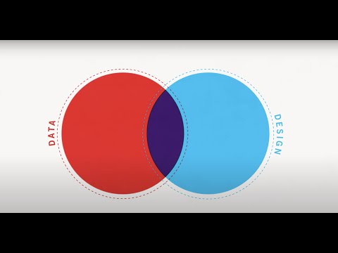
Creating Beautiful and Meaningful Visualizations with Big Data

Показать описание
At Uber, location data is our biggest asset. How do we create data visualizations with rich location data, render a million points of events in the blink of an eye, and, most importantly, derive insights from them? In this presentation, you'll get a behind the scenes look at the tools and data visualizations we use at Uber to inform business decisions. I will walk us through an overview of the data visualization process with a case study, discuss how and why we built our own visualization tool to visualize location data in a more meaningful way. I will also show that you can create beautiful visualizations, but in order for them to be useful, you have to understand the information you are designing.
About: Databricks provides a unified data analytics platform, powered by Apache Spark™, that accelerates innovation by unifying data science, engineering and business.
Connect with us:
About: Databricks provides a unified data analytics platform, powered by Apache Spark™, that accelerates innovation by unifying data science, engineering and business.
Connect with us:
 0:39:14
Creating Beautiful and Meaningful Visualizations with Big Data
 0:17:11
🚨 YOU'RE VISUALIZING YOUR DATA WRONG. And Here's Why...
 0:18:18
The beauty of data visualization - David McCandless
 0:11:02
Data Visualization in 2024 | The Ultimate Guide
 0:10:57
How to Create a Beautiful Python Visualization Dashboard With Panel/Hvplot
 0:01:43
The Value of Data Visualization | The Power of Visual Storytelling
 0:09:51
12 Dashboard design tips for better data visualization
 0:02:06
Neuroscientist: Visualization technique to achieve ALL your goals
 1:01:14
Principles of Beautiful Figures for Research Papers
 0:02:58
LEARN DATA VISUALIZATION and INFORMATION DESIGN - A Course by Federica Fragapane | Domestika English
 0:03:21
Create Meaningful Visualizations with Foursquare Data | Amazon Web Services
 0:07:09
Science of Data Visualization | Bar, scatter plot, line, histograms, pie, box plots, bubble chart
 0:00:22
The Design and Data Visualization platform to create & share engaging content in any format.
 0:07:48
The Art of Data Visualization | Off Book | PBS Digital Studios
 0:00:41
Flourish | Beautiful and easy data visualization and storytelling
 0:25:57
Data Visualization Crash Course | Consulting Best Practices
 0:07:02
Yo Inspo! ep.1 | How to Turn Data into Beautiful Visualizations
 0:14:05
How to Create Visualizations in Tableau | Tableau Tutorials for Beginners
 0:13:17
This Free AI Tool Will Create Beautiful Graphics in Seconds
 0:18:11
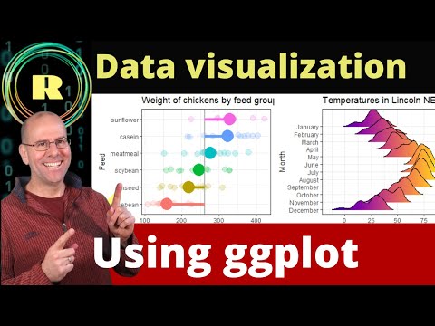
Visualize your data using ggplot. R programming is the best platform for creating plots and graphs.
 0:41:06
How to create meaningful, memorable, instantly understandable data visualizations
 0:54:10
The Beautiful Science of Data Visualization
 0:11:13
7 Top Tips for Better Business Dashboard Design Data Visualization | BI For Beginners
 0:12:28
Data Visualization using Python on Jupyter Notebook
Комментарии