filmov
tv
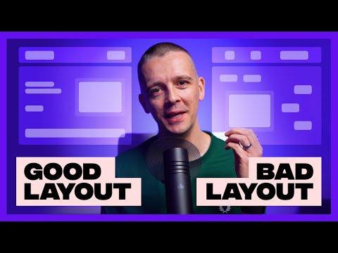
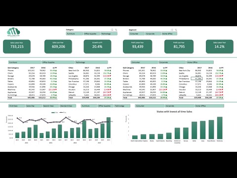
12 Dashboard design tips for better data visualization

Показать описание
Dale shows us 12 tips to design better dashboards.
Whichever dashboard tool you are using, the lessons we cover in this video are applicable to all forms of dashboard design.
12 Tips
00:00 Intro
00:55 #1: Know the purpose
01:24 #2: Include only the most important content
02:08 #3: Consider data ink ratio
03:09 #4: Round your numbers
03:40 #5: Use the most efficient visualization
04:39 #6: Group related metrics
05:15 #7: Be consistent
05:50 #8: Show hierarchy
06:12 #9: Give numbers context
06:50 #10: Use clear labels
07:18 #11: Remember it's for people
08:18 #12: Keep evolving
#dashboards #dashboarddesign #datavisualization
 0:09:51
12 Dashboard design tips for better data visualization
 0:06:22
5 Dashboard Design Tips - COMMON MISTAKES to avoid!
 0:11:13
7 Top Tips for Better Business Dashboard Design Data Visualization | BI For Beginners
 0:12:46
10 Power BI Tips for Better Dashboards | Are you using these in your Power BI reports?
 0:11:59
Complete Layout Guide
 0:11:59
5 Dashboard Design Tips - Important Concepts for Data Visualization
 0:06:56
Dashboard Design Tips: Examples and Best Practices
 0:04:32
5 guiding principles of good dashboard design
 0:46:08
Make A Professional Power Bi Dashboard in 1 Hour ! Power BI Dashboard Project in Hindi !
 0:59:25
Tableau: Dashboard Design Best Practices
 0:06:09
4 x AI Dashboard Designs in 60 SECONDS!
 0:40:32
Create interactive excel dashboard in 5 simple steps #exceldashboard #exceltutorial #pivottable
 0:01:02
Dashboard Design with QlikView
 0:26:17
Dashboard Design Tips: Creative Ways to Use Images | Tableau Conference 2023
 0:54:39
Dashboard Design Best Practices | Learn how to build a dashboard that communicates effectively
 0:04:11
Dashboard design best practices
 0:12:14
Top 50 Dashboard Design in 2021|Best Dashboard Design 2021|Best Control Panel Site Design #dashboard
 0:07:45
Implementing dashboard design best practices with Geckoboard
 0:00:09
Dashboard UI Design #design #dashboard #ui
 0:00:10
power bi dashboard design
 0:10:06
Power BI Dashboard Design from Start to End in Just 10 Minutes
 0:15:06
5 Tips To Improve Dashboard Design In Figma
 0:49:50
Design Donderdag #12: Tips voor jouw Power BI Dashboard
 0:00:13
eCommerce Dashboard Design | UI/UX
Комментарии