filmov
tv
Basic Rules for Button Design | Ui & Ux Design | Tamil.

Показать описание
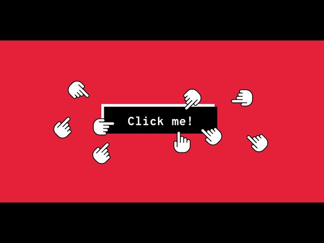
When it comes to interacting with user interface, users need to know instantly what is ‘clickable’ and what’s not. Every item in a design requires effort by the user to decode. Generally, the more time needed for users to decode the UI the less usable it becomes for them.
But how do users understand whether a certain element is interactive or not? They use previous experience and visual signifiers to clarify the meaning of the UI object. That’s why it so important to use appropriate visual signifiers (such as size, shape, color, shadow, etc.) to make the element look like a button. Visual signifiers hold an essential information value — they help to create affordances in the interface.
Unfortunately, in many interfaces the signifiers of interactivity are weak and require interaction effort; as a result, they effectively reduce discoverability.
If clear affordances of interaction are missing and users struggle with what is “clickable” and what is not, it won’t matter how cool we make the design. If they find it hard to use, they will find it frustrating and ultimately not very usable.
Weak signifiers is an even more significant problem for mobile users. In the attempt to understand whether an individual element is interactive or not, desktop users can move the cursor on the element and check whether the cursor changes its state. Mobile users don’t have such opportunity. To understand whether an element is interactive or not users have to tap on it — there’s no other way to check the interactivity.
THANKS
#informalvideos
#infromalmedia
BY your ramuk.😍🤗
DwR - Design with Ramuk
#designwithramuk
My twitter link :
SUBSCRIBE:
Informal media
we have another check that also...
 0:01:07
 0:00:25
 0:00:45
 0:00:55
 0:09:16
 0:01:55
 0:11:25
 0:04:04
 0:23:36
 0:02:47
 0:32:44
 0:04:11
 0:05:32
 0:00:54
 0:01:14
 0:10:06
 0:02:19
 0:07:10
 0:18:36
 0:12:22
 0:07:58
 0:01:54
 0:03:08
 0:00:26