filmov
tv
Another KIA Disaster? 🔎😱📉 (WHAT WENT WRONG?) #shorts

Показать описание
Recently Kia had a change in its logo.
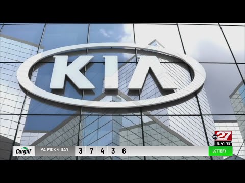
This is their old logo, and this is their new logo. And this logo change has a lot of people confused because a lot of people are reading this as KN instead of Kia. And the changing of logos is actually pretty standard.
Companies usually do this because they want to stay relevant and attract a new audience. And some of the most popular brands worldwide have undergone a logo change.
In fact, sometimes, the logo change has not been favorable to the audience, and because of this, they had to go back to the old logo.
And this is also not the first time that Kia has changed the logo. In fact, you can look at some of the historical symbols that Kia has gone through.
But what's interesting is that the name Kia is hard to read for many people. That might actually create more curiosity in people that perhaps this is an entirely new car brand, and they're literally googling k and car brand.
So maybe this is intentionally or unintentionally creating more buzz around the brand. So do you think the logo change is a good idea for the company and the brand moving forward?
Or should they have stuck with the old design or tried something different? Let me know in the comments. 👇🏽
_________________________________
-------------------------------------------------------------------------------------
You can watch my Full "YouTube for Business Marketing Series" by clicking here:
-------------------------------------------------------------------------------------
____________________________________________________________
🔎 ABOUT ME
My name is Anand, and I'm an Entrepreneur of Indian origin living in Silicon Valley, California. I own a Media and Content Marketing Agency called VidGrowth, which specializes in helping Entrepreneurs, Startups, and Small Businesses build their dream business.
📱 INSTAGRAM @vidgrowth
📩 Email
🖥 Website
💻 Personal website:
This is their old logo, and this is their new logo. And this logo change has a lot of people confused because a lot of people are reading this as KN instead of Kia. And the changing of logos is actually pretty standard.
Companies usually do this because they want to stay relevant and attract a new audience. And some of the most popular brands worldwide have undergone a logo change.
In fact, sometimes, the logo change has not been favorable to the audience, and because of this, they had to go back to the old logo.
And this is also not the first time that Kia has changed the logo. In fact, you can look at some of the historical symbols that Kia has gone through.
But what's interesting is that the name Kia is hard to read for many people. That might actually create more curiosity in people that perhaps this is an entirely new car brand, and they're literally googling k and car brand.
So maybe this is intentionally or unintentionally creating more buzz around the brand. So do you think the logo change is a good idea for the company and the brand moving forward?
Or should they have stuck with the old design or tried something different? Let me know in the comments. 👇🏽
_________________________________
-------------------------------------------------------------------------------------
You can watch my Full "YouTube for Business Marketing Series" by clicking here:
-------------------------------------------------------------------------------------
____________________________________________________________
🔎 ABOUT ME
My name is Anand, and I'm an Entrepreneur of Indian origin living in Silicon Valley, California. I own a Media and Content Marketing Agency called VidGrowth, which specializes in helping Entrepreneurs, Startups, and Small Businesses build their dream business.
📱 INSTAGRAM @vidgrowth
🖥 Website
💻 Personal website:
Комментарии
 0:07:48
 0:00:59
 0:00:23
 0:00:16
 0:00:12
 0:01:01
 0:00:06
 0:03:01
 0:00:05
 0:00:07
 0:00:27
 0:10:21
 0:00:20
 0:00:07
 0:00:12
 0:02:07
 0:00:08
 0:00:24
 0:00:05
 0:00:03
 0:00:40
 0:01:00
 0:00:31
 0:00:08