filmov
tv
The Only Oil Painting Colors You Need

Показать описание
If you could only make oil paintings with three colors plus white, what should those three colors be? Today I'll be looking at a true primary color palette you should try, and demoing how to make Richard Schmid's color charts that he describes in his book, Alla Prima II.
Resources from this video:
B O N U S C O N T E N T
F O L L O W
TikTok: @chelsealangart
C O L L E C T
Resources from this video:
B O N U S C O N T E N T
F O L L O W
TikTok: @chelsealangart
C O L L E C T
 0:30:18
The Only Oil Painting Colors You Need
 0:12:15
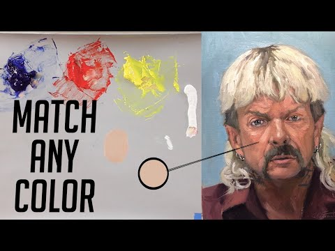
Oil Painting How to Match Any Color
 0:30:42
OIL PAINTS for miniatures -ULTIMATE beginner guide
 0:23:30
TOP 3 OIL PAINTING BRANDS
 0:16:00
What Brands of Oil Paint Should You Buy?
 0:10:37
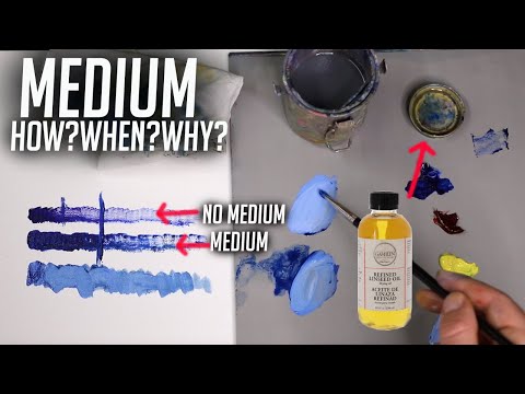
Oil Painting: How And When To Use Medium
 0:09:31
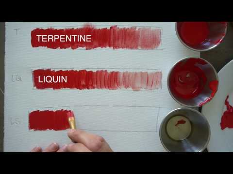
3 Oil Painting Mediums and How to Use Them
 0:24:15
Basics of Color Mixing | Oil Painting For Beginners
 0:00:30
How to draw a flower one stock ll #shorts #youtubeshorts
 0:18:05
Cheap V.s Expensive OIL PAINT - Is it REALLY worth it?...
 0:33:37
How to Match Any Color with Oil Paint
 0:05:26
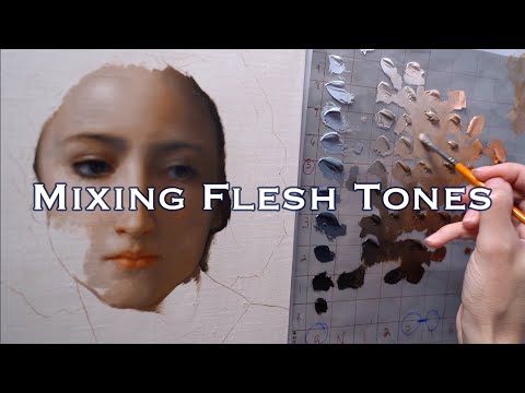
How to Mix SKIN TONES with Oil Paint: ONE Tube Color + B&W
 0:21:50
The Benefits of a Limited Palette for Oil Painting
 0:19:09
Trying OIL PAINTING with only 3 COLORS
 0:17:16
How To Mix Color | A Beginners Guide
 0:13:10
PAINT TALK: Oil Painting Mediums Simplified
 0:15:09
Safe Non Toxic Oil Painting // 6 Tips for Your Health
 0:14:20
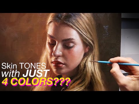
Realistic Skin Tones with Just 4 colours!?!? The Zorn Palette - Colour Mixing Demonstration
 1:01:44
The Color Mixing Masterclass
 0:23:13
COLOUR MIXING SOLUTIONS in oils - Create 3D Effects + What's on my Palette!
 0:19:31
A Simple Beginners Guide To Oil Painting
 0:09:46
Use this to make acrylic paintings look like oil! #acrylicpainting
 0:10:14
How to set up an oil painting palette | Get ready to paint with me
 0:10:10
Oil Painting Tips || Color mixing, mediums, etc
Комментарии