filmov
tv
How to Make Better Graphs - The Data Ink Ratio

Показать описание
In this beginner's guide to the Data Ink Ratio, learn how to create better charts, graphs and data visualizations in this demo tutorial using the Data to Ink ratio. Edward Tufte's Data to Ink ratio is the one data visualization rule that everyone needs to know. Regardless of whether you’re using Tableau, Power BI, Excel, PowerPoint or Illustrator. You may have the best data, insights or analytics skills in the world, but if your charts, graphs and data visualizations are confusing or boring, then it's all for nothing. In this demo tutorial find out how you can start using Edward Tufte's data to ink ratio in your charts, graphs and data visualizations
 0:04:03
How to Make Better Graphs - The Data Ink Ratio
 0:09:44
You can make Economist style graphs in Excel! Make your graphs look better with these tips
 0:02:20
D3.js in 100 Seconds
 0:24:31
Excel Charts and Graphs Tutorial
 0:10:14
Publication ready graphs in Microsoft Excel
 0:00:21
♤.. graphs i use
 0:00:11
graphs i use !! 💗
 0:09:05
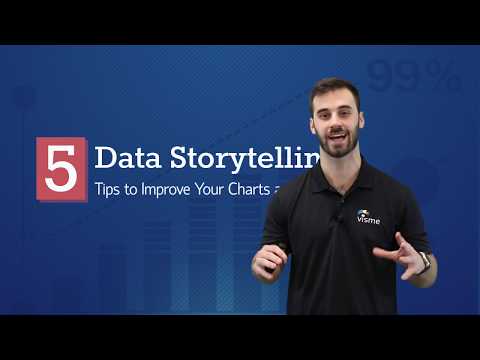
Five Data Storytelling Tips to Improve Your Charts and Graphs
 1:04:41
Zeros are my Heros! Analyzing Polynomial Graphs
 0:02:20
SMOOTH BASIC GRAPHS!! | Alight Motion Tutorial
 0:10:56
Excel: Gorgeous Graphs
 0:18:54
How to make Charts and Graphs in Illustrator (with Datylon plugin)
 0:10:18
Make Beautiful Graphs in R: 5 Quick Ways to Improve ggplot2 Graphs
 0:21:14
How to Create Charts and Graphs in Microsoft Excel - Quick and Simple
 0:01:56
How to Make Excel Graphs Look Good : Microsoft Excel Help
 0:16:25
Build Impressive Charts: It's NOT your usual Bar Chart (Infographics in Excel)
 0:05:13
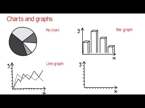
How To Choose The Right Graph (Types of Graphs and When To Use Them)
 0:15:59
How to Make the BEST Gantt Chart in Excel (looks like Microsoft Project!)
 0:00:26
Make it win with better bar graphs | Adobe Creative Cloud
 0:22:09
How to Brainstorm better than ChatGPT with Knowledge Graphs and GPT 4 | InfraNodus Tutorial
 0:00:21
Excel tip to make the best graphs and charts
 0:03:43
How to talk about charts and graphs in English (advanced English lessons)
 0:04:56
How To Create Better Graphs And Charts For Your Presentations
 0:01:45
How to Build Graphs in Java the Right Way (Not What You've Been Taught!)
Комментарии