filmov
tv
Graphic Design Principles Are CRUCIAL! (Here'sWhy)

Показать описание
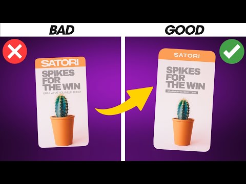
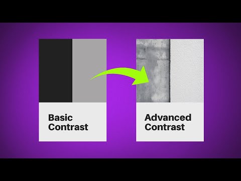
If you MASTER this principle, you will better understand graphic design, and ultimately make better design solutions. Do not underestimate the power of this design principle. It has the power to totally change your designs effectiveness, and how well it communicates with the client and target audience.
'Space' is often misunderstood in the graphic design world. People confuse what negative space is with white space, and few designers know what micro white space and macro white space is. Even fewer know what passive and active white space is. But don't worry. Todays tutorial will teach you about all of this and more, when it comes to using the design principle of space, on your graphic designs.
If you found todays video on graphic design principles enjoyable or useful, let me know in the comments section and drop a like on your way out. Subscribe to stay updated to all of my uploads and until next time, design your future today, peace
********************************************************************
✴️ The following links are affiliate links that I personally use on a daily basis 👍
********************************************************************
********************************************************************
✅ Become a PROFESSIONAL Designer With This Series
✅ 1,000’s of FREE Fonts!!
✅ How To Become A Graphic Designer!
✅ SUBSCRIBE TO MY CHANNEL
********************************************************************
🐦 Join Me On Twitter!
📸 Here's My Instagram!
********************************************************************
©️ Copyright
The work is protected by copyright. This is applied to the video recording of itself as well as all artistic aspects including special protection on the final outcome. Legal steps will have to be taken if copyright is breeched. Music is used from the YouTube audio library and or sourced with permission from the author
 0:05:31
Graphic Design Principles Are CRUCIAL! (Here'sWhy)
 0:06:23
🔸 Master ADVANCED Hierarchy In Under 7 Minutes! (Important)
 0:09:56
Understanding the Principles of Design | Graphic Design Basic
 0:05:14
LESS Than 10% Of Designers Know This! ((Satori Graphics Design Principles))
 0:08:31
LEARN Essential Graphic Design Theory (With Examples)
 0:05:03
3 Principles That Changed My Graphic Designs FOREVER! 🙌
 0:06:36
AVERAGE TO AWESOME IN SECONDS! 5 Tips For Professional Design Artwork
 0:06:45
Become An EFFICIENT Graphic Designer! (Important Things You Need To Know)
 0:00:16
Mastering Arabic calligraphy using just my graphic design skills! #SHORTS #benevolentartzattack
 0:09:56
The ONLY Way To Break Graphic Design Principles!
 0:21:47
The Principles of Design | FREE COURSE
 0:07:10
Unlock The Power Of This One Design Principle!
 0:29:37
Master 5 Design Principles With This Course! (MUST WATCH)
 0:06:07
BEST WAY To Understand Hierarchy In Graphic Design! *Essential*
 0:12:53
My Entire Graphic Design Degree in 12 Minutes
 0:00:23
Hierarchy Is IMPORTANT To Graphic Designers! (Short)
 0:07:19
PRO Graphic Design Principles With Real Design Examples!
 0:17:34
FULL Graphic Design Course – Using Principles On Actual Designs!
 0:11:07
The 5 Design Principles (But in Web Design)
 0:07:53
The ULTIMATE Design Principles TEST! (How Many Do You Know?)
 0:07:07
How to use Principles of Design | Graphic Design Basic
 0:00:58
Top 3 Most Important Graphic Designing Principles
 0:04:59
Brand Design's MOST IMPORTANT Technique! (Need To Know)
 0:11:25
6 Golden Rules Of Layout Design You MUST OBEY
Комментарии