filmov
tv
Top 10 Excel Charts | How to use, When to Use and Practical Examples

Показать описание
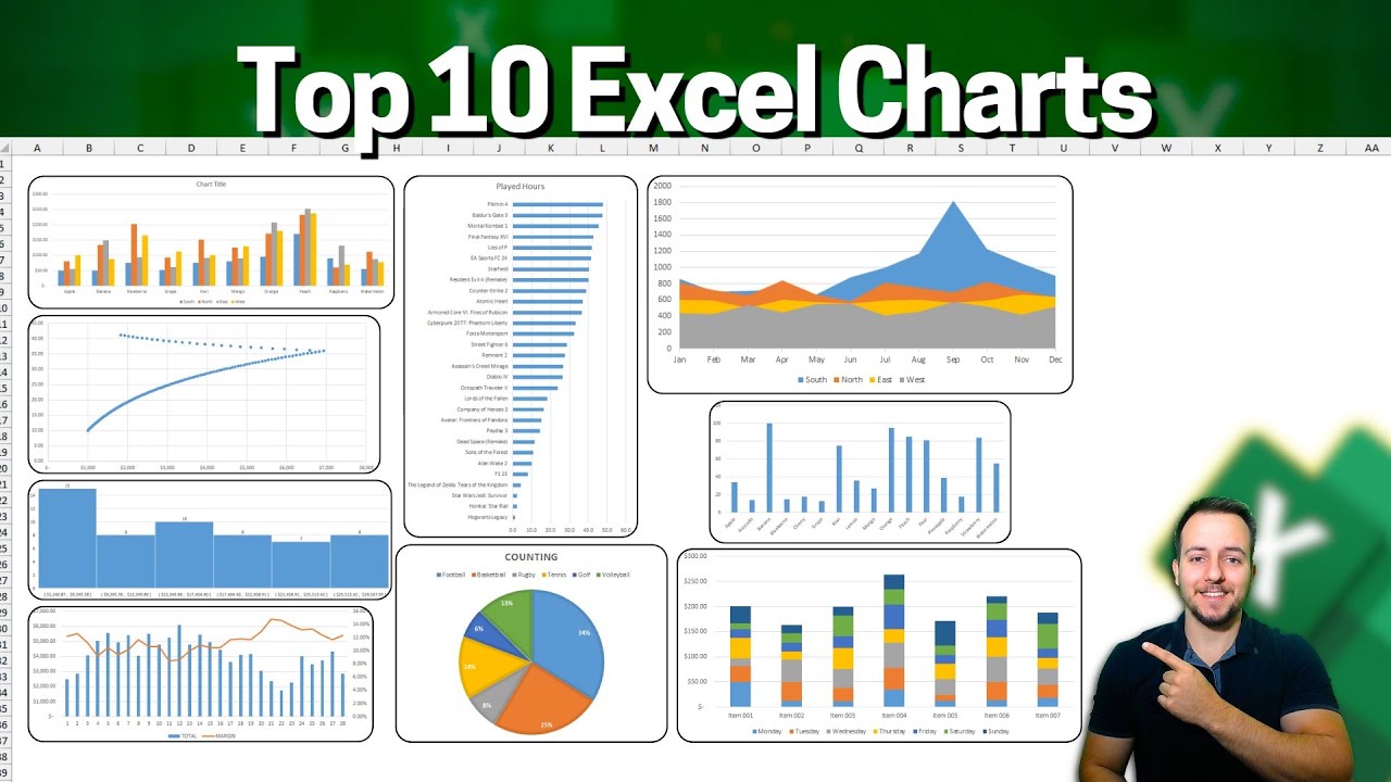
In this Excel video tutorial, we gonna see the top 10 most useful Excel charts, how to use, when to use and practical Examples. Line Chart, Area Chart, Column Chart, Bar Chart, Pie Chart, Scatter Plot Chart, Histogram Chart, Clustered Column Chart, Stacked Column Chart, Combined Chart.
00:00 - Subscribe to the Channel!
00:12 - Like the video!
00:27 - Line
04:15 - Area
08:12 - Column
12:17 - Bar
16:47 - Pie
21:14 - Scatter Plot
23:26 - Histogram
27:07 - Clustered Column
30:03 - Stacked Column
33:20 - Combined
Line Chart
Use Case: Tracking trends over time
Example: Monitoring monthly sales over a year.
Why Use It: Line charts are excellent for showing trends and patterns over continuous intervals (like time), making it easy to observe increases or decreases in data.
Column Chart
Use Case: Comparing discrete data points
Example: Sales figures for different products in a single month.
Why Use It: Column charts are ideal for comparing the performance of different categories side by side.
Clustered Column Chart
Use Case: Comparing multiple categories of data across multiple groups
Example: Sales figures for different products across several regions.
Why Use It: Clustered column charts allow you to compare multiple datasets across different categories, making it clear how each category performs within each group.
Stacked Column Chart
Use Case: Showing the contribution of individual components to the whole
Example: Annual sales broken down by product category.
Why Use It: Stacked column charts are useful for visualizing the total of all categories combined and the proportion of each category within the total.
Bar Chart
Use Case: Comparing data across categories when labels are long or there are many categories
Example: Survey results showing responses to multiple questions.
Why Use It: Bar charts work well for horizontal comparisons, especially when dealing with long category names or a large number of categories, which can be hard to display in column charts.
Pie Chart
Use Case: Showing proportions of a whole
Example: Market share of different companies within an industry.
Why Use It: Pie charts are best for illustrating parts of a whole and are useful when you need to show how different segments compare to each other in percentage terms.
Area Chart
Use Case: Showing cumulative data over time
Example: Cumulative sales over the year, highlighting how total sales build up.
Why Use It: Area charts emphasize the magnitude of change over time and the overall trend. They are particularly good at showing how individual components contribute to a cumulative total over time.
Scatter Plot
Use Case: Exploring relationships between two variables
Example: Correlation between advertising spend and sales revenue.
Why Use It: Scatter plots are excellent for identifying and illustrating correlations, patterns, and outliers between two variables.
Histogram
Use Case: Displaying the distribution of a dataset
Example: Distribution of scores on a test.
Why Use It: Histograms are used to show the frequency distribution of a data set, making it easy to see the shape, spread, and central tendency of the data.
Combined Chart
Use Case: Comparing different types of data within one chart
Example: Plotting both the total revenue (as a column chart) and the revenue growth rate (as a line chart) over the same period.
Why Use It: Combined charts are useful for showing multiple types of information in one chart, which can highlight different aspects of the data and make complex data more comprehensible.
Practical Examples and Visual Comparison:
To make these examples concrete, let's imagine you are an analyst at a retail company, and you want to present the following data to your team:
Monthly sales figures for different products (Product A, Product B, Product C)
Yearly sales distribution by region
Market share comparison between your company and competitors
Sales trends over time
Distribution of customer ages
You would choose different charts based on what you're trying to convey:
Line Chart: For showing monthly sales trends for Product A.
Column Chart: For comparing sales figures of Product A, B, and C in January.
Clustered Column Chart: For comparing sales figures of Product A, B, and C across different regions.
Stacked Column Chart: For showing how different product categories contribute to total annual sales.
Bar Chart: For survey results showing satisfaction ratings for multiple features.
Pie Chart: For market share of your company and competitors in percentage terms.
Area Chart: For cumulative sales data over the year, showing how each product contributes to total sales.
Scatter Plot: For exploring the relationship between advertising spend and sales revenue.
Histogram: For showing the age distribution of your customers.
Combined Chart: For displaying both total sales (column) and growth rate (line) over a year.
#JopaExcel #Dashboard #Excel
Комментарии
 0:01:24
 0:11:33
 0:06:44
 0:08:08
 0:10:51
 0:14:41
 0:08:01
 0:17:26
 2:05:11
 0:14:48
 0:12:37
 0:12:08
 0:10:34
 0:27:19
 0:26:33
 0:00:27
 0:09:21
 0:51:07
 0:13:49
 0:38:24
 0:05:43
 0:06:59
 0:01:31
 0:05:25