filmov
tv
E-DAB 05: Visualizing Data with Tables, Charts, Conditional Formatting & Dashboards
Показать описание
This video teaches about how to visualize in Excel with Tables, Conditional Formatting, Column and Bar Charts, Cross Tab Char (Clustered Column / Bar & Stacked Column / Bar), Line Chart, X Y Scatter Chart and Dashboards. Comprehensive Dashboard Example at end.
This class : Data Analysis & Business Intelligence Made Easy with Excel Power Tools - Excel Data Analysis Basics = E-DAB Class – Sponsored by YouTube and taught by Mike Girvin, Highline College Instructor, Microsoft Excel MVP and founder of the excelisfun channel at YouTube. This is a free educational resource for people how want to learn about the Basics of Data Analysis and Business Intelligence using Microsoft Power Tools such as, PivotTables, Power Query, Power Pivot, Power BI Desktop and more.
Topics:
1. (00:15) Introduction to topics, downloading files and visualizing examples in video.
2. (01:48) Why Visualize? Table or Visualization?
3. (03:47) Edward R. Tufte and High Data/Ink Ratio Rule and “No Chart Junk Rule”
4. (05:57) Tables Formatting Rules
5. (12:05) Conditional Formatting
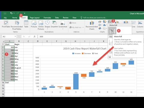
6. (15:45) Column and Bar Charts
7. (24:04) Cross Tab Chart: Clustered Column / Bar & Stacked Column / Bar
8. (27:10) Line Chart: 1 Number
9. (29:47) Line Chart and IF Function for line chart that shows revenue and emphasizes promotions for company.
10. (35:40) X-Y Scatter Chart: 2 Numbers
11. (37:02) Comprehensive Dashboard example with PivotTables and Charts. Print Setup to allow printing.
12. (39:26) PivotTable Custom Style
13. (53:44) Summary
Thanks to Ken Puls and Miguel Escobar for letting me use their logo!!!!
This class : Data Analysis & Business Intelligence Made Easy with Excel Power Tools - Excel Data Analysis Basics = E-DAB Class – Sponsored by YouTube and taught by Mike Girvin, Highline College Instructor, Microsoft Excel MVP and founder of the excelisfun channel at YouTube. This is a free educational resource for people how want to learn about the Basics of Data Analysis and Business Intelligence using Microsoft Power Tools such as, PivotTables, Power Query, Power Pivot, Power BI Desktop and more.
Topics:
1. (00:15) Introduction to topics, downloading files and visualizing examples in video.
2. (01:48) Why Visualize? Table or Visualization?
3. (03:47) Edward R. Tufte and High Data/Ink Ratio Rule and “No Chart Junk Rule”
4. (05:57) Tables Formatting Rules
5. (12:05) Conditional Formatting
6. (15:45) Column and Bar Charts
7. (24:04) Cross Tab Chart: Clustered Column / Bar & Stacked Column / Bar
8. (27:10) Line Chart: 1 Number
9. (29:47) Line Chart and IF Function for line chart that shows revenue and emphasizes promotions for company.
10. (35:40) X-Y Scatter Chart: 2 Numbers
11. (37:02) Comprehensive Dashboard example with PivotTables and Charts. Print Setup to allow printing.
12. (39:26) PivotTable Custom Style
13. (53:44) Summary
Thanks to Ken Puls and Miguel Escobar for letting me use their logo!!!!
 0:54:41
E-DAB 05: Visualizing Data with Tables, Charts, Conditional Formatting & Dashboards
 0:01:35
E-DAB 00: Introduction to Excel Data Analysis & Business Intelligence Class: E-DAB YouTube Class...
 0:14:37
E-DAB-10: Excel & Power BI Together! Import, Publish and Share Reports & Visualizations
 1:42:27
Visualizing Data and Building Dashboards in Excel & Power BI - 365 MECS 11
 0:12:42
E-DAB 01: What is Data Analysis & Business Intelligence?
 0:50:46
Visualizing Data With Excel Chart | Data Visualizing with MS Excel 2010 | Edureka
 0:04:56
Data Visualization Using Pivot Table
 0:00:34
Data Visualization Tools #shorts #Excel
 0:41:39
Basic Excel Business Analytics #43: Visualizing Data: Table & Chart Guidelines
 0:45:21
E-DAB 07: Data Modeling: VLOOKUP, Power Query or Power Pivot?
 0:26:40
E-DAB 06: The Magic of Power Query to Import, Transform & Load Data
 0:04:24
12d: Data Visualization
 0:37:37
E-DAB 09: Power BI Desktop: Data Modeling & Interactive Visualizations
 0:35:27
E-DAB 02: Data, Proper Data Sets, Excel Tables, Logical Tests, More
 0:01:31
Data Visualization with Tables vs Charts
 0:15:34
Learn data customization and visualization in 15 minutes | Excel | Jalal @DrJalal90
 0:28:55
E-DAB 04: PivotTables & Slicers Create Dashboards & Summary Reports
 0:15:52
Data Visualization with MS Excel (Create Bar Chart, Pie Chart and Line Chart using Pivot Table)
 0:15:06
5 Excel 2016 Tips Learn how to Visualize Data Using Charts
 0:04:31
Data Visualization with Tableau! Animated Graphs
 0:00:24
Last step In IHC : visualization with DAB
 1:07:21
Day 8 - Data Visualization (Imported visuals and formatting)
 0:35:02
MS EXCEL: Data Visualization with MS Excel (Part 3)
 0:44:42
E-DAB 08: Power Pivot: Big Data, Data Modeling, DAX & Dashboards
Комментарии