filmov
tv
Basic Excel Business Analytics #43: Visualizing Data: Table & Chart Guidelines
Показать описание
Learn the basic Guidelines for Visualizing Tables & Charts:
1) (00:13) Topics for video
2) (00:41) When to visualize with a Chart or a Table
3) (02:35): Effective Data Visualization makes our analysis easier for others to “see” and understand
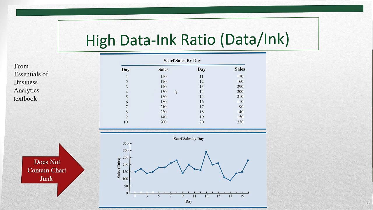
4) (04:05) Edward R. Tufte: Data Ink Ration Rule and “No Chart Junk” Rule
5) (04:49) Data Visualization Golden Rule: No Extraneous Elements in Table or Chart
6) (07:25) Tables Vs. Charts: Tables show Exact Values and allow Exact Comparisons, Charts show Relative Comparisons
7) (08:16) Tables are good when the units or magnitudes are different for the numbers
8) (08:47) Table Design Principles
9) (12:30) Example 1 for implementing Table Design Principles for small table with “less than minimal formatting”
10) (12:45) Remove all formatting with “Eraser” button: Home Ribbon Tab, Edit group, Clear Formats. Keyboard: Alt, H, E, F or Alt, E, A, F
11) (13:48) Borders and Fill and Font Color
12) (14:02) Number Formatting for currency when the unit is implied in Field Name (Header)
13) (14:30) How to present Percentages without Percent Number Format: Times 100 and then Paste Special Values.
14) (16:51) Example 2 for implementing Table Design Principles for small table with “minimal formatting”
15) (17:35) Example 2 for implementing Table Design Principles for big table, where we shade every other column
16) (18:09) Custom Number Formatting for showing numbers in millions
17) (21:27) Overview of Charts
18) (23:12) Terms that Excel Charts use for numbers and categories. Numbers = Series. Categories = labels or criteria.
19) (24:12) Knowing when to use and how to create Column and Bar Charts
20) (27:06) Knowing when to use and how to create “Stacked Column or Bar Chart” and “Clustered column or Bar Chart”
21) (29:55) Line Charts
22) (31:00) Custom Number Formatting for showing numbers in thousands
23) (32:53) Look at Select Dialog Box to change range of cells that Chart points to for numbers and category labels.
24) (33:21) X-Y Scatter Charts
25) (35:15) Bubble Charts
26) (37:39) Conditional Formatting to create heat Map
27) (38:42) Using Excel 2016, see a basic Geographical Information System example that involves taking zip code and population data and plotting it on a map using the 3-D Mapping tool
28) (41:00) Summary and Conclusion
Download Excel File Not: After clicking on link, Use Ctrl + F (Find) and search for “Highline BI 348 Class” or for the file name as seen at the beginning of the video.
1) (00:13) Topics for video
2) (00:41) When to visualize with a Chart or a Table
3) (02:35): Effective Data Visualization makes our analysis easier for others to “see” and understand
4) (04:05) Edward R. Tufte: Data Ink Ration Rule and “No Chart Junk” Rule
5) (04:49) Data Visualization Golden Rule: No Extraneous Elements in Table or Chart
6) (07:25) Tables Vs. Charts: Tables show Exact Values and allow Exact Comparisons, Charts show Relative Comparisons
7) (08:16) Tables are good when the units or magnitudes are different for the numbers
8) (08:47) Table Design Principles
9) (12:30) Example 1 for implementing Table Design Principles for small table with “less than minimal formatting”
10) (12:45) Remove all formatting with “Eraser” button: Home Ribbon Tab, Edit group, Clear Formats. Keyboard: Alt, H, E, F or Alt, E, A, F
11) (13:48) Borders and Fill and Font Color
12) (14:02) Number Formatting for currency when the unit is implied in Field Name (Header)
13) (14:30) How to present Percentages without Percent Number Format: Times 100 and then Paste Special Values.
14) (16:51) Example 2 for implementing Table Design Principles for small table with “minimal formatting”
15) (17:35) Example 2 for implementing Table Design Principles for big table, where we shade every other column
16) (18:09) Custom Number Formatting for showing numbers in millions
17) (21:27) Overview of Charts
18) (23:12) Terms that Excel Charts use for numbers and categories. Numbers = Series. Categories = labels or criteria.
19) (24:12) Knowing when to use and how to create Column and Bar Charts
20) (27:06) Knowing when to use and how to create “Stacked Column or Bar Chart” and “Clustered column or Bar Chart”
21) (29:55) Line Charts
22) (31:00) Custom Number Formatting for showing numbers in thousands
23) (32:53) Look at Select Dialog Box to change range of cells that Chart points to for numbers and category labels.
24) (33:21) X-Y Scatter Charts
25) (35:15) Bubble Charts
26) (37:39) Conditional Formatting to create heat Map
27) (38:42) Using Excel 2016, see a basic Geographical Information System example that involves taking zip code and population data and plotting it on a map using the 3-D Mapping tool
28) (41:00) Summary and Conclusion
Download Excel File Not: After clicking on link, Use Ctrl + F (Find) and search for “Highline BI 348 Class” or for the file name as seen at the beginning of the video.
 0:41:39
Basic Excel Business Analytics #43: Visualizing Data: Table & Chart Guidelines
 0:15:46
Basic Excel Business Analytics #44: Intro To Linear Regression & Scatter Chart
 0:15:58
Basic Excel Business Analytics #45: Covariance and Correlation to Measure Linear Relationship
 0:06:52
Basic Excel Business Analytics #37: Excel 2016 Data Tab, Get & Transform: Unpivot feature
 0:09:34
Basic Excel Business Analytics #18: Data Analysis Add-in for Frequency Distribution & Histogram
 0:12:27
Basic Excel Business Analytics #53: Line Charts for Time Series Data
 0:05:29
Basic Excel Business Analytics #03: Goal Seek For What-If Analysis
 0:13:30
Basic Excel Business Analytics #14: Logical Formulas & Conditional Formatting to Visualizing Dat...
 1:16:01
🔴 Introduction to Data Analysis and Data Science
 0:08:13
Basic Excel Business Analytics #55: Summary of 4 Basic Forecasting Methods & Mean Square Error
 0:15:56
Basic Excel Business Analytics #68: Monte Carlo Simulation Histogram for Construction Project Length
 0:11:22
Basic Excel Business Analytics #33: Power Query: Transform Many Bad Data Files into Proper Data Set
 0:16:37
Basic Excel Business Analytics #58 Excel Solver to Maximize Contribution Margin
 0:05:04
Basic Excel Business Analytics #01: Basic Business Analytics using Excel
 0:12:07
Basic Excel Business Analytics #31: Power Query: Import Multiple Excel Files with 1 Sheet Each
 0:17:17
Basic Excel Business Analytics #10: Find & Fix Excel Formula Errors in Spreadsheet Models
 0:11:32
Basic Excel Business Analytics #05: 1 Variable Data Table For What-If Analysis
 0:04:47
Basic Excel Business Analytics #04: Excel Formula for Units Break Even Point and a Unit Defect Rate
 0:29:49
Basic Excel Business Analytics #27: Clean & Transform Data: Formulas, Flash Fill, Power Query, T...
 0:37:24
Basic Excel Business Analytics #02: Good Spreadsheet Model Design, Fixed Variable Cost Example
 0:30:24
Basic Excel Business Analytics #47: SST = SSR + SSE & R Squared & Standard Error of Estimate
 10:59:43
Excel for Data Analytics - Full Course for Beginners
 0:06:37
Basic Excel Business Analytics #48: Data Analysis Regression feature
 0:04:45
Basic Excel Business Analytics #49: LINEST Array Function for Simple Linear Regression
Комментарии