filmov
tv
Data Visualization with MS Excel (Create Bar Chart, Pie Chart and Line Chart using Pivot Table)

Показать описание
LET'S CONNECT!
-----------------------------------
=================================================
In this tutorial, You'll learn about the Data Visualization and Its importance either in daily life or for business.
And you'll also learn to do data visualization using Microsoft Excel and create bar charts, pie charts and line chart using Pivot Table (Feature of MS Excel).
"Over the period of time you collect data from different sources for different purposes. The data might be in excel or registers. And from this data it''s very difficult to find the trends and patterns that is important for decision making. It is also difficult to read the plain data until it's converted into information."
Thus, using the data analysis techniques and representing data in a graphical format makes easier to understand by everyone (managers, shareholders, decision makers). And the process of representing data in graphical form (charts, graphs, pie charts) is known as Data Visualization.
Data Visualization is important because
1. It converts data into information
2. Data is presented in graphical form which is easier to understand by everyone
3. Helps to identify patterns and trends.
4. Helps in Better Decision Making
You can also check out other complex tutorial series as follows
 0:04:48
7 Data Visualization Tricks on Excel - Tutorial
 1:10:23
Excel Data Visualization Course – Guide to Charts & Dashboards
 0:19:21
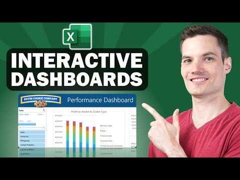
📊 How to Build Excel Interactive Dashboards
 0:14:48
Introduction to Pivot Tables, Charts, and Dashboards in Excel (Part 1)
 0:37:16
Full Project in Excel with Interactive Dashboard | Excel Tutorial for Beginners
 0:08:16
How to use Analyze Data in Excel (AI Creates Pivot Tables and Charts)
 0:19:32
Interactive Excel Dashboard for BETTER Data Visualization (Free Download)
 0:07:51
Data Visualization Power Move: Nested Pie Charts in Excel
 0:53:26
What is Data Visualization? From the expert behind PolicyViz
 4:11:47
Excel Data Analytics Full Course | Essential Skills For Data Analysis In Excel | Simplilearn
 0:08:16
I started my data analyst career taking these beginner courses
 0:01:30
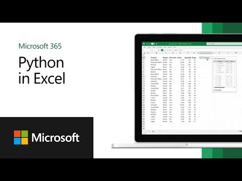
Python in Excel: a powerful combination for data analysis and visualization
 0:11:43
How to Create Dashboard in Excel ☑️
 0:20:42
Data Visualization in Excel | Excel Data Analysis - Data Visualization | Data Analysis in Excel |
 0:08:56
MS Excel - Pie, Bar, Column & Line Chart
 0:00:41
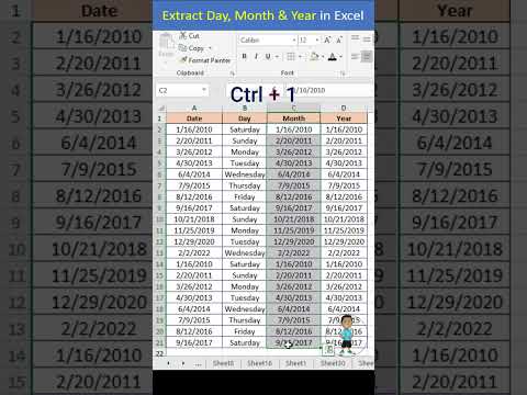
Excel Interview Question Day Month Year in Excel #excel #exceltips #exceltutorial #msexcel #shorts
 0:00:27
Excel Job Interview Questions Data Entry in Excel #excel #microsoftexcel #excel #exceltutorial
 1:14:30
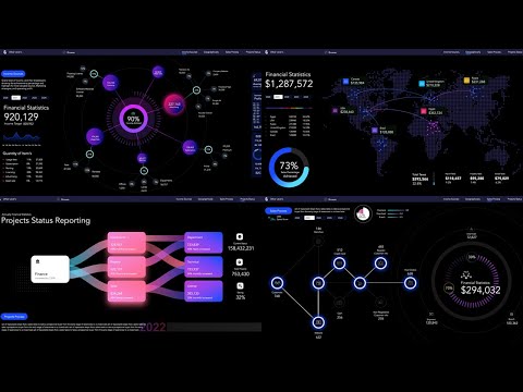
Is This Microsoft Excel?! Financial Statistics Dashboards System | Tutorial 1
 0:01:47
Microsoft Excel - Data Visualization with Excel Charts & Graphs
 0:17:04
How to Install Tableau and Create First Visualization | Tableau Tutorials for Beginners
 0:40:50
Full Project in Excel | Excel Tutorials for Beginners
 0:49:16
Beginner to Pro FREE Excel Data Analysis Course
 0:08:13
Excel AI - data analysis made easy
 0:00:38
How I use Excel as a Data Analyst 📊🤓
Комментарии