filmov
tv
AP Stats 1.5 - Boxplots & Comparing Graphs

Показать описание
Relevant topics: tax cuts & the middle class
Statistics topics: determining outliers, 5 number summary, boxplots, comparing distributions
Video by Dashiell Young-Saver
Music theme: "Something Elated" by Broke For Free
Logo animation by Memie Osuga
Timeline:
0:00 Introduction
1:41 Five Number Summary
2:28 Outliers
4:23 Boxplots
8:51 Comparing Distributions
12:45 Discussion
 0:08:40
Box Plots and Comparing Distributions - AP Statistics Unit 1 Summary Topic 1.8 & 1.9
 0:08:25
Box and Whisker Plots Explained | Understanding Box and Whisker Plots (Box Plots) | Math with Mr. J
 0:03:24
Five Number Summary, Boxplots, and Outliers | Statistics Exercises
 0:14:23
AP Stats 1.5 - Boxplots & Comparing Graphs
 0:06:39
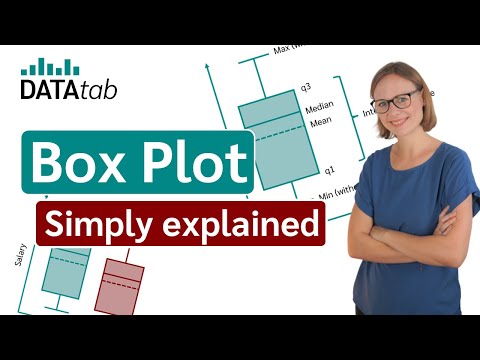
Box-Plot (Simply explained and create online)
 0:13:56
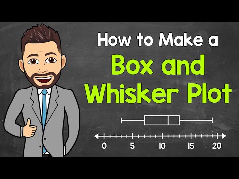
How To Make Box and Whisker Plots
 0:03:18
Box and whisker plot | Descriptive statistics | Probability and Statistics | Khan Academy
 0:06:33
Boxplot - Box and Whisker Plot - AP Stats
 0:07:21
AP Stats FRQ 2015 #1 Walkthrough Comparing Distributions Boxplots
 0:09:53
AP Stats: Boxplots (Day 1)
 0:10:22
Skewness - Right, Left & Symmetric Distribution - Mean, Median, & Mode With Boxplots - Stati...
 0:09:53
AP Statistics: Constructing Boxplots and Using the 1.5 X IQR rule for determining outliers.
 0:15:57
AP Statistics: Chapter 1, Video #7 - Boxplots
 0:15:52
AP Statistics 1-5 Comparing Distributions
 0:01:55
Percentiles (1.7)
 0:07:18
Example: Comparing distributions | AP Statistics | Khan Academy
 0:07:26
AP Stats 1.3b Notes: Identifying Outliers and Creating Box Plots
 0:07:43
Interpreting box plots | Data and statistics | 6th grade | Khan Academy
 0:10:46
Graphs of Quantitative Data - AP Statistics Unit 1 Summary Topics 1.5 & 1.6
 0:07:18
How to Make a Box and Whisker Plot (Box Plot) | Math with Mr. J
 0:13:43
Five Number Summary & Box Plots in ONLY 13 min! (AP stats 1.7 & 1.8)
 0:05:29
Boxplots and Histograms (Chp. 1 - AP Statistics)
 0:12:33
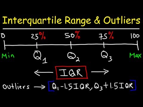
How To Find The Interquartile Range & any Outliers - Descriptive Statistics
 0:10:30
AP Stats Chapter 5: Comparing Distributions
Комментарии