filmov
tv
Graphic Design Theory #15 - Focal Point

Показать описание
GRAPHIC DESIGN THEORY
This video is one of the 200+ video lessons with 25+ hours of total playtime from the Graphic Design Theory Series. Master more than 500 terms with visual examples on Color & Contrast, Balance, Space, Composition, Hierarchy, Typography, Web & Print design and much more.
NEWSLETTER:
READ OUR BLOG
FOLLOW US
PODCAST
BECOME OUR MEMBER:
ADOBE CREATIVE CLOUD
If you don’t have a Creative Cloud subscription yet, you can subscribe to it here.
(*We are partners to Adobe. If you purchase through this link you also support our channel.)
Chapters:
0:00 Intro
0:36 Examples Starts
02:03 Visual CenterPoint
02:44 Visual Journey
04:07 Visual Rythm
04:32 Examples
 0:07:36
Graphic Design Theory #15 - Focal Point
 0:06:16
‘Simplicity’ Design principle of Graphic Design Ep15/45 [Beginners guide to Graphic Design]
 0:06:52
Graphic Design Theory Class 15
 0:15:45
Graphic Design Theory #1 - Color Part 1
 0:09:56
Understanding the Principles of Design | Graphic Design Basic
 0:02:44
Graphic Design Theory 15 EXTRA Student Challenge Exploring Color Palettes
 0:09:41
Graphic Design Theory #14 - Negative Space
 0:06:26
Beginning Graphic Design: Fundamentals
 0:08:31
LEARN Essential Graphic Design Theory (With Examples)
 0:08:19
15 Graphic Design Theory Introduction to Elements of Design, Elements of Design
 0:08:19
Graphic Design 15-Theory: Introduction to Elements of Design, Elements of Design - Dot
 0:21:47
The Principles of Design | FREE COURSE
 0:03:49
Design principles: Space in design — The Freelancer's Journey (Part 15 of 43)
 0:21:30
🔸 Graphic Design FULL Course: Mastering Design Theory!
 0:00:43
How much does a GRAPHIC DESIGNER make?
 0:08:19
Topic 15 | Theory: Introduction to Elements of Design, Elements of Design - Dot
 0:08:23
Graphic Design Theory #16 - Propositional Density
 0:05:27
Learn Graphic Design In 6 Minutes!
 0:09:39
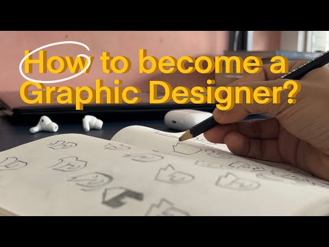
How to get started with Graphic Design? (Tools, Online Resources, Books, Clients etc.)
 0:01:00
Chrome logo Illustration - Illustrator tips #shorts - Design.lk
 0:01:14
Introduction: Detailed Graphic Design Theory: Level Up Your Designing Skill
 0:07:42
‘Line’ Visual element of Graphic Design / Design theory Ep2/45 [Beginners guide to Graphic Design]...
 0:09:22
‘Shape’ Visual element of Graphic Design / Design theory Ep4/45 [Beginners guide to Graphic Design]...
 0:01:00
Change dress color in realistic way in photoshop 2023
Комментарии