filmov
tv
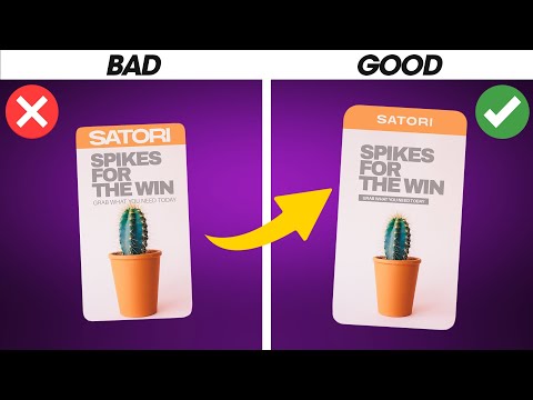
Bad Flyer Re-Design I Graphic Design Tutorial

Показать описание
Graphic Design Tutorials for Beginners: Bad Flyer Re-Design Before and After // In this graphic design tutorial for beginners, I take a bad flyer design with poor graphic design and re-design it using the basic fundamentals of composition to create a more attractive design.
🌍 RESOURCES FOR NEW DESIGNERS:
⭐️ How to Learn Graphic Design Course:
Learn the skills to create quality graphic designs without having to dig through dozens of how-to videos or pay thousands of dollars in expensive programs.
⭐️ Download this FREE Guide to 6 Exercises to Learn Graphic Design:
It is vital to learn graphic design correctly so that you can gain confidence and create professional designs. This guide will get you started with the 6 vital basics of design composition.
🌍 RESOURCES FOR FREELANCE DESIGNERS:
Free Guide to Get More Design Clients to Your Business:
Free Pricing List for Freelance Graphic Designers:
———
#graphicdesigntutorialsforbeginners #flyerdesign #learngraphicdesignbyyourself
 0:08:40
Bad Flyer Re-Design I Graphic Design Tutorial
 0:06:17
Bad Flyer Re-Design I Graphic Design Tutorial
 0:00:52
Anonymously Redesigning Street Flyers
 0:36:16
Epic Bad flyer redesign | PHOTOSHOP Graphic Design Tutorial
 0:01:00
Redesigning flyers without anyone asking me to #art #design
 0:11:31
New Flyer Re-Design I Graphic Design Tutorial
 0:06:23
🔸 Master ADVANCED Hierarchy In Under 7 Minutes! (Important)
 0:06:36
AVERAGE TO AWESOME IN SECONDS! 5 Tips For Professional Design Artwork
 0:03:04
Why Companies Are 'Debranding'
 0:00:06
Flyer Design #flyerdesigner #flyers #logo #posterdesign #flyerdesigns
 0:07:01
5 laws of design layout & composition *golden rules*
 0:14:56
Flyer Design Guide: How to Make a Flyer Your Audience Will Love
 0:13:54
I Paid 5 Designers On Fiverr To Design The SAME Logo... 🧐
 0:06:50
How To Know If Your Designs Are Great or Garbage!
 0:11:59
Complete Layout Guide
 0:08:43
AMATEUR VS PRO: Advanced Design Examples (Before & After)
 0:11:57
Packaging Design Challenge: 5min vs 30min vs 5hr
 0:00:47
Flyer design tips | Canva Tutorial
 0:08:01
What Killed The Movie Poster?
 0:00:19
Surface transformation#Interior Decoration#Self-adhesive wall stickers#old house renovation#shorts
 0:08:01
Beginner Graphic Design in Adobe Express : A Flyer Template
 0:00:11
Designing posters and flyers for events #shorts #thetopreviews
 0:06:11
Flyer Redesign - Time-lapse Transformation, Before & After
 0:02:38
Pricing Design Work & Creativity - Stop Charging Hourly
Комментарии