filmov
tv
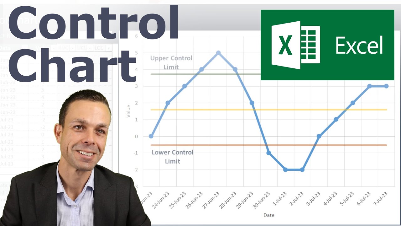
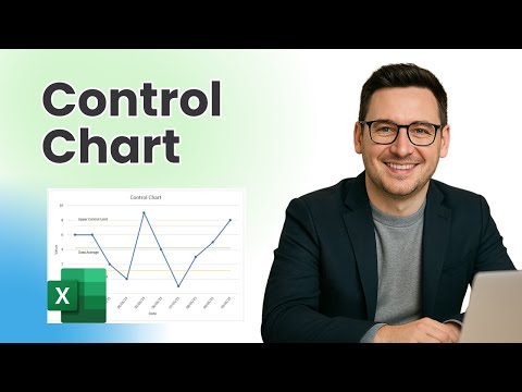
Making a Control Chart in Excel (with dynamic control lines!)
Показать описание
👍 Ready made and ready to use.
Follow along and learn how to make a Control Chart in Excel, with upper and lower control limits and dynamically moving labels.
See how to make a straight horizontal line on a line chart (for the upper and lower control limits).
Timestamps:
00:00 Intro and Control Chart overview
01:01 Starting with blank template - colours
01:27 Making the data table
02:59 Creating the Upper and Lower control limit data
04:46 Creating the control chart basics
06:48 Adding the UCL and LCL lines on the control chart
08:45 Dynamic named labels for the UCL and LCL lines
10:25 Outro and sheet overview
#Excel #SixSigma #ProjectManagement
 0:11:03
Making a Control Chart in Excel (with dynamic control lines!)
 0:15:14
Create a Basic Control Chart | HOW TO CREATE CONTROL CHARTS IN EXCEL | Shewhart Control Chart
 0:01:00
How to Construct a Control Chart in Excel
 0:06:47
How to make Run Chart and Control Chart
 0:11:04
Control Charts simply explained - Statistical process control - Xbar-R Chart, I-MR Chart,...
 0:09:55
Create a Basic Control Chart
 0:07:49
How to Create a Control Chart
 0:04:25
How to Create Control Charts in Minitab Statistical Software
 0:07:34
Core Tools syllabus
 0:05:08
How to Create Control Charts using Minitab 17
 0:03:34
p-Chart in Excel | Control Chart | LCL & UCL
 0:12:16
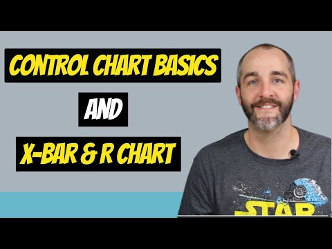
CONTROL CHART BASICS and the X-BAR AND R CHART +++++ EXAMPLE
 0:04:43
Create a Control Chart
 0:28:08
Create the Perfect Control Chart for SPC in Excel - MiniTab not Required
 0:05:50
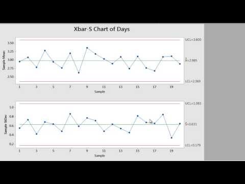
XBar-R Control Charts
 0:08:49
How do SPC control charts work?
 0:13:10
Create a Basic Control Chart | HOW TO CREATE CONTROL CHARTS IN EXCEL | Shewhart Control Chart
 0:16:16
How to Create a Control Chart (Process Behavior Chart)
 0:00:33
What is a Control Chart?? #SPC #LeanSixSigma #OpEx #SixSigma #Lean #ASQGreenBelt #CSSGB
 0:09:21
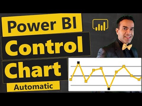
Power BI Control Chart: Create Automatically, Improve Processes Continuously 📈
 0:09:40
HOW TO CREATE CONTROL CHARTS ON EXCEL | Step by Step guide by Lean6Sigma
 0:05:18
Easily Learn how to create Control Chart in Excel Sheet
 0:41:49
Automated Control Chart in Excel (with built-in Data Simulation)
 0:17:30
How To Create a Control Chart In Excel
Комментарии