filmov
tv
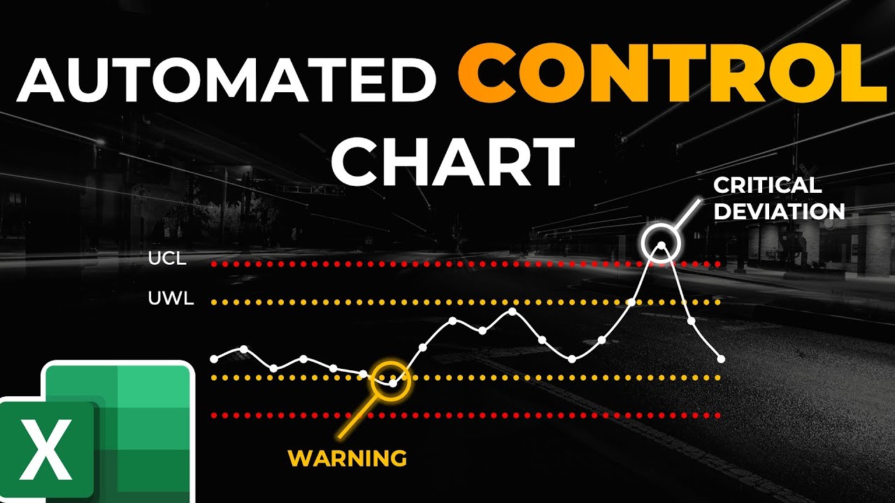
Automated Control Chart in Excel (with built-in Data Simulation)
Показать описание
Automated Control Chart in Excel (with built-in Data Simulation)
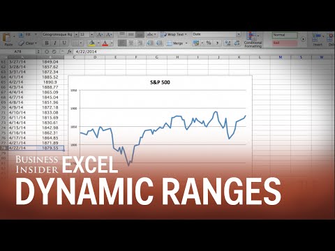
In this tutorial you will learn how to create an Automated Control Chart in Excel with a dynamic chart range and a built-in, interactive Data Simulation.
Learn step-by-step how to create the automated control chart, that automatically highlights any deviation based on limits you define, how to make the range of that chart dynamic, and how to build a VBA Data Simulation, that adds new random data points to your existing data set.
00:00 Introduction and Demo
03:07 Create the Automated Control Chart
17:25 Make the Chart Range Dynamic
28:23 Create an Interactive Data Simulation in Excel VBA
🔎 EXCEL FUNCTIONS IN THIS VIDEO
For this tutorial we recommend the latest Excel version (Excel in Microsoft 365).
▬▬▬▬▬▬▬▬▬▬▬▬▬▬▬▬▬▬▬▬▬▬▬▬▬▬▬▬▬▬▬▬
You want to become an Excel Power-User?
Take a look at our recommended trainings that you can start with for FREE!
▬▬▬▬▬▬▬▬▬▬▬▬▬▬▬▬▬▬▬▬▬▬▬▬▬▬▬▬▬▬▬▬
You want to show your support and help me grow?
Here is what you can do.
☕ WANT TO MAKE MY DAY?
🔥 MORE AWESOME EXCEL AND POWERPOINT CONTENT
Note: Some of the links in this description are affiliate links, meaning, at no additional cost to you, we will earn a commission if you click through and make a purchase. This supports the channel and allows us to continue to produce videos like this. Thank you for your support!
#excel #automated #controlchart
 0:41:49
Automated Control Chart in Excel (with built-in Data Simulation)
 0:15:14
Create a Basic Control Chart | HOW TO CREATE CONTROL CHARTS IN EXCEL | Shewhart Control Chart
 0:11:03
Making a Control Chart in Excel (with dynamic control lines!)
 1:06:15
Automated Control Chart with Process Simulation
 0:00:30
How to create control charts in Excel using QI Macros Add-in
 0:41:21
Automated Control Chart in Excel
 0:01:44
Automated Control chart & SPC
 0:09:21
Power BI Control Chart: Create Automatically, Improve Processes Continuously 📈
 0:20:36
Building Control Charts (Xbar and R Chart) in Microsoft Excel
 0:01:31
Excel Quick Tip: How to Make Charts Auto Update
 0:01:31
How to Make a Graph Change Color Based on Value | Conditionally Formatting Charts
 0:03:12
Excel VBA Code to Create Chart - Charts Automation Example
 0:13:10
Create a Basic Control Chart | HOW TO CREATE CONTROL CHARTS IN EXCEL | Shewhart Control Chart
 0:01:16
Excel Quick Tip: Automating Charts & Graphs
 0:15:12
Quick 3D Container Chart in Excel
 0:02:03
Use dynamic named ranges so your charts update automatically
 0:17:15
How to automate your control charts and reports
 0:06:47
How to make Run Chart and Control Chart
 0:05:02
🅴🆇🅲🅴🅻 - 𝟒𝟏: 𝐀𝐮𝐭𝐨𝐦𝐚𝐭𝐞𝐝 𝐂𝐡𝐚𝐫𝐭/𝐆𝐫𝐚𝐩𝐡 𝐢𝐧 𝐄𝐱𝐜𝐞𝐥...
 0:08:20
Excel Charts - three methods for filtering Chart Data
 0:15:15
How to Automate Tasks in Excel with a Button | MACRO VBA | Create a Chart with Practical Examples
 0:07:33
Link chart axis maximum and minimum to cells | Excel
 0:11:03
Creating a Control Chart in Excel
 0:03:09
How to Make Control Charts in Excel
Комментарии