filmov
tv
Create the Perfect Control Chart for SPC in Excel - MiniTab not Required
Показать описание
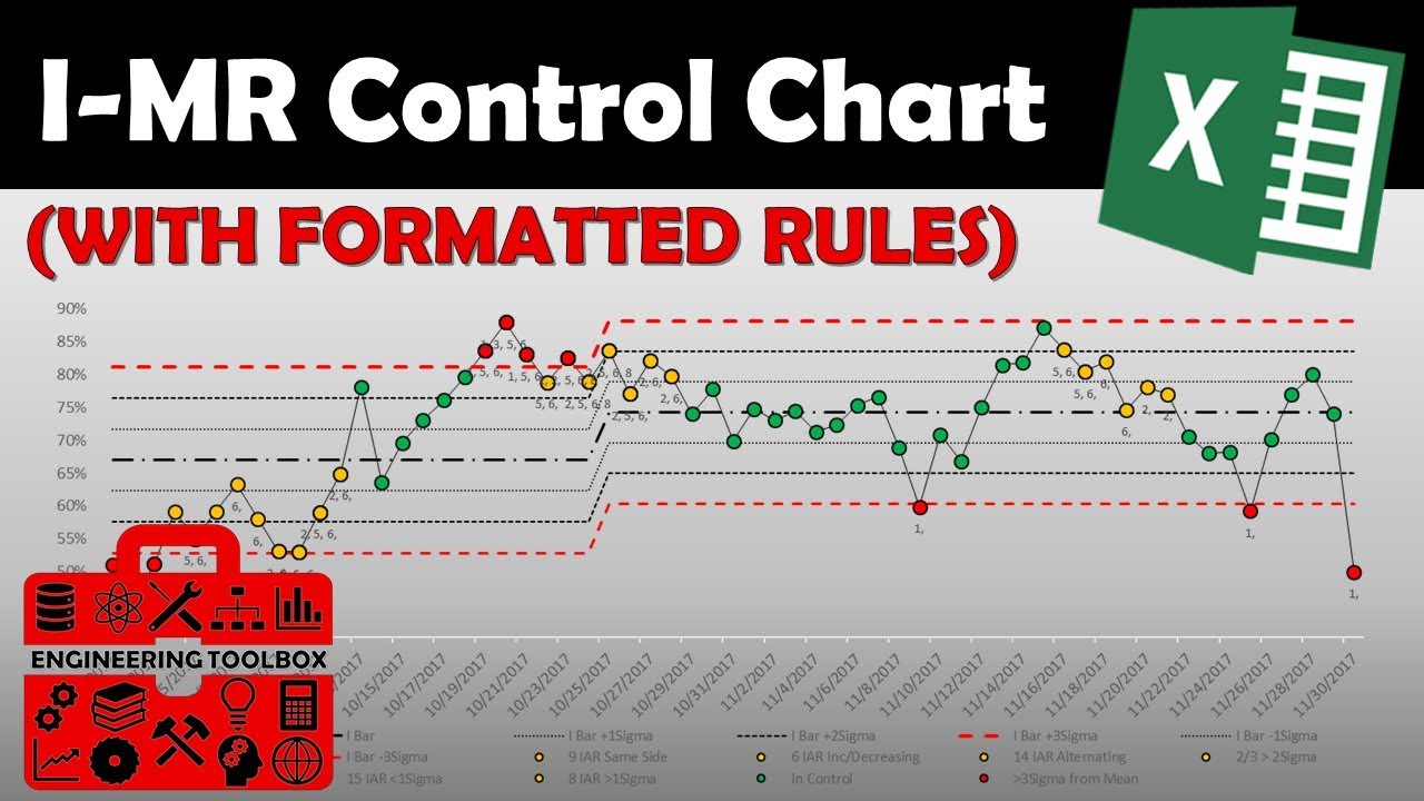
Learn how to create an Individuals and Moving Range (ImR) control chart that dynamically formats out of control data points.
In this video, we'll show you how to create an ImR control chart in Excel that formats similar to MiniTab. This control chart is a commonly used tool for measuring process variation, and is a great way to evaluate process control. After watching this video, you'll be able to create an ImR control chart in Excel quickly and easily! No need for MiniTab.
Control Charts are a great tool for engineering, business, and quality Engineers and other quality professionals. The most basic form of control charts are the Individuals and Moving Range chart (XmR chart).
Time Quick Links:
[0:34] - End Product
[1:36] - MR Bar Formula Correction
[4:55] - MR Chart Conditional Columns
[6:22] - Setting Up Test Columns
[9:30] - Rule #1 (Outside control limits - Out of control)
[10:24] - Rule #2 (9 IAR same side of Mean - Process Shift)
[12:50] - Rule #3 (6 IAR Increasing or Decreasing - Trend)
[14:11] - Rule #4 (14 IAR Alternating Inc/Dec Points - Over Control)
[15:38] - Rule #7 (15 IAR within 1 Sigma of mean - Under stratification)
[17:02] - Rule #5 (2/3 Greater than 2 Sigma - Going Out of Control)
[18:22] - Rule #6 (4/5 Greater than 1 Sigma - Going Out of Control)
[18:53] - Rule #8 (8 IAR Greater than 1 Sigma Either Side - Mixture)
[19:55] - Data Labels Column
[21:26] - In Control column
[21:42] - Formatting & Update Chart Data
[26:30] - Bonus Tip
- - - - - - - - - - - - - - - - - - - -
- - - - - - - - - - - - - - - - - - - -
Check out my channel for more videos and tutorials for engineers!
Like, follow, share and don't be afraid to drop me a comment/message with feedback, questions, or video suggestions!
Thanks for watching!
- - - - - - - - - - - - - - - - - - - -
Other great content!
Top Free Engineering Software:
Removing Outlier from Excel Pivot Table (Pt 1):
- - - - - - - - - - - - - - - - - - - -
Follow and interact!
- - - - - - - - - - - - - - - - - - - -
#spc
#processcontrol
#engineeringtoolbox
#EngineeringTutorials
#Engineering
 0:28:08
Create the Perfect Control Chart for SPC in Excel - MiniTab not Required
 0:11:04
Control Charts simply explained - Statistical process control - Xbar-R Chart, I-MR Chart,...
 0:15:14
Create a Basic Control Chart | HOW TO CREATE CONTROL CHARTS IN EXCEL | Shewhart Control Chart
 0:09:55
Create a Basic Control Chart
 0:07:12
Creating a Control Chart using MS Excel
 0:08:49
How do SPC control charts work?
 0:00:30
How to create control charts in Excel using QI Macros Add-in
 0:09:46
Control Chart
 0:13:55
What's the BEST Loss Recovery Strategy for 2025 Quotex Trading
 0:16:04
The 7 Quality Control (QC) Tools Explained with an Example!
 0:00:23
How to create an s-curve combo chart in #excel #exceltips #exceltricks
 0:03:50
How to show phases on a control chart in Minitab
 0:10:55
How to create a statistical process control chart in excel
 0:04:43
Create a Control Chart
 0:00:26
Control chart - excel 2016 - video 42
 0:20:36
Building Control Charts (Xbar and R Chart) in Microsoft Excel
 0:00:11
Add data to chart in excel #exceltips #exceltutorials #charts
 0:57:31
Understanding Process Performance Through Control Charts Webinar Recording
 0:13:11
Control Chart in Jira
 0:00:34
How to make a Pivot Table in 3 Steps‼️ #excel
 0:11:21
Capability Control Charts
 0:10:26
The Right Way to Create Xbar & R charts using MS Excel!
 1:33:33
Creating Special Purpose Control Charts using Statgraphics
 0:00:06
Blood Sugar Level Chart #shorts
Комментарии