filmov
tv
Create a Combination Chart in Excel

Показать описание
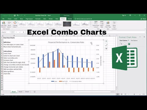
Ever see those charts where there is a column chart and a line chart in one? It's sort of like a someone was able to add a chart to another chart. Also there are two axis that show ranges on values on both the left and right side of the chart? Well this is called a combination chart or (combo chart or dual axis chart) and it's commonly used to show two series of data together. Or it's trying to combine two graphs (or two charts) together. I see this most in stock price type of charts where the column charts shows the volume of stock trading activity and the line chart shows the stock price. You might think that to create this custom combo chart would take some effort, but it's actually fairly easy to create by adding a secondary axis to the chart. Though it's not really trying to merge two graphs together, it's a great way to show multiple views of data in one chart. See the video to learn how it's done.
📝 This description may contain affiliate links and we'll receive a small commission if a purchased is made using the links (but at no additional cost to you). It'll support the channel and so more videos like this can be made. Thanks for your support!
#excel
#msexcel
#doughexcel
-~-~~-~~~-~~-~-
Please watch: "Convert Table in a PDF File to Excel"
-~-~~-~~~-~~-~-
 0:01:19
Make a Combination Column and Line Chart in Excel 2016 or later
 0:02:04
How to create a combination (combo) chart in Microsoft Excel
 0:06:47
Create a Combination Chart in Excel
 0:05:57
Create a Combination Chart in Excel 2010
 0:00:15
BITE SIZE EXCEL: Combo Chart in excel
 0:11:05
Excel Column Chart - Stacked and Clustered combination graph
 0:03:11
How To Combine A Line And Column Chart In Excel
 0:01:27
Excel Combination Chart or 2 Axis Chart - Chris Menard
 0:56:16
How to Analyze Christmas Sales & Trends in Power BI 🎄📈 Workshop
 0:07:30
How to Create Combo Chart in Microsoft Excel
 0:03:48
How to Create a Combination Chart in Power Point - Office 365
 0:02:17
How to Create a Combination Chart with Overlapping Bars & a Line
 0:07:32
How to Create a Combination Chart (Combo Chart) in Excel
 0:00:44
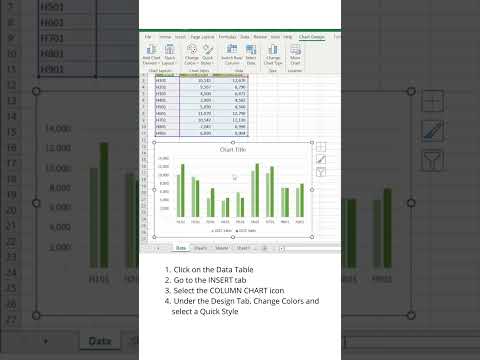
📊 How to create and design a Clustered Column Chart in Excel using Quick Styles
 0:08:03
How to Create Excel Combination Chart with Secondary Vertical Axis
 0:01:04
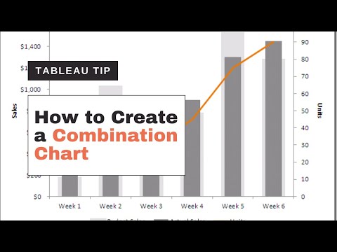
How to create a graph that combines a bar chart with two or more lines in Tableau
 0:01:12
How to Make a Combination Chart in Microsoft Excel : Microsoft Excel Help
 0:08:38
Dynamic Combination Chart in Excel
 0:05:39
How to Create a Combination Bar & Line Chart in Excel 2007
 0:13:51
Combination Stacked & Clustered Column Chart in Excel - 2 Examples
 0:10:08
Excel Combo Chart: How to Add a Secondary Axis
 0:11:13
Excel Combo Chart: How to Add a Secondary Axis | combo chart in excel | combo chart
 0:10:22
Line chart, profile chart, area chart, area 100% chart, combination chart (think-cell tutorials)
 0:03:18
Combine stacked and clustered bar chart in Excel
Комментарии