filmov
tv
Interactive Excel Dashboard Tutorial in 3 Steps (+ FREE Template)

Показать описание
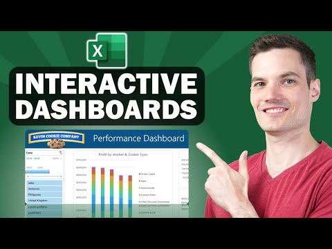
How to Make Interactive Excel Dashboards & ONE CLICK Update.
In this video, we're going to transform the sea of data into a sleek, interactive dashboard. We'll craft this dashboard in 3 steps, starting with cohesive design elements. Then, we will analyze and visualize key metrics; and lastly, add interactive elements for data exploration. All in under 20 minutes.
LEARN MORE
===========
⏲ TIMESTAMPS
==============
0:00 Before & after
0:29 Step 1: Designing the dashboard
3:47 Don't miss out on this opportunity!
4:03 Step 2: Analyzing & visualizing key metrics
16:37 Step 3: Adding interactive elements
17:59 Adding new data & refreshing the dashboard
18:40 If you struggle with gathering the data
#ExcelDashboard #Excel #ExcelTutorial
 0:19:41
Make an Interactive Excel Dashboard in 4 Simple Steps!
 0:19:21
📊 How to Build Excel Interactive Dashboards
 0:40:32
Create interactive excel dashboard in 5 simple steps #exceldashboard #exceltutorial #pivottable
 0:30:37
How to build Dynamic & Interactive Dashboard in EXCEL with Pivot Tables&Charts | Tutorial Ep...
 0:52:26
Interactive Excel Dashboards & ONE CLICK Update!
 0:28:08
How to make an Excel Dashboard in 5 Easy Steps (Interactive + Free File)
 0:40:04
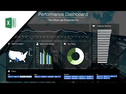
Interactive Excel Project Management Dashboard - FREE Download
 0:13:20
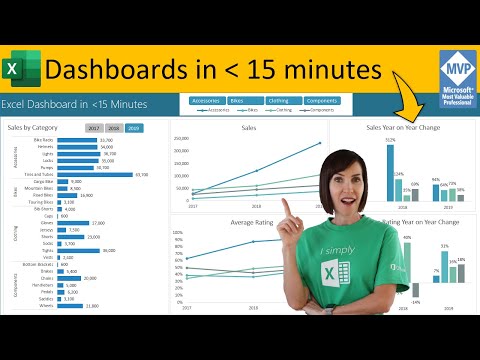
Secrets to Building Excel Dashboards in Under 15 Minutes & UPDATES with 1 CLICK!
 0:00:51
Stop Merging Cells! Use This Excel Trick Instead! #excel #exceltips
 0:05:56
Create an Interactive Excel Dashboard In Under 3 MINUTES!
 0:14:43
Excel Dashboard Course #21 - Creating a Pivot table Dashboard with Slicers in Excel (in 15 minutes)
 0:37:16
Full Project in Excel with Interactive Dashboard | Excel Tutorial for Beginners
 0:00:50
Adding a menu in #excel to make navigating your #dashboards a bit easier
 0:39:36
How to Build Interactive Excel Dashboards
 0:30:52
How to build a Well-Designed and Interactive Excel Dashboard with Pivot Tables and Pivot Charts
 0:26:01
Interactive Excel Student Performance Dashboard - FREE File Download
 0:00:15
Project Management dashboard in excel for sale
 0:00:16
Sales Dashboard in Excel
 0:00:46
Create Instant Dashboard In Excel 🔥 | This Excel Trick Will Blow Your Mind ‼️ #exceltips #bytetech...
 0:13:53
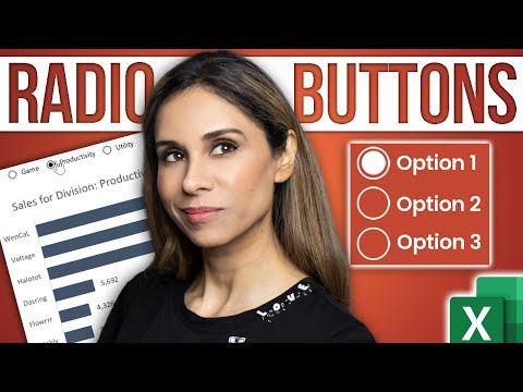
Create INTERACTIVE Excel Dashboards With Option Buttons | How to use Radio Buttons
 0:01:00
The 5 skills you need to build dynamic #dashboards in #Excel
 0:14:03
Beginner's Guide to Excel Dashboards
 0:12:39
Smart Excel Pivot Table Trick - Choose Your KPI from Slicer (Excel Dashboard with DAX)
 0:22:23
Create an Excel Dashboard to Easily Track Budget and Actuals with Variances
Комментарии