filmov
tv
Interactive Excel Student Performance Dashboard - FREE File Download
Показать описание
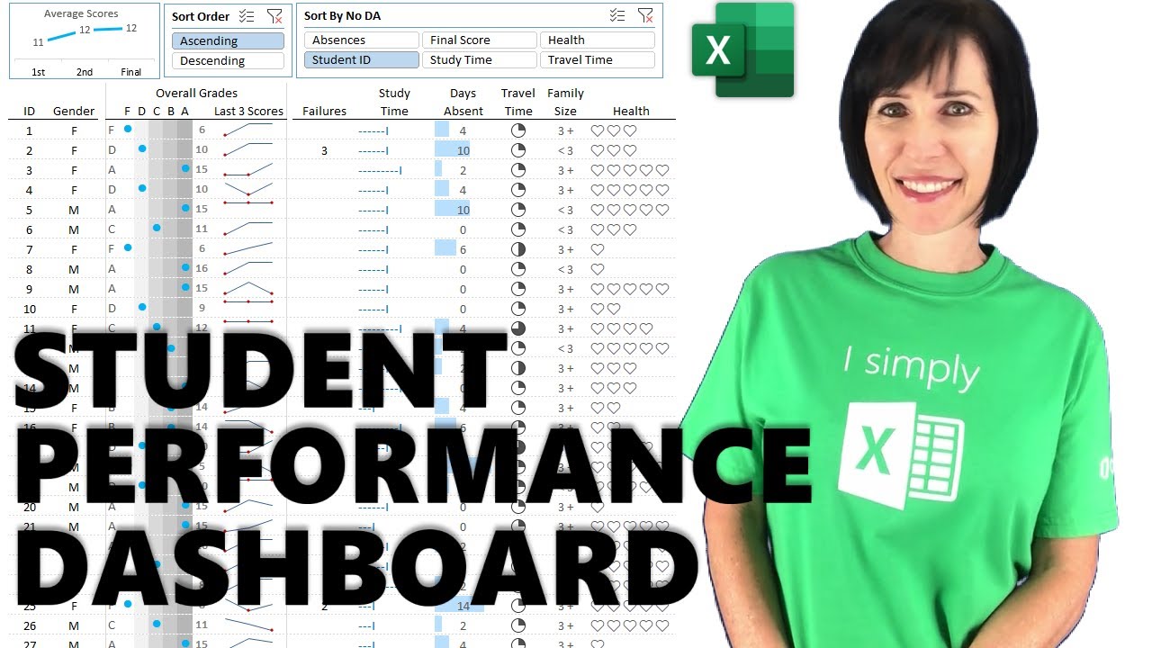
Building Excel Dashboards from student performance data requires some different techniques to your typical dashboard, because you have a lot of data to fit into a small space. In this video I cover both the dynamic array and non-dynamic array techniques.
0:00 Introduction
0:53 Layout and Data
1:44 Slicers
4:19 SORTBY Dynamic Array Student ID Column
6:50 INDEX & MATCH Gender Column
7:50 Symbols for grades
9:58 Sparklines
12:47 Failures column & Custom Number Format
13:28 Study Time & in-cell charts
14:38 Absentee Time & Conditonal Formatting Bars
15:20 Travel Time & Conditional Formatting Icons
16:18 Family Size column
16:29 Health & Emoji Chart
17:32 Line Chart
19:59 Non-dynamic Array Dashboard Formulas
 0:26:01
Interactive Excel Student Performance Dashboard - FREE File Download
 0:19:21
📊 How to Build Excel Interactive Dashboards
 0:00:20
How to Make INTERACTIVE Excel Dashboards - Step by Step Guide
 0:00:58
How to Create Dynamic Dashboards in Excel
 0:18:56
How to create a Simple Dashboard Report in Microsoft Excel
 0:14:03
Beginner's Guide to Excel Dashboards
 0:37:26
Excel Dashboard for Schools with changing students images dynamically | Full Tutorial + Voiceover
 0:12:00
Student Performance Dashboard
 0:52:12
Free Power BI Training 2025 | Chapter - 5 | Complete Step-by-Step Course with Hands-On
 0:18:57
Interactive Excel Dashboard Tutorial in 3 Steps (+ FREE Template)
 0:00:27
How to Create Dashboards with Copilot in Excel
 0:00:16
Sales Dashboard in Excel
 0:19:41
Make an Interactive Excel Dashboard in 4 Simple Steps!
 0:14:48
Introduction to Pivot Tables, Charts, and Dashboards in Excel (Part 1)
 0:00:46
Create Instant Dashboard In Excel 🔥 | This Excel Trick Will Blow Your Mind ‼️ #exceltips #bytetech...
 0:40:32
Create interactive excel dashboard in 5 simple steps #exceldashboard #exceltutorial #pivottable
 0:18:47
Employee Performance Rating Card and Dashboard in Excel
 0:06:41
Student Performance Meter using Excel charts & Formula
 0:00:23
Excel KPI Dashboard Template
 0:00:54
Creating an Instant Dashboard in Excel A Step by Step Guide
 0:08:32
How I Built a ONE CLICK Excel Dashboard with ChatGPT 😎
 0:30:37
How to build Dynamic & Interactive Dashboard in EXCEL with Pivot Tables&Charts | Tutorial Ep...
 0:00:50
Adding a menu in #excel to make navigating your #dashboards a bit easier
 0:01:52
Student Performance Dashboard
Комментарии