Create an Excel Dashboard to Easily Track Budget and Actuals with Variances

preview_player
Показать описание


I also show you how add a drop-down for months and use a formula to grab the current year.

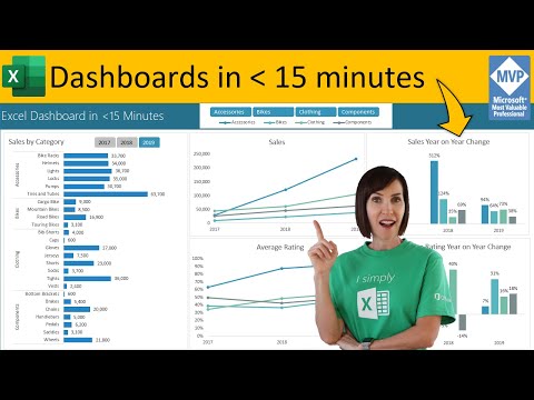
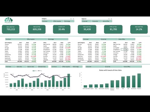
Then I move on to variance calculations (percentage change). Once we have the information we create a column chart to compare actual and previous year data and also add Excel bar charts to show the variance. We make sure that positive values (bars) are in green and negative bars are in red. We do this dynamically of course using "invert if negative" feature of Excel charts. Lots to cover, so get ready to transform your understanding of actual sales, budget figures, and variances into a visually stunning and informative dashboard.

🔍 What you'll discover:
▶ Excel Dashboard Design: Receive detailed, step-by-step instructions on crafting an automatically updating sales dashboard.
▶ Data Management in Excel: Learn effective techniques for extracting data from various sources and establishing intuitive user selections.
▶ Advanced Excel Functions: Gain proficiency in XLOOKUP and other critical Excel functions for precise data analysis.
▶ Variance Analysis: Understand the methods to calculate and visually present data variances.
Excel Chart Visualizations: Acquire skills in adding dynamic column charts for a compelling visual data interpretation.

➡️ Join this channel to get access to perks:

00:00 How to Setup an Interactive Dashboards in Excel from Scratch
00:53 Setup of Data
02:20 Drop-Down for Month Selection
07:49 Calculate Variance Actual to Previous Year/Budget
09:37 Add Visual Insights
14:00 Zebra BI Add-in
21:34 Wrap Up

🎬 LINKS to related videos:

🚩Let’s connect on social:

This description contains affiliate links, which means at no additional cost to you, we will receive a small commission if you make a purchase using the links. This helps support the channel and allows us to continue to make videos like this. Thank you for your support!

#Excel
Рекомендации по теме
Комментарии
Автор

This is a very useful video. I am a mechanical engineer. I like your videos because they are always straight to the point. I use some of your idea and concepts to build efficient tables and clearer reports.

kevbaken
Автор

As usual, this is Leila's another great video - concise content gracefully delivered ! Wish you all the best Leila and more videos to come 👍👍👍

jinwei
Автор

There is always something new to learn in every tutorial video posted by Leila. Thanks!

lynalmangulkar
Автор

It was helpful watching you talk us through the process from beginning to end while considering which approach to use and THEN show an alternative. It was like a classroom but better because I could pause and think about how I would approach it before hearing your approach.

I’m working on building an in-house timesheet, payroll, and certified payroll system for the construction industry using Excel and find myself building complex tables when better knowledge of functions would be more effective and efficient. And, again, because I’m spending a lot of time, trying to work my way through how to build something in excel, it was helpful to watch you do the same thing, so thank you.

jasonchanslor
Автор

This video is a fortune, it has helped me with tons of problems I was facing while analyzing data for my work, especially that multiple Xlookup commands within one command. Thank you so much Leila for this amazing video and this amazing channel. 🙏🙏🙏

jiteshsharma
Автор

Considering the sales value are Numbers, I would actually have used a SumIfs, setting the sum_range as the entire sales column of the TSales table. Criteria 1 would be the Year column to match the current year, Criteria 2 the month, and criteria 3 the locations list as a range instead of a cell. That way it'll be able to handle multiple entries per location within the same year and month, and will be able to even move over to future years without an issue, and it should spill down automatically per the list of locations which if set correctly can also account for new locations for futureproofing (Would be even easier if the list of locations would be a spill range by way of the Unique formula.)

AkushevDmitry
Автор

I've only worked on one Excel project that included a dashboard. Ah, but what a dashboard it was! The model was created over a long period of time by a woman who was the manager of an industrial maintenance and safety department, and she was an awesome manager as well as an Excel wiz of your caliber. The model took a feed from a mainframe and did all manner of calculations from it, many of which I didn't understand. I was brought in for 5 months to clean up the formulas and add some VBA automation. By the end of that time, I knew more about tables, charts, domain lookups and statistical calculations than anybody else I know (would have wanted to). Of course, I've forgotten most of it, as that project ended more than a dozen years ago, but thank you for the fond memories and for showing how some of these things have changed since Excel 2010 (which is what they were using at the time).

markl
Автор

Dear Leila, thank you for your posts, I love them and your name is already famous among my colleagues - with note: look what I have learned from Leila. Thank you for improving the excel and logic skills among people. Love to see your next video.

Monika-hxke
Автор

I’ve got two of your dashboard courses (dashboard and charts) can’t say enough how tremendously useful they’re!!! I’m not even thinking about making pivot charts anymore, to be honest I doubted before why you’re using simple charts and not pivot charts. Now I know why and now my reasons are the same! My dashboard looks so much presentable and professional!!! Thank you so much!!!

mindyourown
Автор

How do you remember so much! Can't wait for you to star in a Marvel movie as the super hero who beats up villains with excel sheets lol! =punch(Face&Body, *2, "")+Run(Villian=massive)

DuraceBunny
Автор

I was just looking for a video presentation on Zebra BI.
This is perfect.
Thanks Leila.

anillpatel
Автор

Very nice. The stacking visuals of Zebra BI to show actual to PY was neat.

One edit I'd make to your dashboard table is keep the location list dynamic based on the source data. That way, if you add a new location, you won't run into missing data on the dashboard.

IceHot
Автор

This is nothing less than amazing. Learned so much in 1 exercise, thank you, you’ve gained a follower.

cassiotoscano
Автор

Thanks for always simplifying data analysis.

ugonnabriggs
Автор

Hi Leila, this is so useful. Am gonna applied this is my analyst roles! Thank you very much for the easy understandable video!

asfazarajuatan
Автор

Thanks Leila, definitely filter function nested in a sum will be my no1 option..this add-in is outstanding..No doubt it will inhance my dashboards and dynamic reports. Very well explained as usual 👏

adhamm
Автор

Thank you so much for clear expresion. I will use for my monthly report

sunsunny
Автор

I appreciate the content. Thank you for making it easy to understand.

unluckymoiz
Автор

Brilliant!! Fantastic!! And YOU!! Dearest sweetie pie!! In a little bubble !! right there! Floating in my spreadsheet!! !! I absolutely love it !! loads of lotssss !! ❤❤❤❤ thank you! You’re amazing!

AndreaUK
Автор

Dude. The invert as negative feature for two different colors - I've always done this manually! Amazing, thank you!

benjirexx