filmov
tv
Clustered bar/line chart of means (repeated measures) in SPSS

Показать описание
Create a clustered bar or line chart of means for repeated measures data using SPSS.
ASK SPSS Tutorial Series
ASK SPSS Tutorial Series
 0:03:16
Clustered bar/line chart of means in SPSS
 0:03:00
Clustered bar/line chart of means (repeated measures) in SPSS
 0:03:44
Clustered Bar or Line chart of means using SPSS (optional error bars)
 0:04:20
Repeated measures Clustered Bar or Line chart of means using SPSS (optional error bars)
 0:02:38
Bar/Line chart of means (repeated measures) in SPSS
 0:00:31
Plot Mean and SD of data as Bar plot with error bar
 0:02:21
Bar/Line chart of means in SPSS
 0:07:06
Line Graph with markers (grp means) Using SPSS
 3:29:51
Week-4|TA Session-2
 0:05:47
Making a chart with means and standard deviations
 0:02:40
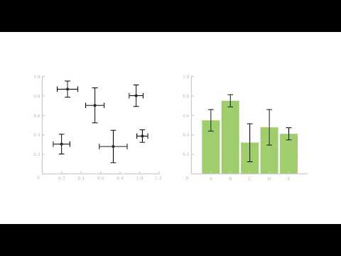
A Guide to Error Bars
 0:02:21
SPSS - Clustered bar chart (via Chart builder)
 0:05:58
How to Create a Clustered Bar Graph With Multiple Data Points on Excel
 0:04:47
SPSS: Bar Charts Comparing Group Means
 0:00:27
Axes options in Excel
 0:01:06
How to Add Individual Error Bars in Excel
 0:03:40
22. Clustered Bar Chart – Summaries of Separate Variables in IBM SPSS || Dr. Dhaval Maheta
 0:11:05
Excel Column Chart - Stacked and Clustered combination graph
 0:04:17
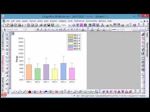
Bar graph with standard error on OriginPro
 0:05:06
Edit a chart in an SPSS output file, Ex 1 (clustered bar chart)
 0:09:21
MS Excel - Pivot Table and Chart for Yearly Monthly Summary
 0:11:34
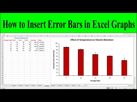
How to Add Error Bars of Standard Deviation in Excel Graphs (Column or Bar Graph)
 0:03:33
How to Plot Grouped Column Graph In OriginPro
 0:01:57
Plot Multiple Lines in Excel
Комментарии