filmov
tv
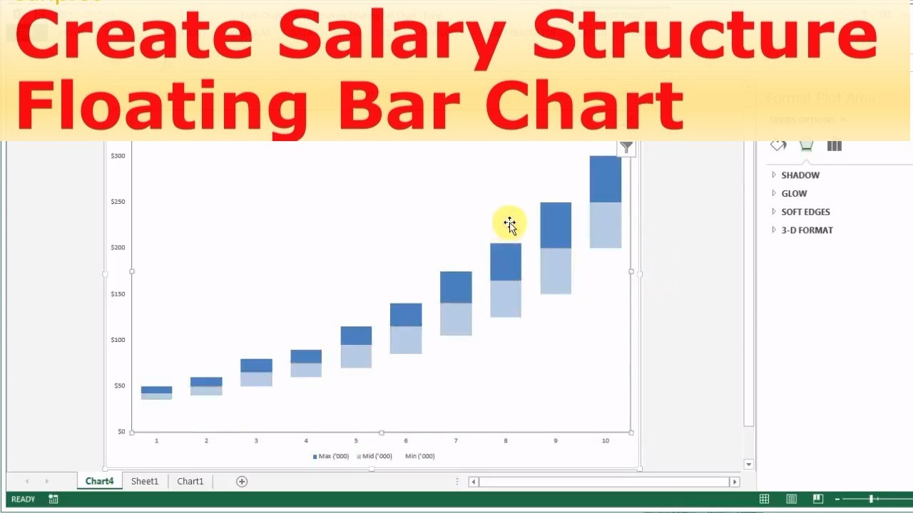
Excel for HR: Salary Structure Floating Bar Chart
Показать описание
New course Launched! I created it to show you step-by-step how to design a salary structure with regression analysis in Excel. Check out the detail here:
Chart Type: Clustered Column Chart 0:48
-~-~~-~~~-~~-~-
Please watch: "How to create a Merit Matrix for Salary Increase with Goal Seek function"
-~-~~-~~~-~~-~-
******Follow-up Consulting Services******
******More Videos in Playlists******
#ExcelforHR#HRAnalytics#Excel#HR
Chart Type: Clustered Column Chart 0:48
-~-~~-~~~-~~-~-
Please watch: "How to create a Merit Matrix for Salary Increase with Goal Seek function"
-~-~~-~~~-~~-~-
******Follow-up Consulting Services******
******More Videos in Playlists******
#ExcelforHR#HRAnalytics#Excel#HR
 0:05:54
Excel for HR: Salary Structure Floating Bar Chart with Employee Data
 0:03:10
Excel for HR: Salary Structure Floating Bar Chart
 0:07:47
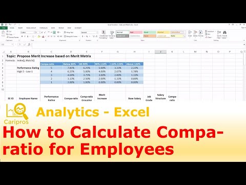
Excel for HR - What is Compa-Ratio and How to Calculate it
 0:11:20
Excel for HR: Multiple Groups of Employee Data vs Salary Structure
 0:14:52
How to create a SALARY STRUCTURE with EXCEL
 0:00:19
Create Salary Sheet in Excel - Tips & Tricks from @todfodeducation
 0:11:49
How to Build a Salary Structure with Simple Regressed Midpoints
 0:05:41
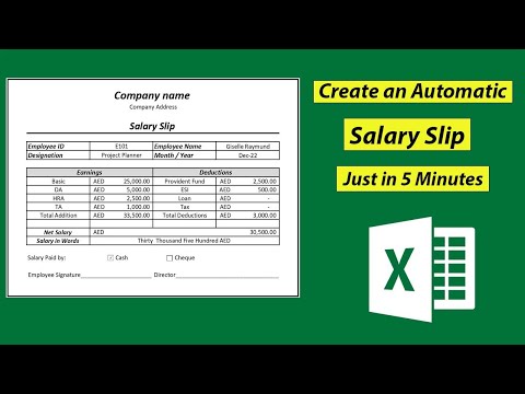
Make a Salary Slip in Excel | Automatic Salary Pay Slip in 5 Minutes
 0:08:55
Designing Pay Structure, How to Calculate Salary Range Excel
 0:15:07
Salary Structure Explained with Example - Create your own in less than 5 minutes
 0:12:20
Excel for HR - Prorate Employee Salary for Merit Increase or Bonus Calculation
 0:08:55
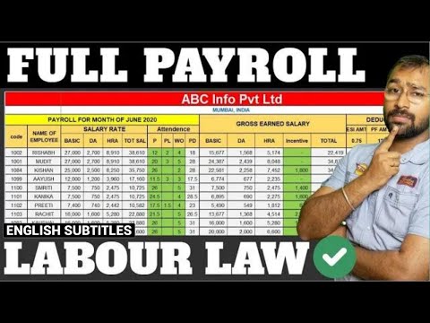
🔴How to make Payroll in Excel for beginners | Payroll Calculation as per Labour Laws
 0:15:12
Excel for HR: Market Benchmark Pay Report with Floating Bar Chart (Part 1)
 0:00:53
Mastering Salary Calculation in Excel: Basic Salary, Allowances & Deductions @digitaltutorial42...
 0:04:35
Excel for HR: Salary Structure Floating Bar Chart with Customized X axis
 0:03:47
Design Salary Structure Using Exponential Regression
 0:00:25
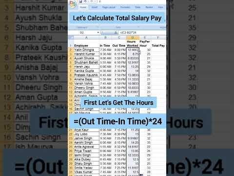
Let's Calculate Salary Pay Hours kaise nikale in excel
 0:15:38
How to Build a Salary Structure with simple Market Midpoints
 0:33:39
How to Create Employee Annual Salary Increase Template - Excel for HR
 0:08:19
How To Build A Salary Structure Using Excel: A Beginners Guide
 0:05:07
Easy Payroll System In Excel
 0:08:53
HR Compensation 101: Position in Range Metric Explained
 0:14:15
Critical HR Ratio Explained: What is Compa-ratio, Range Penetration and more
 0:00:54
Make a Salary Sheet in Excel in 5 Minutes or Less | ComputerGuruTricks
Комментарии