filmov
tv
The History of Typography - Animated Short
Показать описание
A paper-letter animation about the history of fonts and typography.
291 Paper Letters.
2,454 Photographs.
140 hours of work.
Created by Ben Barrett-Forrest
© Forrest Media - 2013
Information Sources:
Thinking in Type by Ellen Lupton
Just My Type by Simon Garfield
If this video sparks any ideas, I would love to hear about them!
Script:
Type is power. The power to express words and ideas visually. It’s timeless, but always changing, and that’s what we’re going to explore.
Most people agree that the creator of typography was a German man named Johannes Gutenberg. (And yes he wore a hat like that).
Before Gutenberg came along and revolutionized the world of communication, books needed to be scribed by hand, usually by monks, which was very time-consuming and expensive.
So Gutenberg created Blackletter, the first ever typeface, modeled after the writing of the scribes. Blackletter has thick vertical lines and thin horizontal connectors which made it great for scribing but it looked very dense and squished together when printed. Things needed to change.
Enter Roman Type.
Now this typeface is Cambria, which you're probably used to seeing on your word processor, but the first ever Roman typeface was created in the 15th century by Nicolas Jenson.
Jenson worked mainly in Venice, Italy, and was inspired by the lettering found on Ancient Roman Buildings.
His letterforms were based on straight lines and regular curves, which made it much more legible compared to the dense darkenss of Blackletter.
This typeface was an instant success and quickly spread across Europe, riding on the coat tails of the renaissance.
The next major innovation in typography after roman letters was italics, which are like slanted and stylized versions of roman type. They were created in the late 15th century by Aldus Manutius from Italy as a way of fitting more letters onto the page and saving money. Now we use italics interspersed in roman type for emphasis. Aldus Manutius also created the modern comma and semicolon, but that’s another story.
Type development stayed fairly stagnant until the 18th century in England, when William Caslon created a typeface that set a new standard for legibility. While it wasn’t anything radical, it was just what the world was looking for. The style of Caslon’s typeface is now referred to as Old Style. A few decades later, another Brit named John Baskerville created a new variety of typeface, which we call Transitional. Later still a Frenchman named Didot, and an Italian Named Bodoni created typefaces that we have classified as modern.
Most serif typefaces fit into one of these three categories, but what does each one mean?
An old style typeface has letters that have thick serifs, and low contrast between thick and thin strokes.
A transitional typeface has letters with thinner serifs and a higher contrast between thick and thin strokes.
And a modern typeface has letters with very thin serifs and an extreme contrast between thick and thin strokes .
Next, William Caslon’s great Grandson, named William Caslon IV, got sick of all of these serifs, so he decided to remove them entirely and made a new kind of typeface called a sans-serif. It didn't catch on immediately, but would eventually get really big.
During the second industrial revolution, advertising created a need for new typefaces. Letters were made taller, and wider, mainly used in large sizes on posters and billboards. Things got pretty weird, but one happy result of all this experimentation is Egyptian, or slab serif. It has really thick serifs and is usually used for titles.
As a backlash to the complexity found in typefaces of the 19th century, the early 20th century brought something simple. Paul Renner from Germany created a typeface called Futura and it was based on simple geometric shapes.
This is called a geometric sans. Around the same time a British man named Eric Gill created a typeface called Gill Sans that was similar to a geometric sans but with gentler, more natural curves, and this is called a Humanist sans.
The next major step in the world of sans serifs happened in Switzerland in 1957 with the introduction of Helvetica. It has simple curves and is available in many different weights, and some would call it the world’s favourite typeface.
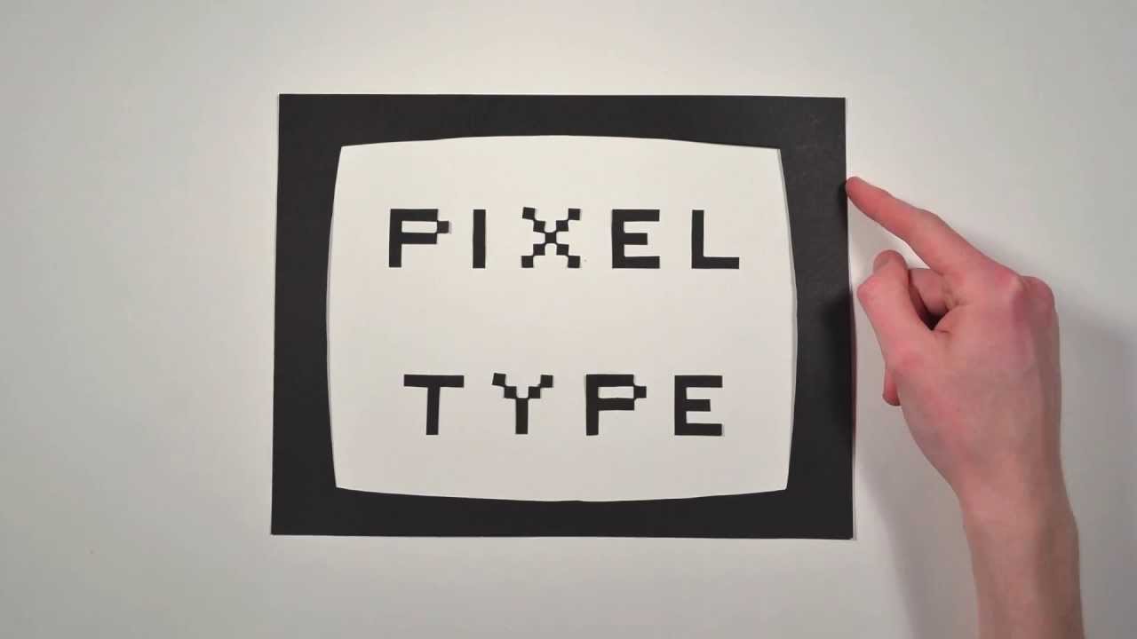
The world of typography changed forever with the introduction of the computer. There were a difficult few years of crude pixel type due to the primitive screen technology. But then technology evolved and computers began to allow for the creation of thousands of beautiful typefaces. And the odd, ahem, dud. But now anyone has the freedom to create their own unique typeface.
And that is the history of typography.
291 Paper Letters.
2,454 Photographs.
140 hours of work.
Created by Ben Barrett-Forrest
© Forrest Media - 2013
Information Sources:
Thinking in Type by Ellen Lupton
Just My Type by Simon Garfield
If this video sparks any ideas, I would love to hear about them!
Script:
Type is power. The power to express words and ideas visually. It’s timeless, but always changing, and that’s what we’re going to explore.
Most people agree that the creator of typography was a German man named Johannes Gutenberg. (And yes he wore a hat like that).
Before Gutenberg came along and revolutionized the world of communication, books needed to be scribed by hand, usually by monks, which was very time-consuming and expensive.
So Gutenberg created Blackletter, the first ever typeface, modeled after the writing of the scribes. Blackletter has thick vertical lines and thin horizontal connectors which made it great for scribing but it looked very dense and squished together when printed. Things needed to change.
Enter Roman Type.
Now this typeface is Cambria, which you're probably used to seeing on your word processor, but the first ever Roman typeface was created in the 15th century by Nicolas Jenson.
Jenson worked mainly in Venice, Italy, and was inspired by the lettering found on Ancient Roman Buildings.
His letterforms were based on straight lines and regular curves, which made it much more legible compared to the dense darkenss of Blackletter.
This typeface was an instant success and quickly spread across Europe, riding on the coat tails of the renaissance.
The next major innovation in typography after roman letters was italics, which are like slanted and stylized versions of roman type. They were created in the late 15th century by Aldus Manutius from Italy as a way of fitting more letters onto the page and saving money. Now we use italics interspersed in roman type for emphasis. Aldus Manutius also created the modern comma and semicolon, but that’s another story.
Type development stayed fairly stagnant until the 18th century in England, when William Caslon created a typeface that set a new standard for legibility. While it wasn’t anything radical, it was just what the world was looking for. The style of Caslon’s typeface is now referred to as Old Style. A few decades later, another Brit named John Baskerville created a new variety of typeface, which we call Transitional. Later still a Frenchman named Didot, and an Italian Named Bodoni created typefaces that we have classified as modern.
Most serif typefaces fit into one of these three categories, but what does each one mean?
An old style typeface has letters that have thick serifs, and low contrast between thick and thin strokes.
A transitional typeface has letters with thinner serifs and a higher contrast between thick and thin strokes.
And a modern typeface has letters with very thin serifs and an extreme contrast between thick and thin strokes .
Next, William Caslon’s great Grandson, named William Caslon IV, got sick of all of these serifs, so he decided to remove them entirely and made a new kind of typeface called a sans-serif. It didn't catch on immediately, but would eventually get really big.
During the second industrial revolution, advertising created a need for new typefaces. Letters were made taller, and wider, mainly used in large sizes on posters and billboards. Things got pretty weird, but one happy result of all this experimentation is Egyptian, or slab serif. It has really thick serifs and is usually used for titles.
As a backlash to the complexity found in typefaces of the 19th century, the early 20th century brought something simple. Paul Renner from Germany created a typeface called Futura and it was based on simple geometric shapes.
This is called a geometric sans. Around the same time a British man named Eric Gill created a typeface called Gill Sans that was similar to a geometric sans but with gentler, more natural curves, and this is called a Humanist sans.
The next major step in the world of sans serifs happened in Switzerland in 1957 with the introduction of Helvetica. It has simple curves and is available in many different weights, and some would call it the world’s favourite typeface.
The world of typography changed forever with the introduction of the computer. There were a difficult few years of crude pixel type due to the primitive screen technology. But then technology evolved and computers began to allow for the creation of thousands of beautiful typefaces. And the odd, ahem, dud. But now anyone has the freedom to create their own unique typeface.
And that is the history of typography.
 0:05:10
The History of Typography - Animated Short
 0:08:03
History of Typography - Domestika
 0:29:35
I promise this story about fonts is interesting
 0:05:14
Fun History of Type
 0:10:43
A Brief History of Type
 0:39:03
The Ultimate Guide to Typography | FREE COURSE
 0:01:37
A Brief History of Typography
 1:30:12
For a Labor History of Typography
 0:18:10
A History of Typography
 0:05:10
The History of Typography: Animated Short
 0:12:47
The power of typography | Mia Cinelli | TEDxUofM
 0:16:42
The story behind the most famous typeface in history | Monotype
 0:05:10
The History of Typography Animated Short
 0:10:21
Why this font is everywhere
 1:06:44
A Brief History of Graphic Design
 0:03:31
A History of typography with Austin Schleis
 0:07:02
The Anatomy of Typography
 0:05:10
Typografie | The History of Typography
 0:04:22
Course Trailer: The History and Evolution of Typography
 0:01:19
The History of Typography (in 60 Seconds) by Lori Chollar
 1:35:21
Letterforms as Identity: A Brief History of Typography at The New York Times with Kelly Doe
 0:01:41
History of Typography | Short History of Everything (SHOE)
 0:05:10
The History of Typography Animated Short
 0:22:03
Typographic History
Комментарии