filmov
tv
The Ultimate Guide to Typography | FREE COURSE
Показать описание
Do you know the difference between a typeface and a font? Tracking and kerning? Learn everything you need to know in our ultimate typography guide.
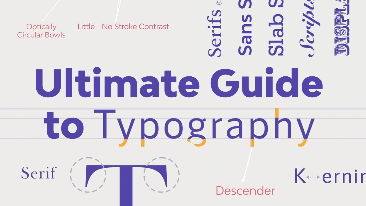
Good typography is one of the cornerstones of good design. In The Ultimate Guide to Typography, you'll learn everything from the most basic elements of typography and common mistakes through to more complex topics like combining and choosing fonts for your projects.
By the end of this course, you’ll be able to confidently talk about typography and experiment with concepts and fonts as you hone your typography skills.
What You'll Learn:
00:00:00 1.1 Introduction
00:01:19 1.2 Brief History of Type
00:05:47 1.3 Typeface vs. Font
00:07:14 2.1 Type Classification
00:17:00 2.2 Type Families
00:19:48 2.3 Font File Types
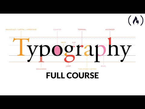
00:22:32 3.1 Legibility and Type Anatomy
00:25:19 3.2 Readability and Typesetting Basics
00:28:53 3.3 Common Typesetting Mistakes
00:31:09 4.1 Choosing the Right Fonts
00:34:41 4.2 Font Combinations
00:37:42 5.1 Conclusion
- - - - - - - - - - - - - - - - - - - - - - - - - - - - - - - - - - - - - - -
Envato Tuts+
Envato Elements
All the creative assets you need under one subscription. Customize your project by adding unique photos, fonts, graphics, and themes.
- - - - - - - - - - - - - - - - - - - - - - - - - - - - - - - - - - - - - - -
Good typography is one of the cornerstones of good design. In The Ultimate Guide to Typography, you'll learn everything from the most basic elements of typography and common mistakes through to more complex topics like combining and choosing fonts for your projects.
By the end of this course, you’ll be able to confidently talk about typography and experiment with concepts and fonts as you hone your typography skills.
What You'll Learn:
00:00:00 1.1 Introduction
00:01:19 1.2 Brief History of Type
00:05:47 1.3 Typeface vs. Font
00:07:14 2.1 Type Classification
00:17:00 2.2 Type Families
00:19:48 2.3 Font File Types
00:22:32 3.1 Legibility and Type Anatomy
00:25:19 3.2 Readability and Typesetting Basics
00:28:53 3.3 Common Typesetting Mistakes
00:31:09 4.1 Choosing the Right Fonts
00:34:41 4.2 Font Combinations
00:37:42 5.1 Conclusion
- - - - - - - - - - - - - - - - - - - - - - - - - - - - - - - - - - - - - - -
Envato Tuts+
Envato Elements
All the creative assets you need under one subscription. Customize your project by adding unique photos, fonts, graphics, and themes.
- - - - - - - - - - - - - - - - - - - - - - - - - - - - - - - - - - - - - - -
 0:39:03
The Ultimate Guide to Typography | FREE COURSE
 0:13:30
The ULTIMATE Guide To Typography For Beginners
 0:45:35
The ULTIMATE GUIDE to TYPOGRAPHY in UI Design!
 0:10:34
The Ultimate Guide to Basic Typography
 2:04:11
Typography for Developers Tutorial - Full Course
 0:03:01
Ultimate Guide to Typography Effects in Photoshop :Text Effect
 0:33:23
Variables for Typography in Figma - The Ultimate Guide
 0:18:03
How To Choose Fonts | The Ultimate Guide to Typography
 0:00:50
Logo Design in Adobe Illustrator: The Ultimate Guide | Graphic Learn
 0:03:00
Typography Design Using Corel Draw | The Ultimate Guide to Typography | Key To Mastering #typography
 0:00:57
How to improve Typography: 3 tips
 0:04:48
The Basics of Typography
 0:44:44
The Ultimate Guide to Typography & Portfolio (FREE COURSE)
 0:00:25
The Ultimate Guide to Typography
 0:02:39
What is the Difference Between Font and Typeface: Understanding Fonts and Typefaces
 0:00:25
The Ultimate Guide to Typography in Graphic Design
 0:00:17
The Ultimate Guide to Choosing the Best Typography
 0:12:52
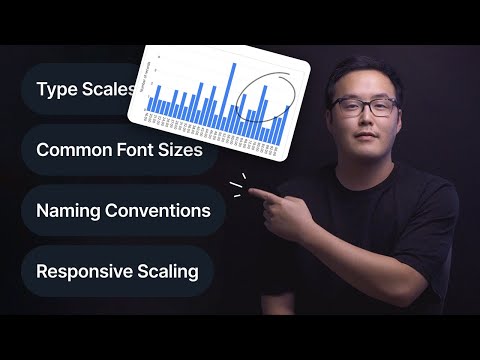
Typography - Ultimate Design System Breakdown (Font Sizes, Text Style Naming, Responsive Scaling)
 0:00:31
3 Categories of Typefaces | Typography #typography #design #visualdesign #ixdf
 0:09:59
How To Know if a Font Is Good or if It Sucks?
 0:00:10
4 Books to improve your Typography
 0:00:59
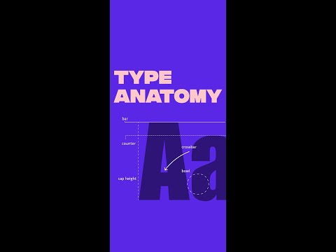
Type Anatomy in 60 seconds
 0:00:52
How To CORRECTLY Kern Typography #shorts
 0:00:41
A super quick tip to improve your typography #webdesign
Комментарии