filmov
tv
Responsive Multi Level Dropdown Menu with CSS | CSS3 Animated Hamburger Menu
Показать описание
Responsive Multi Level Dropdown Menu with CSS | CSS3 Animated Hamburger Menu
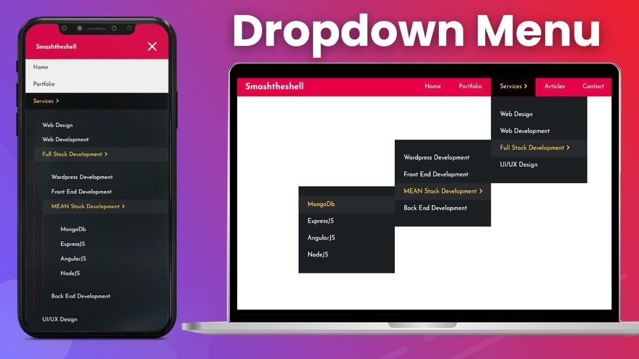
Awesome responsive multi level dropdown menu using css and html with an animated hamburger menu created with css3. In this tutorial you will learn to create a responsive navigation dropdown menu with multilevel dropdown nested submenu using html and only css. This is an animated navbar menu built using css flexbox which will help you learn how to create an animated hamburger icon animation using css only. CSS flexbox is really poweful for creating your responsive navigation dropdown menu bar. You will also learn how to animate the navigation menu arrows and animate the dropdown submenus using CSS transforms and transitions.
First we will design our multi level navigation menu bar using html and css flexbox for the desktop devices and then will use media queries to make the navbar design responsive for the mobile devices. Making a multi level responsive navigation design using html and only css can be little intimidating and challenging at first. But in this video you'll learn step by step how to create a fully responsive navigation bar design with multi-level dropdown support which will not only work on the desktop devices but also be fully functional on the mobile devices. We will be using a little bit of javascript to toggle the hamburger icon to show and hide the menu bar on the mobile devices.
The navbar hamburger icon is an animated hamburger icon which is created with pure css and we are going to animate the hamburger icon to switch between close icon and the hamburger icon.
This multi-level drop down menu for the navigation bar is packed with a lot of useful stuff that you can learn. You will learn to create a pure css arrow icons to include in your navigation menu items.
Timestamps:
00:00 Intro - Responsive Navigation Multilevel Dropdown Menu
01:32 HTML structure for navbar menu design with logo
05:06 Styling the responsive navbar menu using css flexbox
12:45 HTML structure of Dropdown navigation menu with multilevel nested submenu
17:19 Styling the multi level dropdown menu for the desktop devices
24:18 Creating CSS arrows for parent menu item which has nested submenu.
26:50 Hide nested dropdown menu initially and display on hover
27:40 Animating dropdown menu using CSS transforms and transitions on hover state
31:27 Making navigation menu responsive for smaller desktop devices
37:10 Using css media queries - responsive multi level drop down menu for mobile devices
43:16 Creating Hamburger Icon for mobile devices - HTML structure
45:06 Custom hamburger icon design using css only
50:22 Animating the hamburger icon during menu toggle on mobile devices
51:40 Toggle main menu on mobile using hamburger menu icon on mobile using CSS :checked pseudo selector
============Awesome Videos on CSS3=============
Placeholder Animation CSS - Floating Label Animation - Move placeholder to top | No Javscript
Responsive login form with animated input placeholder using html css & javascript
How to Apply Gradient Animation on button background in CSS
Clip image to text using CSS background-clip | CSS Text Knockout Effect
CSS Sticky Header - Fixed Navigation Menu Bar on Scroll using HTML5 and CSS3
Creating Automatic CSS Image slider with CSS3 animation & HTML5 | No Javascript or Jquery - Tutorial
Simple Responsive Navigation Menu Bar with Logo on Left Using HTML5 and CSS3 Flexbox - Tutorial
How to Create Masonry Layout CSS3 & HTML5 - Material Design Card Based Pinterest Like Column Layout
How to Create Download Link in HTML5 | Making Direct Downloadable Button for Any File Type
How to Create Simple HTML5 / CSS3 Preloader Animation | Circular Spinner Preloader - Youtube
How to add a Preloader in Website using HTML, CSS and Javascript
Find all the source codes here:
Follow on Twitter
Add on Facebook
Like Page on Facebook
Share this video and Subscribe to this channel for latest updates and web design tips and techniques.
************Credits - Mobile & Desktop Devices on Thumbnail*********
Комментарии
 0:25:53
 0:10:49
 0:08:04
 0:16:53
 0:35:05
 0:46:29
 0:05:40
 0:05:11
 0:29:32
 0:37:03
 0:31:37
 0:09:44
 0:26:45
 0:33:47
 0:35:06
 0:10:46
 0:09:44
 0:03:55
 0:16:18
 0:35:02
 0:42:36
 0:16:52
 0:55:55
 0:30:43