filmov
tv
Reporting Services (SSRS) Part 18 - Charts

Показать описание
By Andrew Gould
You can download the script to create the Movies database used in this video at the following link:
 0:21:57
Reporting Services (SSRS) Part 18 - Charts
 0:11:23
SSRS Passing Date Parameter To Reports Part 18
 1:04:46
SSRS Detailed Sessions Part 18
 0:11:33
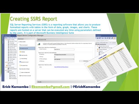
SSRS: Report Server Configuration - Part 18 | Email, Web Service URL and Web Portal URL Settings
 0:07:12
Reporting Services (SSRS) Part 19 - Subreports
 0:07:18
Concatination Operatores in SSRS-Video18
 0:09:57
Concatenating Values in SSRS - Part 18
 0:04:31
What is BookMark in SSRS Report - SSRS Interview Questions and Answers
 0:25:09
Reporting Services (SSRS) Part 21 - Pivot Table (Dynamic Matrix)
 0:23:25
18 SSRS - Alternate Row Coloring in SSRS Reports (SQL Server Reporting Services)
 0:15:13
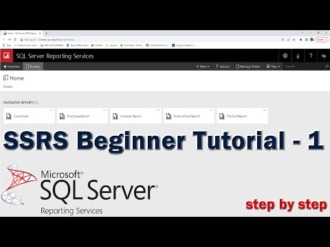
SQL Server Reporting Services (SSRS) Tutorial for Beginners - 1
 0:07:52
SQL Tutorial - Adding indicators to a report in Reporting Services
 0:12:02
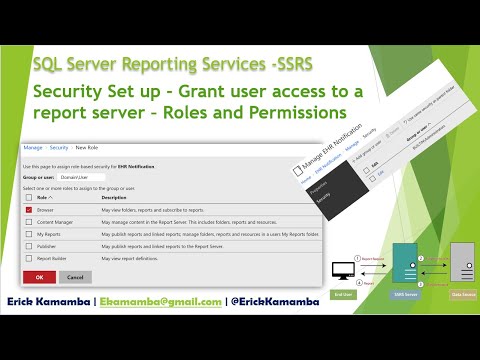
SSRS Security Set up - Grant user access to a report server (Roles and Permissions) - Part 20 | EHR
 0:31:24
Reporting Services (SSRS) Part 20 - Basic Maps
 0:03:44
SQL Tutorial - The elements of a report in Reporting Services
 0:05:05
SQL Tutorial - Customizing report parameters in Reporting Services
 0:14:01
Install & Configure SQL Server Reporting Services (SSRS) Express 2022 || SSRS Web Portal
 1:04:02
Using Parameters in SQL Server Reporting Services
 0:14:04
What Is Reporting Services?
 0:33:23
SSRS Tutorial for Beginners | MSBI SQL Server Reporting Service | Components | Types of Reports
 0:08:34
SSRS Tutorial 18 - Create DrillDown Group Report with Group Total and Grand Total from Basics
 0:13:08
SQL Server Programming Part 18 - Dynamic Pivot Tables
 0:16:53
SSRS Tutorials | How to implement Pagination in SSRS | Control number of records in SSRS Reports
 0:11:56
Reporting Services (SSRS) Part 2 - Data Sources and Datasets
Комментарии