filmov
tv
What Every Power BI Visual Needs

Показать описание
Join my Power BI Transformation
Let my team develop your reports to instantly gain momentum
--------------------------------
📊 TRAININGS 📊
---------------------------------
---------------------------------
⏱️ TIMESTAMPS ⏱️
---------------------------------
00:00 Intro
02:38 Creating data table
09:09 Adding KPI labels
11:47 Moving the x-axis labels up
14:17 Drill up and down buttons
15:17 End
---------------------------------
😍 JOIN 😍
----------------------------------
---------------------------------
👇 CHECK THIS OUT! 👇
---------------------------------
* Above are affiliate links, which means at no additional cost to you, if you make a purchase using these links we will receive a small commission. It supports us and helps us to continue making more How to Power BI videos!
Thanks for being a part of this channel and all your support! 💪 🙏
#HowToPowerBI #PowerBI #DataTraining
#powerbidesktop #powerbitraining #powerbideveloper #DAX
 0:16:00
What Every Power BI Visual Needs
 0:20:22
5 DESIGN TRICKS that Make EVERY Power BI Report Look GREAT!
 0:10:55
How To Create these useful Power Bi Visuals that Excel Lacks
 0:16:14
PUSH the limits of Power BI native VISUALS and CAPTIVATE your audience | TIMELINE chart Step-by-Step
 3:02:18
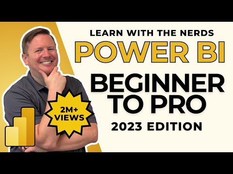
Hands-On Power BI Tutorial 📊 Beginner to Pro [Full Course] 2023 Edition⚡
 0:51:11
Charts & Visualizations in Power Bi | Full Tutorial | Power Bi| KSR DATAVIZON
 1:33:34
Visualizations in Power BI - Full Tutorial
 0:07:06
Easiest Way to Edit Visuals in Power BI - Watch before using the new features (Includes hidden tips)
 0:57:07
Implementing Visual Level Security in Power BI by Greg Strzyminski
 0:04:48
Want a custom LEGEND for your Power BI visual? WATCH THIS!
 0:33:24
Upgrade Your REPORT DESIGN in Power BI | Complete Walkthrough From A to Z
 0:23:03
Power BI Tutorial For Beginners | Create Your First Dashboard Now (Practice Files included)
 0:00:27
Power BI - Matrix Visualization - move values from columns to rows
 0:04:41
How to Switch Visuals in Power BI with BUTTONS
 0:14:14
Popular Visualizations in Power BI | Microsoft Power BI for Beginners
 0:11:33
Create a Power BI Custom Visual in 10 Minutes!
 0:06:26
Swap Power BI Visuals to add FLEXIBILITY in your reports
 0:11:15
Your first 10 minutes of Power BI - A no-nonsense getting started tutorial for beginners
 0:10:32
Build a Slicer Panel in Power BI (2022/2023)
 0:05:01
From Decomposition Tree to Details in Power BI!!!
 0:41:07
How to Build Power BI Reports from Start to Finish
 0:05:15
A new approach for dynamic Power BI visuals?
 0:16:21
Power BI Tips and Tricks
 0:07:09
Exploring the Power Automate Visual in Power BI | Sending emails
Комментарии