filmov
tv
Streamlit STOCK dashboard using Python 🔴

Показать описание
How to build Streamlit Stock Dashboard using Python: In this tutorial, we used Streamlit to make a simple stock dashboard. Streamlit web app is a great open-source app framework in Python language. Click 👇 “Show more” to learn more:
⌚ TimeStamps:
Introduction (0:00)
Topics to cover (2:15)
Streamlit web app setup (3:42)
Using yfinance to extract stock price (5:56)
Tabs for pricing, fundamental, and stock news analysis (7:45)
Stock Price Analysis on Streamlit (8:36)
Stock fundamental data using Alpha vantage (12:44)
My Google Drive (15:04)
Stock News analysis on Streamlit (16:18)
Outro (20:36)
𝐈𝐦𝐩𝐨𝐫𝐭𝐚𝐧𝐭 𝐋𝐢𝐧𝐤𝐬:
𝐆𝐞𝐭 𝐢𝐧𝐬𝐭𝐚𝐧𝐭 𝐮𝐩𝐝𝐚𝐭𝐞𝐬 𝐚𝐛𝐨𝐮𝐭 𝐭𝐡𝐞 𝐥𝐚𝐭𝐞𝐬𝐭 𝐯𝐢𝐝𝐞𝐨𝐬:
𝐌𝐚𝐤𝐞 𝐬𝐮𝐫𝐞 𝐭𝐨 𝐬𝐮𝐛𝐬𝐜𝐫𝐢𝐛𝐞 𝐬𝐨 𝐲𝐨𝐮 𝐝𝐨𝐧'𝐭 𝐦𝐢𝐬𝐬 𝐨𝐮𝐭 𝐨𝐧 𝐦𝐲 𝐟𝐮𝐭𝐮𝐫𝐞 𝐯𝐢𝐝𝐞𝐨𝐬:
#fpritvik #streamlit #python
 0:22:34
Streamlit STOCK dashboard using Python 🔴
 0:16:31
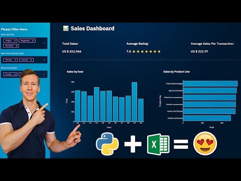
Turn An Excel Sheet Into An Interactive Dashboard Using Python (Streamlit)
 0:56:11
Streamlit - Building Financial Dashboards with Python
 0:17:27
Streamlit NSE Stock Dashboard in Python
 0:13:36
Building a Dashboard web app in Python - Full Streamlit Tutorial
 0:38:30
Real-Time Live Finance/Marketing/Data Science Dashboard in Python #8daysofstreamlit Day8 Tutorial
 0:25:19
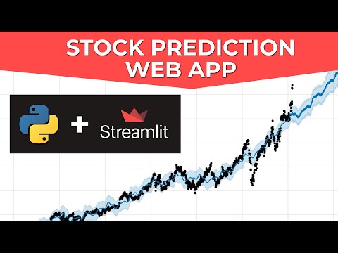
Build A Stock Prediction Web App In Python
 0:01:04
I Create Dashboard in One Minute using Python | Python for beginners | #python #coding #programming
 0:15:54
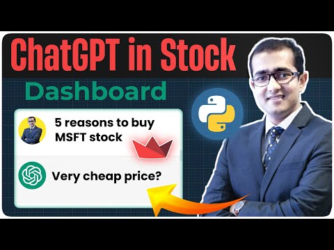
OpenAI Chat GPT in Streamlit Stock Dashboard in Python 🔴
 0:05:48
Build a Real Time Stock Price Dashboard in Python (with Streamlit)
 0:06:04
Streamlit for Stocks Research - Automate Stock Fundamental Analysis with Python - Web App Tutorial
 0:11:12
Interactive INVESTMENT PORTFOLIO ANALYSIS with Python and Streamlit
 0:18:10
Streamlit Interactive Finance Dashboard - Stock Performance Comparison
 0:36:47
Crafting a Dashboard App in Python using Streamlit
 1:06:21
Python Interactive Dashboard Development using Streamlit and Plotly
 0:27:41
EPIC Google Sheets to Interactive Dashboard in Python ft. Streamlit / CSS
 0:12:36
Build an Interactive Finance Dashboard with Python & Streamlit to compare Fundamentals of Stocks
 0:10:41
How to Build a Dashboard Web App in Python with Streamlit
 1:04:06
How to Build a Yahoo Finance Stock Dashboard with Python Framework Streamlit & yfinance and Plot...
 0:56:31
Build a Stock Trend Prediction Web App in Python | GeeksforGeeks
 0:33:51
Build an Interactive Dashboard with Python(Streamlit)
 1:53:32
Analytics Website Dashboard using Python and Streamlit Library with MYSQL database (Data Science)
 0:27:03
Candlestick App with Technical Indicators 📈📉💹 | Streamlit App📱| Python Tutorial
 0:45:01
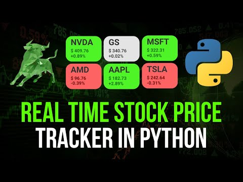
Real-Time Stock Price Tracker in Python
Комментарии