filmov
tv
Turn An Excel Sheet Into An Interactive Dashboard Using Python (Streamlit)
Показать описание
𝗗𝗘𝗦𝗖𝗥𝗜𝗣𝗧𝗜𝗢𝗡
▀▀▀▀▀▀▀▀▀▀▀▀▀▀▀▀▀▀▀▀▀▀▀▀▀▀
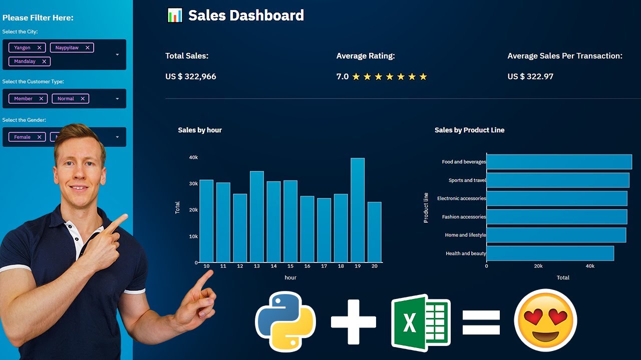
This video will show you how to build interactive Excel dashboards with Python using the Streamlit library. Streamlit allows us to create interactive Dashboards with a few lines of code. We will start by installing the necessary Python libraries. Afterwards, we will dive into building an interactive dashboard with Streamlit, which will be easy to customize and provide excellent user interaction.
🌍 𝗟𝗜𝗡𝗞𝗦:
📝 𝗥𝗘𝗦𝗢𝗨𝗥𝗖𝗘𝗦:
✅ 𝗧𝗜𝗠𝗘𝗦𝗧𝗔𝗠𝗣𝗦:
00:00 | Intro
00:46 | Exploring the dataset
01:13 | Convert Excel Data into a Pandas Dataframe
02:28 | Install Dependency's
02:55 | Getting started with Streamlit
04:17 | Building the Sidebar (Filter Selection)
06:27 | Building the KPI Section
08:53 | Building the Visualizations (Bar Charts)
12:37 | A brief digression: Enhance App Performance
13:22 | Continue Building the Visualizations
14:22 | Styling the Web App
15:51 | Wrap-Up
𝗧𝗢𝗢𝗟𝗦 𝗔𝗡𝗗 𝗥𝗘𝗦𝗢𝗨𝗥𝗖𝗘𝗦
▀▀▀▀▀▀▀▀▀▀▀▀▀▀▀▀▀▀▀▀▀▀▀▀▀▀
𝗖𝗢𝗡𝗡𝗘𝗖𝗧 𝗪𝗜𝗧𝗛 𝗠𝗘
▀▀▀▀▀▀▀▀▀▀▀▀▀▀▀▀▀▀▀▀▀▀▀▀▀▀
☕ 𝗕𝘂𝘆 𝗺𝗲 𝗮 𝗰𝗼𝗳𝗳𝗲𝗲?
 0:06:18
How to Convert Excel spreadsheet data into a Table
 0:16:31
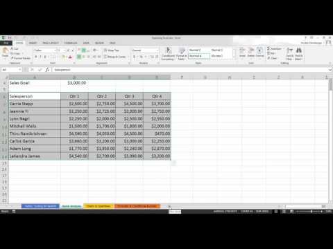
Turn An Excel Sheet Into An Interactive Dashboard Using Python (Streamlit)
 0:32:45
How to Turn Your Excel Spreadsheets into Power Apps
 0:03:28
Make 1 Excel file allow Multiple Users at the same time | NETVN
 0:02:33
How to Convert Excel to Google Sheets (Quick and Easy)
 0:01:12
How To Convert an Excel File into A MS Word Doc
 0:21:43
Turn An Excel Sheet Into An Interactive Dashboard Using Python (Taipy Tutorial)
 0:03:38
Automatically Convert Excel Spreadsheet to Google Sheets
 0:00:33
Simple Tricks to Write Roman Numerals in Excel
 0:01:45
Excel How To Copy As Picture
 0:04:01
Convert your excel sheet into an app easily (Without Coding) | Excel converter | App DNA
 0:16:05
Turn Your Excel File Into A Web App With Python (fast & easy) | Streamlit Tutorial
 0:00:27
How to Convert Excel to XML Format
 0:18:53
Turn Your Excel Sheet Into An Interactive Application Using Python (Full Project)
 0:00:57
Convert XLS to XML (Excel to XML) - 2021
 0:11:32
How to Print Excel Sheet
 0:05:05
How to Turn Excel File with VBA & Macros into a Web Application
 0:02:08
How Do I Convert Excel Sheets to Word? : Microsoft Excel Tips
 0:03:42
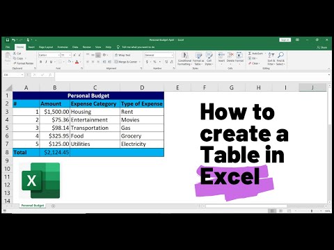
How to Create a Table in Excel (Spreadsheet Basics)
 0:00:32
How to Convert a Table to a Normal Range in Excel
 0:03:03
How to Split Each Excel Sheet into Separate Files Easy (Excel 2003-2016)
 0:02:53
How to Split Each Excel Sheet Into a Separate File
 0:00:34
How to Move an Excel Worksheet to Another Workbook
 0:03:41
Convert Excel Spreadsheets to Word Documents
Комментарии