filmov
tv
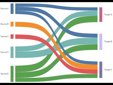
Multi-Level Sankey diagram in Power BI using DAX | Sankey Chart Custom Visual

Показать описание
Advantages of Sankey Chart in Power BI:
Flow =
CALCULATE(
SUM('YourDataTable'[FlowColumn]),
USERELATIONSHIP('YourDataTable'[ChildID], 'HierarchyTable'[ChildID])
)
NodeValue =
CALCULATE(
SUM('YourDataTable'[FlowColumn]),
ALL('HierarchyTable'),
'HierarchyTable'[Level] = SELECTEDVALUE('HierarchyTable'[Level])
)
SortOrder =
RANKX(ALL('HierarchyTable'), [NodeValue],, ASC, DENSE)
Effective Flow Representation: Ideal for showcasing the flow of resources, processes, or relationships in a visually compelling manner.
Highlighting Relationships: Excellent for emphasizing relationships and proportions between different stages or entities.
Decision Analysis: Useful for decision analysis, especially when understanding the impact of choices or transitions between stages.
Storytelling: Facilitates storytelling by visually guiding users through a sequence of interconnected events or stages.
Scenario Analysis: Enables scenario analysis by illustrating how changes in one part of the system affect the overall flow.
Data Emphasis: Places a strong emphasis on the magnitude of data flow, allowing users to quickly identify trends and patterns.
Path Analysis: Useful for path analysis, showing the most common or relevant paths within a system.
Process Optimization: Helpful for identifying bottlenecks and optimizing processes by visually assessing the efficiency of flow.
Resource Allocation: Suitable for displaying resource allocation and utilization throughout different stages of a process.
Comparative Analysis: Allows for comparative analysis, showing variations in flow between different categories or time periods.
Impact Assessment: Effective in assessing the impact of changes or interventions within a dynamic system.
Interactive Filtering: Supports interactive filtering, allowing users to focus on specific elements within the chart.
Real-time Monitoring: Can be employed for real-time monitoring of dynamic systems or processes.
Intuitive Design: Once understood, Sankey charts provide an intuitive representation of complex relationships.
Multi-level Hierarchies: Suitable for representing multi-level hierarchies, offering a comprehensive view of interconnected elements.
Visual Appeal: Has a visually appealing design that can capture attention and convey information in an engaging manner.
Enhanced Storytelling: Enhances storytelling capabilities in reports by providing a clear narrative through interconnected stages.
Efficiency Visualization: Efficiently visualizes data flow and relationships without the need for extensive textual descriptions.
Compliance Monitoring: Useful for compliance monitoring, showing how entities or resources adhere to specific stages or criteria.
Predictive Analysis: Can support predictive analysis by illustrating potential future flow patterns based on current trends.
#SankeyChart
#DataVisualization
#PowerBICharts
#VisualAnalytics
#DataFlow
#GraphVisualization
#DataStorytelling
#InteractiveCharts
#InfoViz
#Diagramming
#DataAnalysis
#DataDrivenDecisions
#AnalyticsTools
#BusinessIntelligence
#VisualizeData
#FlowCharts
#DashboardDesign
#BIReporting
#DataScienceVisualizations
#GraphTheory
#InformationDesign
#VisualizationTools
#DataInsights
#ChartDesign
#ExploreData
#PowerBI
#DataVisualization
#BusinessIntelligence
#DataAnalytics
#PowerBIDesktop
#PowerBIPro
#PowerBIService
#DashboardDesign
#PowerQuery
#DAX
#ReportDesign
#PowerBITips
#PowerBISolutions
#BIReporting
#DataInsights
#PowerPivot
#DataModeling
#DataDrivenDecisions
#PowerBICommunity
#PowerBIDashboards
#AnalyticsTools
#PowerBIFunctions
#PowerBIFilter
#PowerBIMobile
#DataStorytelling
#VisualAnalytics
#PowerBIGateway
#PowerBICertification
#PowerBISuccess
#PowerBIJobs
#PowerBIChampion
#DataTransformation
#PowerBIExcel
#PowerBIAggregations
#CustomVisuals
#PowerBIOnline
#PowerBIEmbedded
#PowerBIAdmin
#PowerBIRestAPI
#PowerBIMeasures
#DataIntegration
#ReportDevelopment
#PowerBIRocks
#PowerBIQuery
#PowerBIMapping
#PowerBIMetrics
#PowerBIRollup
#PowerBIBookmarks
#PowerBIQueryEditor
#PowerBIWorkspace
#PowerBICharts
#PowerBIDatasets
#PowerBIDataflows
#PowerBIConnectors
#PowerBIFunctions
#PowerBIAdvanced
#PowerBITransformations
#PowerBISharing
#PowerBIParameters
#PowerBIRibbon
#PowerBIAutomation
#PowerBIAzure
#PowerBIFeedback
#PowerBICustomizations
#PowerBIPieChart
#PowerBIAgile
#PowerBISlicer
#PowerBILearning
#PowerBIEducation
#PowerBIDatasets
#PowerBIHacks
#PowerBIComparison
#PowerBIJSON
#PowerBIMashup
#PowerBITutorial
#PowerBIFilters
#PowerBIProjects
#PowerBIIntegration
#PowerBIForAll
#PowerBIBestPractices
#PowerBIUserGroup
#PowerBIUserCommunity
#PowerBIConsulting
#PowerBICharts
#PowerBICollaboration
#PowerBIMeetup
#PowerBIOnlineTraining
#PowerBIPublishToWeb
#PowerBIProTips
#PowerBIDualAxis
#PowerBIShapes
#PowerBIErrors
#PowerBIMonthlyUpdate
#PowerBIDrillDown
#PowerBIReddit
#PowerBIForFinance
#PowerBIForSales
#PowerBIFinancialAnalysis
#PowerBIForMarketing
#PowerBIArticles
 0:07:10
Multi-Level Sankey diagram in Power BI using DAX | Sankey Chart Custom Visual
 0:05:17
How to create a Multi-Level Sankey Diagram in Microsoft Power BI | Power BI Custom Visuals
 0:14:14
Multi-Level Sankey Chart in Power BI using DAX Technique | Data from Web, The Richest in 2020 Forbes
 0:13:08
How to create a Sankey Visual in Power BI - Tutorial. Multi level Sankey
 0:48:06
Preparing a data model for Sankey Charts in Power BI
 0:00:19
Modify sankey diagram
 0:05:14
How to create a Multi-Level Sankey Diagram in Microsoft Power BI | Power BI Custom Visuals
 0:08:03
How to use SANKEY Charts in Power BI // Beginners Guide to Power BI in 2020
 0:13:01
Multilevel Sankey Chart in Power BI - Visuals with Nags
 0:00:19
Income statement and a balance sheet Sankey diagram templates
 0:05:26
Sankey Chart in Microsoft POWER BI
 0:08:35
Quick Guide to Creating Sankey Charts in Microsoft Power BI!
 0:05:25
Power BI: Using Sankey Diagrams to show US Rivers data
 0:00:51
Tableau Mini Tutorial: Creating Sankey Chart in One Minute
 0:01:49
How to create a Sankey Diagram in Excel
 0:14:07
Convert INCOME STATEMENTS into SANKEY Diagrams in Power BI // Beginners Guide to Power BI in 2023
 0:00:56
A Sankey Diagram of Microsoft's Income Statement
 0:00:50
Multi level Sankey Chart in Power BI
 0:22:23
Building Sankey Charts in Power BI | Advisicon
 0:00:44
New How to build a Tableau Sankey Chart in 10 seconds
 0:03:24
Power BI - Sankey Chart in Power BI | @TableauExperts
 0:00:32
Multi-Level Dendrograms in Tableau
 0:03:55
Build Sankey Charts in Tableau 24.2 in 30 seconds | Tableau Viz Extensions
 0:00:19
Copying data from Google Sheets to SankeyArt
Комментарии