filmov
tv
How to use SANKEY Charts in Power BI // Beginners Guide to Power BI in 2020

Показать описание
In this video, we go through a step by step guide on how to use Sankey Charts in Power BI. It's a very powerful visualisation tool that I don't see a lot of people using, so in this video I cover how to start using it and how to transform your data so it's ready for consumption by the Sankey Diagram.
We also touch a little bit on two new DAX functions, UNION and SUMMARIZE.
-
🚩 Support us to get perks such as demo files, early access and more!
MY FAVOURITE POWER BI BOOKS
MY GEAR
GET IN TOUCH
🌍 WHO IS SOLUTIONS ABROAD
Hi, my name is Fernan, the one-man band of Solutions Abroad. I work as a Data Scientist based in London, UK and have over 6 years of experience working in Business Intelligence. Solutions Abroad these days is dedicated to teaching the ins and outs of Power BI, through the power of YouTube.
If you want to learn more, I’ve conveniently created playlists to help you find the right topic for you.
🐎 First, watch this video about how a typical Power BI workflow looks like
🗺 Learn DAX to extend your Power BI calculations
📆 Stay up-to-date on all the features Power BI releases monthly
🧪 Get certified as a Microsoft Data Analyst Associate
💡 Learn Power BI Features to improve your dashboards
📊 WHAT IS POWER BI?
Power BI is a business analytics tool by Microsoft. It creates a working environment suited for normal users, meaning tasks such as data extraction, cleansing, analysis and storytelling; these are made easily-accessible to citizen-users, and extendable for technical users. At face value it provides visually-stunning, interactive dashboards, but it’s built on top of so much more.
🔻 Get started with Power BI Desktop for FREE
#PowerBI #DataAnalytics #BusinessIntelligence
 0:00:51
Tableau Mini Tutorial: Creating Sankey Chart in One Minute
 0:08:03
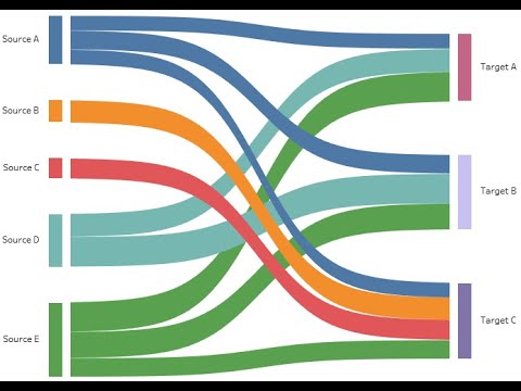
How to use SANKEY Charts in Power BI // Beginners Guide to Power BI in 2020
 0:01:49
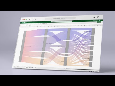
How to create a Sankey Diagram in Excel
 0:08:04
What is a SANKEY diagram (+ examples) ??
 0:00:37
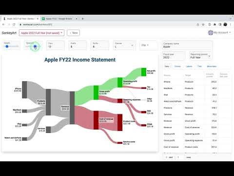
Creating a Sankey diagram of an income statement in Excel
 0:00:19
Copying data from Google Sheets to SankeyArt
 0:48:06
Preparing a data model for Sankey Charts in Power BI
 0:00:19
Income statement and a balance sheet Sankey diagram templates
 0:01:42
How to create a Sankey Diagram in Excel
 0:05:26
Sankey Chart in Microsoft POWER BI
 0:19:18
How to Make a SANKEY diagram for Free (Step-by-Step)
 0:03:37
Physics - Energy - Sankey Diagrams
 0:02:33
How to create a Sankey Chart in Excel Sankey diagram Use case for Sankey chart Excel charts
 0:07:10
Multi-Level Sankey diagram in Power BI using DAX | Sankey Chart Custom Visual
![[R Beginners guide]](https://i.ytimg.com/vi/k-IN6HBhgq4/hqdefault.jpg) 0:06:12
0:06:12
[R Beginners guide] - Sankey diagram from your own datasets: Code Included
 0:04:03
Visual Digital Presentation - Creating Sankey Flow Diagrams with SankeyMATIC
 0:04:10
Sankey Diagrams - p159 (Foundation p160)
 0:08:35
Quick Guide to Creating Sankey Charts in Microsoft Power BI!
 0:18:09
Create Sankey diagrams in Excel | Using standard charts, no add-ins | Excel Off The Grid
 0:18:00
Generating Sankey Diagrams or Alluvial Diagrams with Python's Plotly Library | Jupyter Notebook
 0:05:15
Sankey Diagrams
 0:02:21
e!Sankey - A software tool to easily create Sankey diagrams - by ifu Hamburg
 0:00:42
How to Create a Sankey Diagram
 0:00:19
Modify sankey diagram
Комментарии