filmov
tv
The ONLY Graphic Design Process You Need!
Показать описание
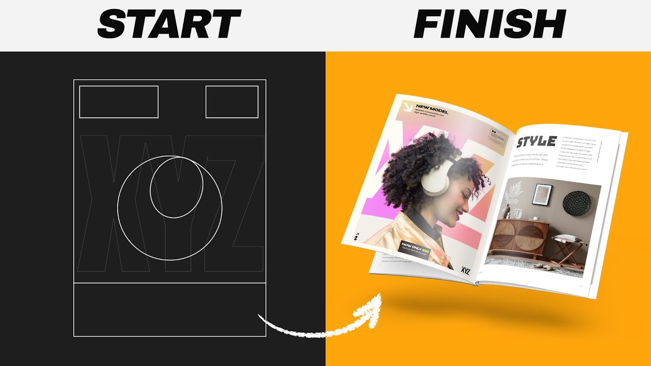
This video WILL help you see how to get so good at graphic design, that you can smash literally any brief that comes your way. You will have the confidence to take on a project, and deliver the final design solutions that will make your clients smile.
I use ChatGPT to create a mock brief to work on, and then I show you how to use the brief, and even utilise ChatGPT to expand on the brief and get yourself all of the info you need to design something really awesome.
From there, we jump into Photoshop and use a model from Envato Elements to begin the poster design. The design aims to promote headphones of a sleek, stylish, and modern nature. So we build up a design using graphic design principles, the brief, and knowledge, that in the end really works well and looks visually appealing. Making this design was a lot of fun, and actually, I feel like it turned out super good.
If you found todays video on how to get so good at graphic design that you can smash any brief enjoyable or useful, let me know in the comments section and drop a like on your way out. Subscribe to stay updated to all of my uploads and until next time, design your future today, peace ✌️
Satori Graphics®
📌📌📌📌📌📌📌📌📌📌📌📌📌📌📌📌📌📌📌📌
The above links are affiliate links, most of which I personally use on a daily basis 👍
📌📌📌📌📌📌📌📌📌📌📌📌📌📌📌📌📌📌📌📌
⏯️ PLAYLISTS
********************************************************************
🐦 Join Me On Twitter!
📸 Here's My Instagram!
********************************************************************
©️ Copyright
The work is protected by copyright, produced by Satori Graphics®
This is applied to the video recording of itself as well as all artistic aspects including special protection on the final outcome. Legal steps will have to be taken if copyright is breeched. Music is used from the YouTube audio library and or sourced with permission from the author
0:00 Get So Good At Designing
0:16 Easiest Way To Create A Brief
1:01 What You Need From The Brief
2:02 How To Expand Your Briefs
3:04 Below Average Designs We Want To Avoid
3:35 Starting The Design
4:42 Colour Palettes
6:35 Important Lighting Effects
8:29 Typography That Relates To The Brief
10:33 Adding The Key Element
11:43 Blend Modes Make A Big Difference
12:50 Finishing Details
#graphicdesign #graphicdesigner #designprocess #tutorials #howto #designprinciples #satorigraphics
Комментарии
 0:14:11
 0:09:28
 0:18:31
 0:08:59
 0:06:36
 0:17:13
 0:17:13
 0:30:34
 0:00:44
 0:00:39
 0:09:39
 0:00:16
 0:06:44
 0:08:28
 0:08:15
 0:00:22
 0:12:03
 0:13:33
 0:06:30
 0:00:18
 1:03:05
 0:00:32
 0:08:29
 0:00:42