filmov
tv
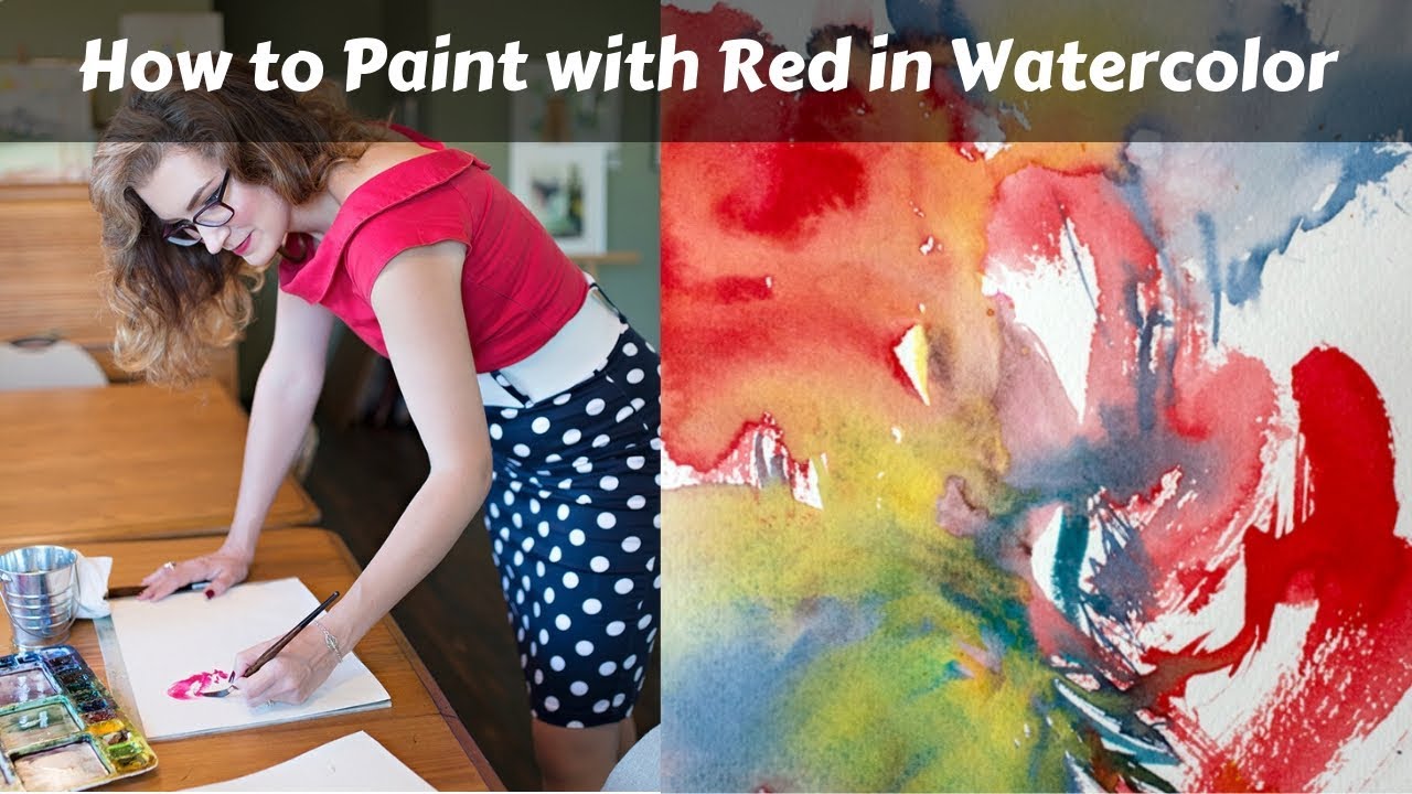
How to Choose & Use Red in your Watercolor Paintings

Показать описание
Red is a glorious, vibrant color, so why is it sometimes so hard to paint with it? I’ve made a LOT of mud out of my red paints over the years, and I’ve learned a few things about using red that I’m excited to share with you in this free video lesson.
If you find that your paintings featuring red tend to look muddy, or that mixing red doesn’t give you the bright colors you were looking for, I have some solutions that will help you paint with red more confidently and keep this amazing color vibrant, rich and beautiful.
Top tips:
1. Remember that red is a dark value color. To create contrast, surround it with light value hues, or dilute it to make it lighter.
2. Choose cool reds for brighter mixes of color.
3. Dilute red paint with water to make it look brighter or to create a more luminous, light value of red or pink.
4. Mix red with green to create neutrals and near-blacks.
5. Start light and build up to create richer reds.
Mindset matters, so when you’re working with red, paint with confidence and energy to see your paint and brush respond with authenticity.
Supplies Used: (some links are affiliate links, I receive a small commission when you order using them. Thank you!)
Комментарии
 0:03:41
 0:14:03
 0:16:25
 0:06:25
 0:18:22
 0:01:52
 0:04:17
 0:02:23
 0:13:37
 0:04:24
 0:05:30
 0:03:11
 0:04:04
 0:05:12
 0:05:23
 0:11:34
 0:25:20
 0:04:01
 0:04:44
 0:03:35
 0:04:36
 0:00:27
 0:13:30
 0:01:50