filmov
tv
How to show or hide HTML elements on particular screen size - bootstrap lesson [#3]

Показать описание
How to hide or show html tags on different devices - smartphones tablets or desktops. Free Bootstrap tutorial .
This is bootstrap responsive web design lessons series.
How to create pages with bootstrap framework - new learning path from Synteo IT Academy 2016.
Bootstrap basics for beginners.
Mobile First technology - know how to start with .
How to make mobile friendly and optimized web pages and web applications.
In this part we will show how hide or show elements on particular devices and how to use:
idden-xs hidden-sm hidden-md hidden-lg
visible-xs visible-sm visible-md visible-lg
css classes.
Next part will be continuing about RWD, Bootstrap, jQuery and RestFUL webservices in PHP to handle server-side backend.
Synteo IT Academy is free on-line lessons series for beginner and more advanced programmers.
 0:00:12
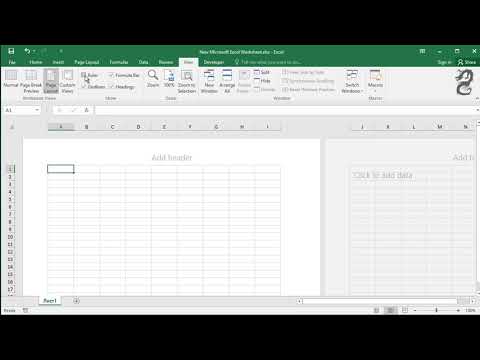
Excel short: how to hide and unhide rows or columns
 0:03:02
How to Show or Hide the Ribbon in Excel (Quick and Easy)
 0:00:16
How to show or hide ruler in Excel
 0:01:28
How to Show or Hide the Formula Bar in Excel (Quick and Easy)
 0:01:59
How To Hide Or Show Ribbon Bar In Microsoft Word
 0:06:43
3 Methods to Unhide All Sheets in Excel (& how to hide)
 0:01:24
How To Hide Or Show Ribbon Bar In Microsoft Word
 0:00:32
Auto Hide Taskbar in Windows 11
 0:01:21
How To Show/Hide Comments In Excel
 0:01:50
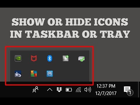
Show or Hide Icons In Taskbar or System Tray in Windows 10
 0:03:44
Show or Hide Icons / Folders / Files on Windows Desktop
 0:00:48
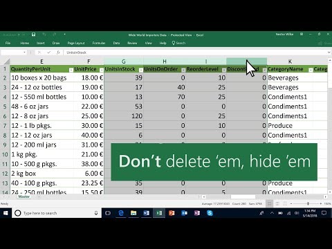
Hide and unhide columns in Microsoft Excel
 0:01:44
How to Display or Hide Zero Values In Excel
 0:02:05
Show or hide icons in Taskbar, System Tray or Desktop in Windows 10
 0:01:15
Show or Hide all Comments and Comment Indicators in Excel
 0:00:16
How to hide apps on iphone
 0:06:49
How to Show and Hide Containers with Clicking Buttons - Elementor Wordpress Tutorial
 0:00:20
Hide Notifications of your iPhone!!! #shorts | iGeeksBlog
 0:00:14
hide any chat or group in Whatsapp || Archive chat #whatsapp #shorts #archievechats
 0:05:16
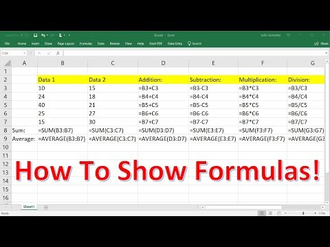
How To Show and Hide Formulas In Excel - 3 Methods!
 0:00:26
How to Hide a Folder in Windows
 0:02:12
How to Hide Formula In Excel
 0:00:37
How to hide apps from the app library and home screen on iPhone? (Tinder, Snapchat, and others)
 0:02:45
How to Hide or UnHide All Contacts on iPhone (iOS 14.3)?
Комментарии