filmov
tv
ADVANCED Logo Design Theories (No Basic Stuff Here)

Показать описание
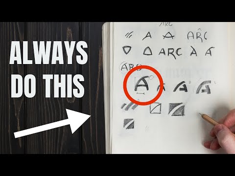
In todays video, a list of ADVANCED logo design rules, that you surely will need to listen to if you want to take the career of 'logo designer' seriously. The rules are a little less obvious and basic than you may have heard before, but they will surely take the logo artwork you produce in your logo design process to new heights.
When we think about our logo design process, we're talking about really getting to grips with what it means to be a logo designer, by using psychology, professional workflows, and to do the things that our clients really want us to do.
So after watching this list of golden rules or advanced rules on logo designing, you should better understand how to design a logo in your graphic design workflow.
If you found todays video on more advanced logo design rules enjoyable or useful, let me know in the comments section and drop a like on your way out. Subscribe to stay updated to all of my uploads and until next time, design your future today, peace ✌️
Satori Graphics®
********************************************************************
********************************************************************
⏯️ PLAYLISTS
********************************************************************
✴️ The following links are affiliate links that I personally use on a daily basis 👍
********************************************************************
********************************************************************
🐦 Join Me On Twitter!
📸 Here's My Instagram!
********************************************************************
©️ Copyright
The work is protected by copyright, produced by Satori Graphics®
This is applied to the video recording of itself as well as all artistic aspects including special protection on the final outcome. Legal steps will have to be taken if copyright is breeched. Music is used from the YouTube audio library and or sourced with permission from the author
 0:05:48
ADVANCED Logo Design Theories (No Basic Stuff Here)
 0:06:26
Master Logo Design In 7 Minutes!!
 0:57:46
FULL 1 Hour Logo Design Course (Everything You Need To Know)
 0:06:30
LEARN 13 Golden Rules Of Logo Design! (MUST KNOW)
 0:18:03
The ONLY Logo Design Tutorial You'll Ever Need! (Professional Reveals All)
 0:08:29
7 MIND BLOWING Logo Design Tips ✍
 0:03:28
The Logo Design MISTAKE You MUST Avoid!
 0:03:04
Why Companies Are 'Debranding'
 0:11:57
Use This Method for Better Logo Design Ideas 🚀
 0:06:39
Understand This To MASTER LOGO DESIGN! (Advanced Colour)
 0:06:25
LEARN Logo Design Theory! (How To Design A Logo)
 0:06:23
🔸 Master ADVANCED Hierarchy In Under 7 Minutes! (Important)
 0:08:02
LOGO Designing Was HARD Until I Mastered This!
 0:08:26
6 GOLDEN Rules Of Logo Design (Logotype) — 100% Essential!
 0:18:36
9 Types Of Logos For Brand Design & Strategy (44 Top Examples)
 0:05:11
4 Logo Design Rules NOT Taught On YouTube!
 0:01:00
Chrome logo Illustration - Illustrator tips #shorts - Design.lk
 0:07:19
SHAPE PSYCHOLOGY IN LOGO DESIGN (Need To Know)
 0:08:02
Exposing The Dirty LIES Of Logo Design Trends!
 0:05:30
How To Choose The RIGHT LOGO (90% Don't Think About It)
 0:06:18
5. Before You Begin Logo Design Theory
 0:12:13
Just 30 Days And You'll Master LOGO DESIGN!
 0:06:33
16 FAMOUS LOGOS WITH A HIDDEN MEANING (That We Never Even Noticed)
 0:07:54
30 Illustrator Secrets Graphic Designers MUST KNOW!
Комментарии