Japanese Style Small Seaside Apartment, Sydney 52sqm/560sqft
preview_player
Показать описание

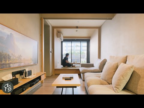
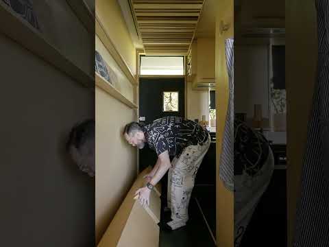
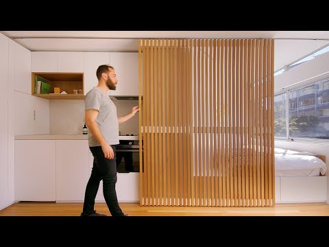
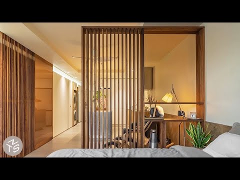
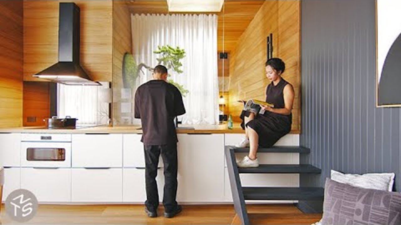
Dform Projects were tasked with transforming a dark and stuffy apartment into a tranquil, natural space more suited to its Sydney beach setting. By stacking and overlapping rooms and spaces, they were able to completely reconfigure the home's layout, and introduce more natural light and airflow throughout. A Japanese bedroom with a connecting meditation room is built on a raised platform which extends seamlessly from the kitchen counter into the bedroom itself. Here, a zero maintenance zen garden and bonsai tree creates a connecting green space. This raised platform also allows for dedicated storage underneath the bedroom and meditation space, with further storage is cleverly concealed within the bathroom. A study space is neatly tucked away in the 2nd bedroom in the nook created by extending the hallway. Customised to its owners dreams of beachside living, the home reflects an approach that could be applied to any home design, large or small.

#smallapartment #architecture #interiordesign

Project Name: The Ryakon

Produced by New Mac Video Agency
Creator: Colin Chee
Director/Camera Operator: Nam Tran
Producer: Lindsay Barnard
Editor: Colin Chee
Music: Lucid Dreaming by Dear Gravity
Рекомендации по теме
Комментарии
Автор

"Reconnect with nature" Pulls back curtain to a parking lot lol. Such is life. Very beautiful.

LavianoTS
Автор

""""zero maintenance plants""""
...just say plastic

HSP
Автор

I can’t focus on anything except the fact that he is wearing shoes in the house!

globalgirlster
Автор

I'd need that meditation room for sure because sitting on a hard kitchen floor to drink a cup of tea and eat some cake with my knees around my neck as I try not to slide down the wall for back support watching a tiny TV a few inches off the floor at a 45 degree angle would stress me out real quick! That whole place is completely bonkers but hey good for them if they like it.

dogsconkers
Автор

First one of these videos that I did not think, “I could live there.” Having to walk across the kitchen counter to get to the bedroom, having to pull the refrigerator out to access storage, no closet, and tiny frig. Definite no go for me!

ellenfoster
Автор

Am I the only one who thinks the second bedroom looks considerably more spacious, comfortable and liveable than the main bedroom? Easily the highlight of the entire apartment.

_dont_mind_me
Автор

It's gorgeous but I have to wonder where the wardrobe is- and how practical it is to have a fridge in the same space where you access storage from

sarahphilips
Автор

There are many strong design elements in this space that make it aesthetically successful. But I’m questioning a lot of the impractical solutions - like the hard platforms for sitting, stepping over the kitchen counters to access the guest bedroom, climbing through a window to access a meditation space, etc. This feels like a architectural student experiment. Great on paper, but terribly impractical in my opinion.

carlosdejesus
Автор

The space looks very serene, and has been thoughtfully designed to fit the clients needs. I am hardwired to need a comfortable sitting area, and I wouldn't like standing on the kitchen bench or crawling around the storage space. If the bedroom wasn't on a raised platform, the space under the meditation room could be accessed like a small wardrobe - hanging space for shirts and shelves for folded clothes. I'd probably brutalise the meditation room by making it my tv room.

LitteJeanie
Автор

This is a beautiful apartment. I was very surprised to see that the occupants wore their shoes inside. I would have thought that wearing shoes inside was disappearing, but especially for a Japanese style home.

youyong
Автор

So you have to crawl through the kitchen to access storage, walk on the kitchen counter to go to the bedroom, sit on the hard floor and look diagonale to watch the TV, or go back to bed if you want to be compfy ... I'm very confused 🥲

rubama
Автор

Beautiful as it is, this apartment as it is shown has some impractical features for everyday living. I guess it must be for short stay living. Like a Pied a Terre, a B&B or a second home. It has many inspirational ideas. The Bonsai tree, the black wall, the meditation room, the white curtains, the entrance area, the bathroom tiling, the bronze mirror, etc.

realmofthesenses
Автор

Visually - stunning. As far as function goes - I think it's terrible at best. Bathroom entrance was right originally from the hallway - now it's directly from the dining/kitchen area and the toilet is in front of the door? Meditation room gets all the sunlight and bedroom gets some indirect? Why? The priorities for this appartment are so out of order, it baffles my mind.

TheNikolokobe
Автор

Mixed feelings about this one. Overall I appreciate the aesthetic and minimalism, but a practical living space it is not. Entry way and hallways - beautiful, kitchen - nice, bonsai installation - cool. However - huge miss on storage, no one's going to move the fridge out of the way to access a tiny crawl space under the floor on a daily basis. Meditation room is a waste of space and comfort (intentionally make it impossible to stand in?), there is no tatami or living room as such - a few cushions on a hard floor are not very inviting, no ones going to sit there awkwardly looking at the tv, and the bathroom exposed plastic plumbing is a crime. The rest of the apartment was thought out and finished very neatly and it feels like either they ran out of money or someone forgot about designing the vanity area altogether.

pumpkinonastick
Автор

As a New Zealander, seeing someone sitting and standing on a kitchen bench is just too much for me. UGH. I can see this as an art installation but not a home.

msbonsaihuman
Автор

I like the aesthetics but I don't think it is practical at least for me. Firstly, there could have been a better second enclosed bedroom rather than the open bedroom just behind the kitchen . Secondly, the toilet just off the dining/living room is not good design. Thirdly, the access to the storage space is just too restrictive. Lastly, lowering the height in the meditation room is just giving up valuable storage space in a small dwelling.

benwatts
Автор

Lovely calm space, but probably not practical for the majority. I would like to see examples of spaces which are practical for everyone. Children, aging adults, and those with mobility issues (of all kinds, from minor to major) are rarely considered on this channel: if we are all to live in these sized spaces in the future we need to be shown how they can fulfil the needs of all sections of society, youngest to oldest, able-bodied to disabled.

myrtle
Автор

Really love the different levels and the appearance of wood and greenery - looks peaceful and cosy.

janecunningham
Автор

The overall aesthetics is very soothing and pleasant, and I really like it. I love that it is essential, minimal, showing that we don't need much, but a space for calmness and serenity. As European I lack the background to understand and appreciate sitting on plain hardwood to watch tv or when socializing with friend/family. Giving more importance and space to your mental wellbeing (meditation space) than to storing your bulk of stuff, is something that I take with me from this video.

tanjacavalli
Автор

I love the standard of finish and choice of materials in this project. Using levels to differentiate between spaces is always a great idea to establish the flow of a home. I cant say I love every aspect of the design here, but certainly beautiful end result!

adamglen