filmov
tv
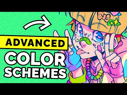
10 Colour Schemes You've (probably) Never Heard Of!

Показать описание
Struggling to pick which colours to use in your art? Have no fear, artist Jessie Chang is here! In this short colour theory lesson, she breaks down 10 basic and advanced colour palettes you can use to give your piece more character. 🌈 These colour combinations should be in every artist's toolbox, as they help define moods, emotions, and atmospheres! Let us know your favourite scheme in the comments below! 😎
🕓 Timestamps:
0:00 - Achromatic & monochromatic palettes
0:50 - Analogous palette
1:39 - Types of colour wheels
2:20 - Complementary palette
3:22 - Triadic palette
3:51 - Split complementary palette
4:46 - Double split complementary palette
6:05 - Polychromatic palette
7:17 - Tetradic palette
8:29 - Discordance colour scheme
10:24 - Outro
🔴 Watch the Original Livestream in real time:
🖤 Free Digital Art Resources & Goodies
🖤 See our complete tutorial for Medibang Paint Pro on a computer:
😎 Save $10 off our Beginner Digital Art Course with promo code: ARTNERDS10
🎨 Try a Virtual Art Class (2 for 1 promo for new students!)
✏️ Learn some serious art skills — LIVE in our online classroom:
💪 Sharpen your art skills with personalized critiques to create a winning portfolio!
🍎 Browse our Art Resources for Teachers:
🥰 Support the Winged Canvas team on Patreon
🤩 Support the channel by becoming a member:
💕 Make a donation to support Winged Canvas and free art education
💡 Subscribe for more art tutorials, tips, and art resources
🤓 Join our Art Nerd community 🤓
Winged Canvas is an online art school based in Canada specializing in virtual art programs. We are known for our Art Mentorship program and quirky art nerd culture. Our instructors are professional artists and designers with a passion for teaching and nurturing creativity, sharing our artistic skill sets and industry experience with others.
Music credits:
Track: I Want To Be — Declan DP [Audio Library Release]
Music provided by Audio Library Plus
Track: JPB - High [NCS Release]
Music provided by NoCopyrightSounds.
 0:10:51
10 Colour Schemes You've (probably) Never Heard Of!
 0:00:16
Color Schemes #shorts
![[ ʚɞ ]](https://i.ytimg.com/vi/H7doscxsKmg/hqdefault.jpg) 0:00:12
0:00:12
[ ʚɞ ] color schemes for bloxburg houses!
 0:00:16
Rare Colors You’re Probably Never Heard of before PT 1😍 #color #colors
 0:00:58
Colour Scheme Basics!!
 0:00:12
Rare color You probably never heard of
 0:00:31
Colour theory will blow your mind away!
 0:07:14
ADVANCED Colour Theory Makes Designs SUPERIOR! (With Real Examples)
 0:01:00
art tip for picking colors 🌈 #shorts
 0:08:54
Color Theory for Noobs | Beginner Guide
 0:31:46
🔸 The ONLY Colour Theory Video You Ever Need To Watch!
 0:11:23
Creating VIBRANT Color Schemes Easily -- Triadic Colors
 0:13:42
How to Pick Colours for Your Art
 0:06:42
You've been creating your colour palettes all wrong! | Colour basics & tutorial
 0:00:10
Rare color You probably never heard of
 0:00:15
rare aesthetic colors you probably haven't heard of.... volume 4
 0:00:16
Rare colors you’ve probably never heard of 🩷🩷(part 4) #preppy #viral #popular #blowup #aesthetic...
 0:00:14
Rare color You probably never heard of
 0:00:38
Complementary colour schemes - Quick inspiration from Victoria Plum
 0:00:20
Probably my favorite color combo for my NEUTRAL brown skin 🤎✨ #browngirlmakeup
 0:00:17
Rare colour that you probably never heard of ✨
 0:00:39
Colour palette #challenge
 0:10:01
HOW TO CHOOSE COHESIVE COLOURS FOR YOUR ARTWORK 🎨 | Colour Theory + Colour Palette Tips
 0:00:13
rare colours you have probably not heard 😁 #shorts #colours
Комментарии