filmov
tv
COMPLETE Anime Shading Tutorial (In 2 Minutes!!!)

Показать описание
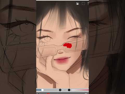
Today I present the FINAL Anime Shading Tutorial - A complete workflow demonstration from A to Z - For anyone looking for the entire workflow in a single video, the Process can now be binged in the next 2 minutes :)
FREE Anime Shader Proxy:
If you enjoyed this video, I have a small 1$ Member perk available for anyone who would like to help us save up for Facial Motion Capture :)
(Just click the "Join" Button next to "Like"!)
Blender RIGGING & ANIMATION SERIES:
Intro To Unity Programming FULL Series:
If you're a gamer, please check out my new game on steam! It took over 3 years to create and has thousands of hours and heart put into it :)
Or if you just wanna play something casual, you can download my phone game to test your reaction time and see if you get into the top 10!
As always, thank you so much for watching, please have a fantastic day, and see you around!
- Royal Skies -
-------------------------------
 0:02:23
COMPLETE Anime Shading Tutorial (In 2 Minutes!!!)
 0:09:53
How to Shade Like Japanese Artists - The 1/2/3 Shadow system【TUTORIAL】
 0:08:39
How to color your drawings - (Anime Cel-Shading method)
 0:09:54
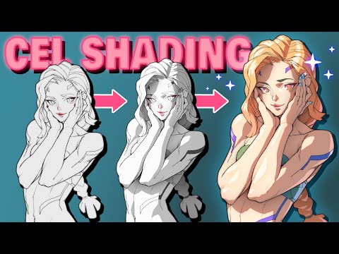
MY FULL CEL-SHADING DRAWING PROCESS - 2025 (coloring tutorial)
 0:00:30
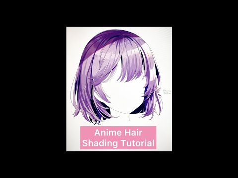
Anime Hair Shading Tutorial #Shorts
 0:00:19
How to shade like manga artist || Jmarron
 0:10:06
👨🎨 HOW TO COLOR YOUR DRAWINGS using cel shading
 0:00:42
Quick Shading Tutorial for Beginners
 0:00:33
how to draw Monkey D. Luffy step-by-step #anime #monkeydluffy #coloring #draw #drawing #trending
 0:00:51
Fix Your Anime/Toon Face Shading! (Blender 4.0+) #shorts
 0:03:29
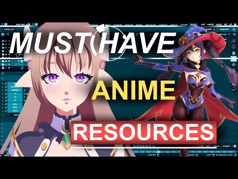
Anime Shading Resources (YOU NEED!!)
 0:00:18
Shading like this ✍️ || Jmarron
 0:00:50
Shading Skin and Choosing Colors | Marikyuun Tutorial
 0:00:21
How to shade your manga like anime || Jmarron
 0:00:38
A simple way to shade faces
 0:00:29
Different ways artist shade 💢 Which one are you? #ibispaintx #ibispaint #genshinimpact #xiao
![[How to]Anime Style](https://i.ytimg.com/vi/R1rQcXMT-mI/hqdefault.jpg) 0:30:34
0:30:34
[How to]Anime Style Coloring with CLIP STUDIO PAINT
 0:00:18
Learn to shade like a MANGA ARTIST . . . 😩🙏 || #art #anime #manga #naruto #shorts
 0:00:33
How to shading black hair ⚫✨ #shading #shadingtutorial #ibispaintx #the_artf #artist #tutorial
 0:47:40
Drawing and Coloring CEL SHADING Tutorial | ANIME STYLE
 0:00:25
how to draw ✨JUICY✨ nose
 0:00:14
Charmer 🥀✨ Digital Art IBISPAINTX
 0:00:21
Gojo Satoru 😎 Eyes Coloring!!! #shorts #animedrawing #jujutsukaisen
 0:00:35
stop drawing ur lips like this❌ #shorts
Комментарии