filmov
tv
Sankey Diagram in Power BI

Показать описание
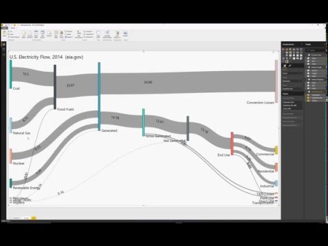
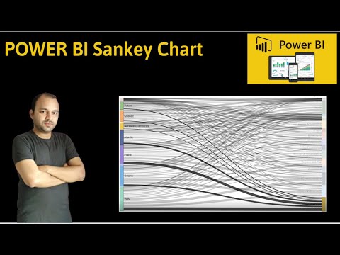
Sankey diagrams show how data flows from one entity to another. You'd think that it would be difficult to create but with Power BI and the Visuals marketplace from Microsoft, you can create a simple Sankey chart to have provide some interactivity or just copy/paste to a presentation or infographic.
📝 This description may contain affiliate links and we'll receive a small commission if a purchased is made using the links (but at no additional cost to you). It'll support the channel and so more videos like this can be made. Thanks for your support!
#excel
#msexcel
#doughexcel
-~-~~-~~~-~~-~-
Please watch: "Convert Table in a PDF File to Excel"
-~-~~-~~~-~~-~-
 0:08:03
 0:48:06
 0:14:07
 0:07:10
 0:05:26
 0:03:47
 0:08:35
 0:01:30
 0:02:08
 0:13:13
 0:02:49
 0:01:32
 0:08:10
 0:13:01
 0:08:10
 0:16:16
 0:19:24
 0:05:25
 0:01:27
 0:00:56
 0:14:14
 0:00:57
 0:01:09
 0:05:17